CLIENT: Fenra Studios
Fenra Studios is a dynamic and forward-thinking film production company. The objective was to create a logo that not only encapsulated their innovative spirit but also conveyed a strong sense of sophistication and professionalism, essential attributes in the competitive world of filmmaking.

The core challenge lay in translating Fenra Studios' dynamic and creative ethos into a static visual mark. We needed a logo that would stand out in a saturated market and hint at their artistic vision, without being overly literal or cliché. The solution required a balance between contemporary aesthetics and timeless elegance, ensuring longevity and impact.

The design solution: A bold, custom wordmark
A custom wordmark that would be instantly recognizable and embody the studio's unique character. The chosen design features a bold and modern aesthetic, meticulously crafted to ensure a distinctive identity.
Key design elements:
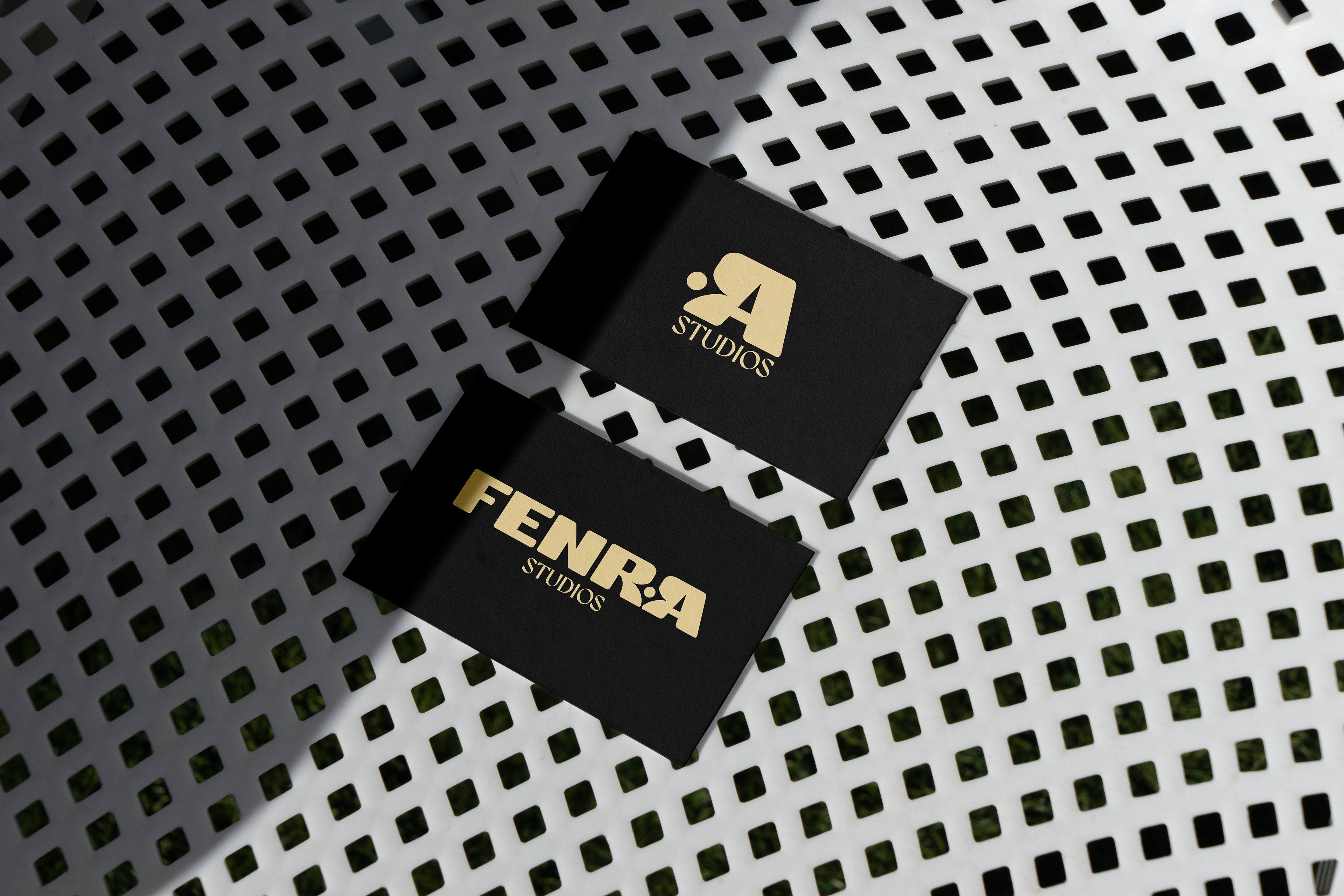
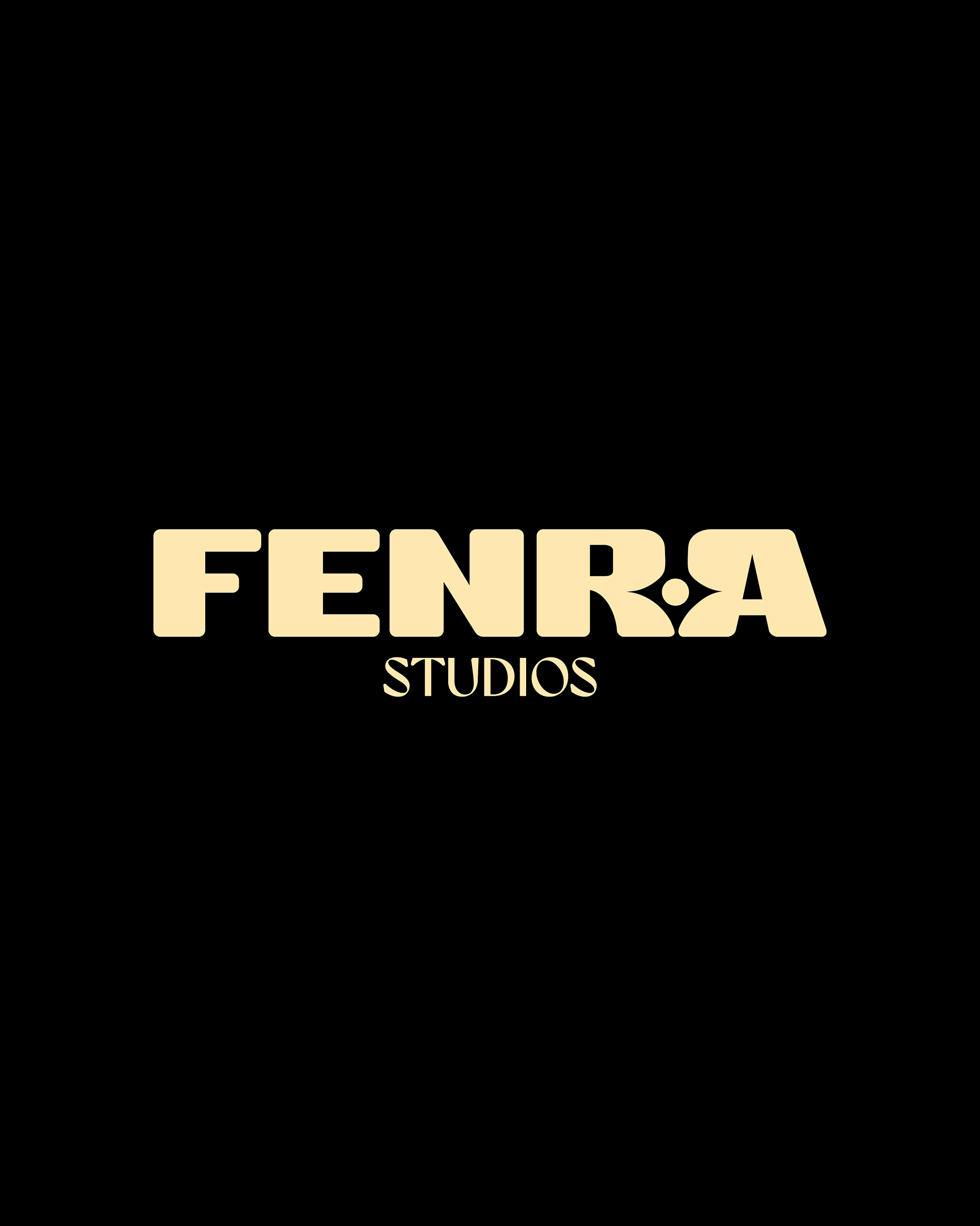
Custom typography: The primary element is the bespoke "FENRA" wordmark. Particular attention paid to the distinctive form of the "A", this custom approach ensures that the logo is not merely a font choice but a crafted piece of art, mirroring the nature of film production itself. The robust, slightly rounded forms convey strength and a contemporary feel, while subtle nuances add a unique character.
Color palette: The decision to set cream-colored text against a dark background was deliberate. This high-contrast pairing immediately evokes a sense of sophistication, luxury, and cinematic depth. The cream hue suggests the warmth of light often found in film, while the dark background provides a strong, professional base, reminiscent of a darkened movie theater or a film reel. This palette is designed to be striking and memorable, creating a visual impact that aligns with the dramatic nature of film.