CLIENT: Grain
Creation of the brand identity and packaging design for Grain, a new healthy oat-based snack. The goal was to develop a visual language that communicates natural goodness, high fiber content, and sustainable sourcing, appealing to health-conscious consumers seeking wholesome and convenient snack options.
The Challenge
In a crowded market of healthy snacks, Grain needed to stand out. The challenge was to:
- Create a brand identity that felt authentic, natural, and trustworthy.
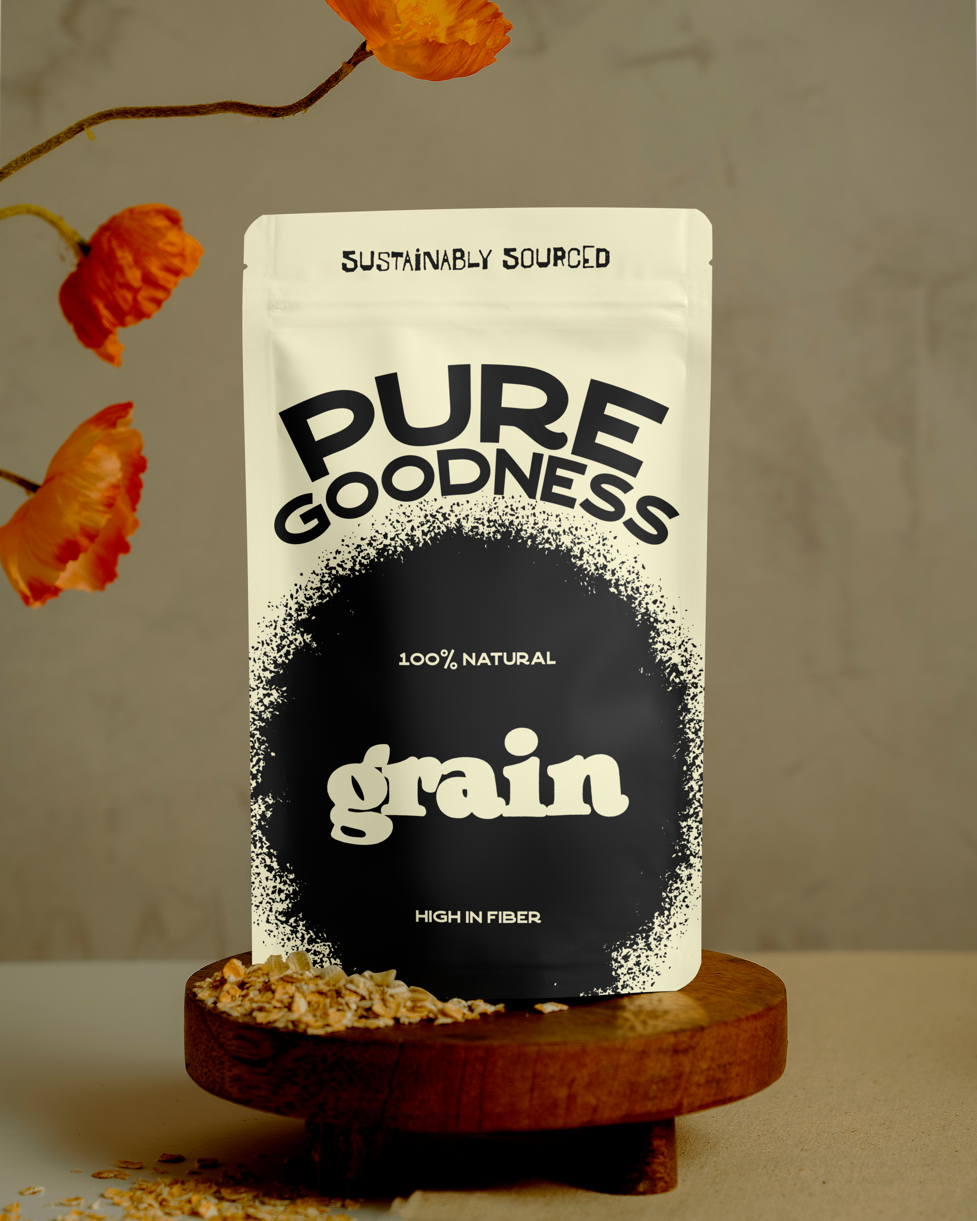
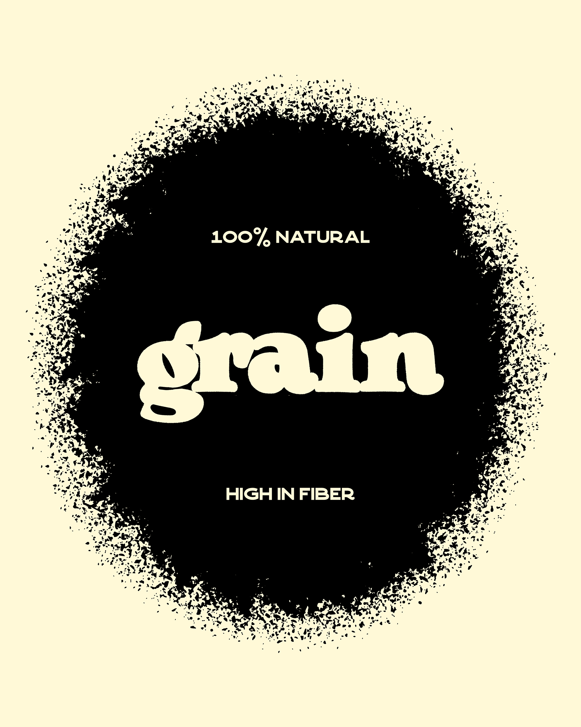
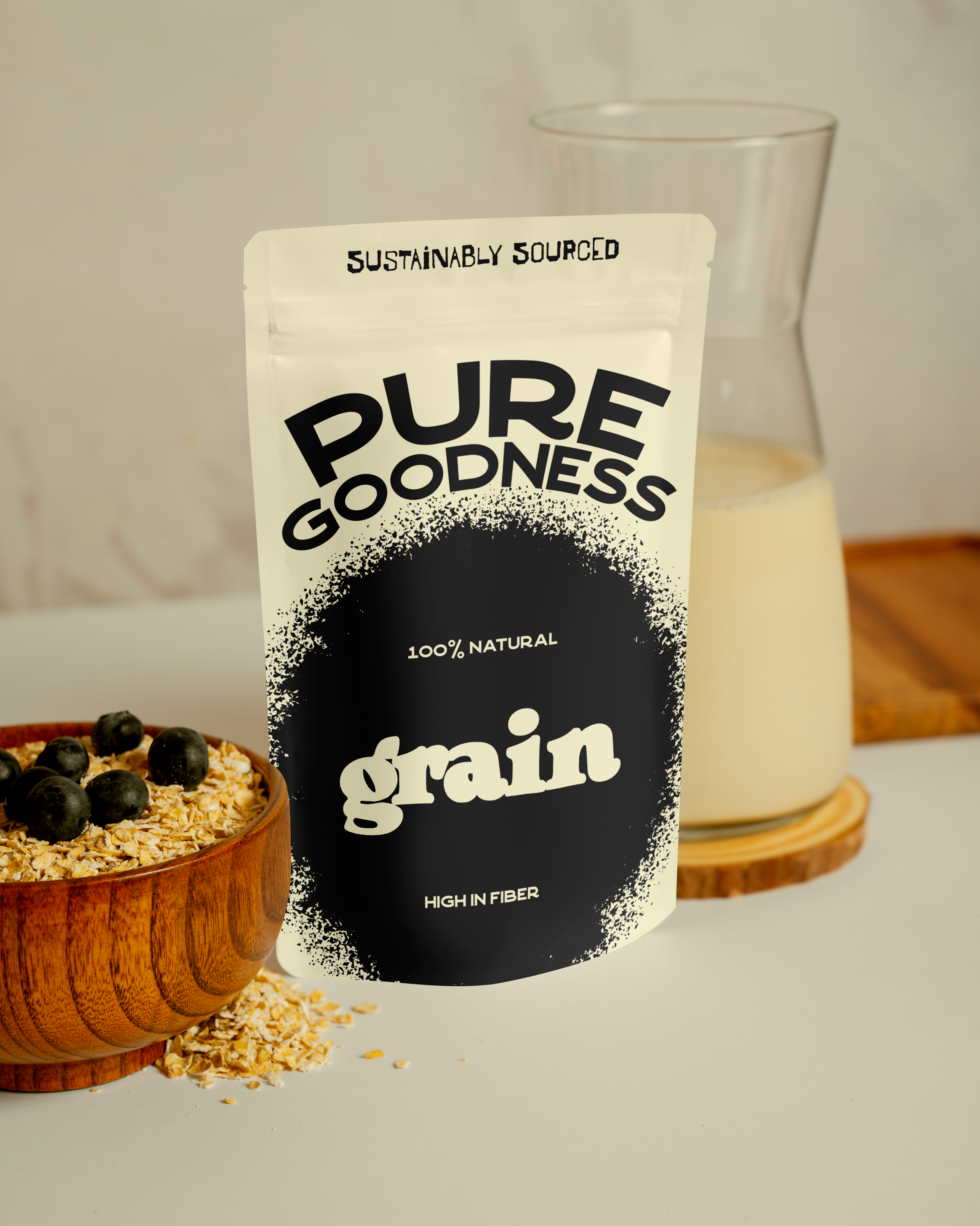
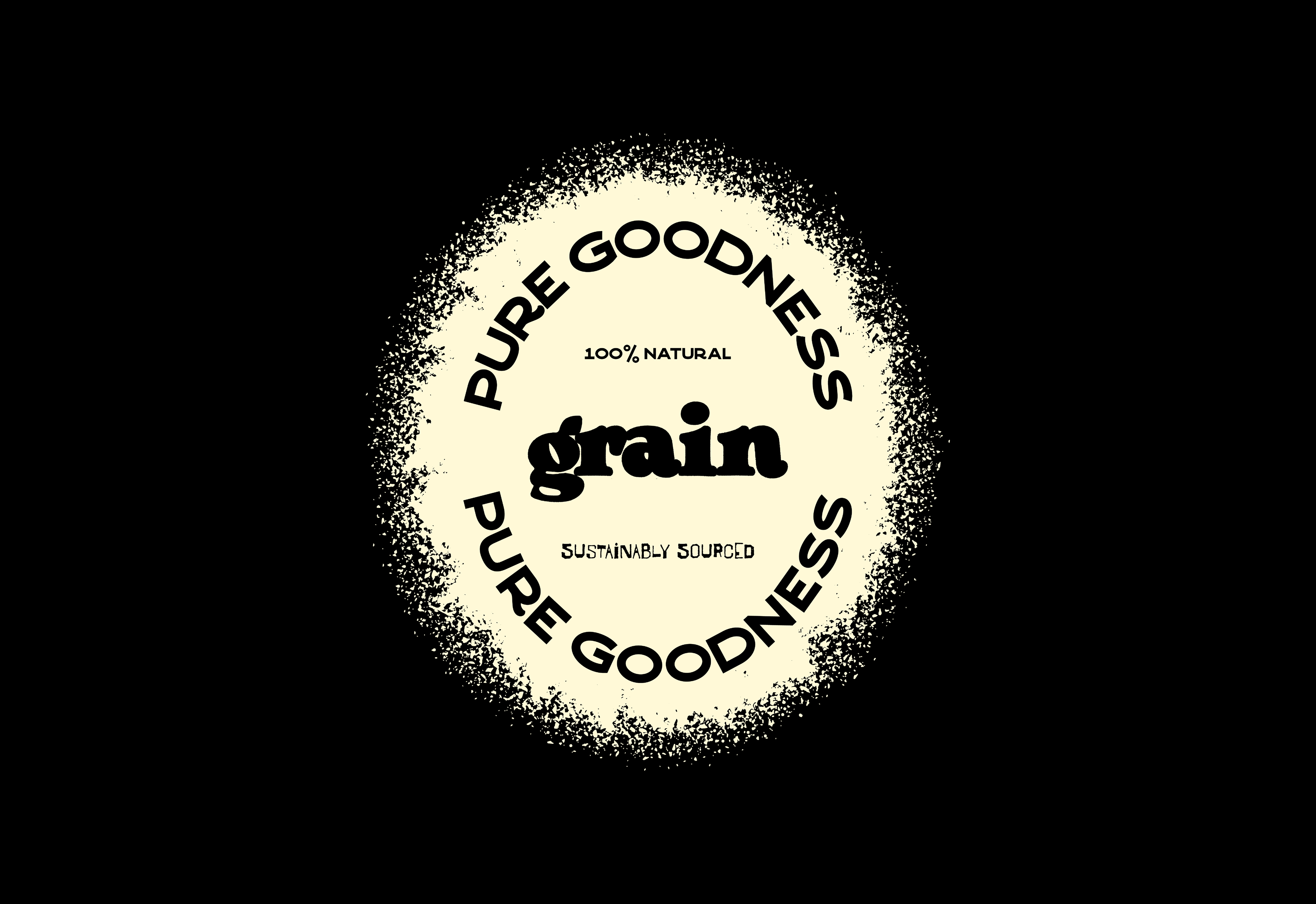
- Design packaging that clearly communicated key benefits: "100% Natural," "High in Fiber," and "Sustainably Sourced".
- Develop a visual system that was both modern and approachable, resonating with a target audience that values health and environmental responsibility.
- Ensure the design was versatile enough for potential future product line extensions.
My design process focused on simplicity, clarity, and a tactile feel to evoke the natural origins of the product.
1. Discovery & Strategy
Grain's core values: purity, natural ingredients, and sustainability. I identified the target audience as active, health-aware individuals who prioritize clean eating and eco-friendly choices. This led me to a strategy emphasizing transparency and a connection to nature.
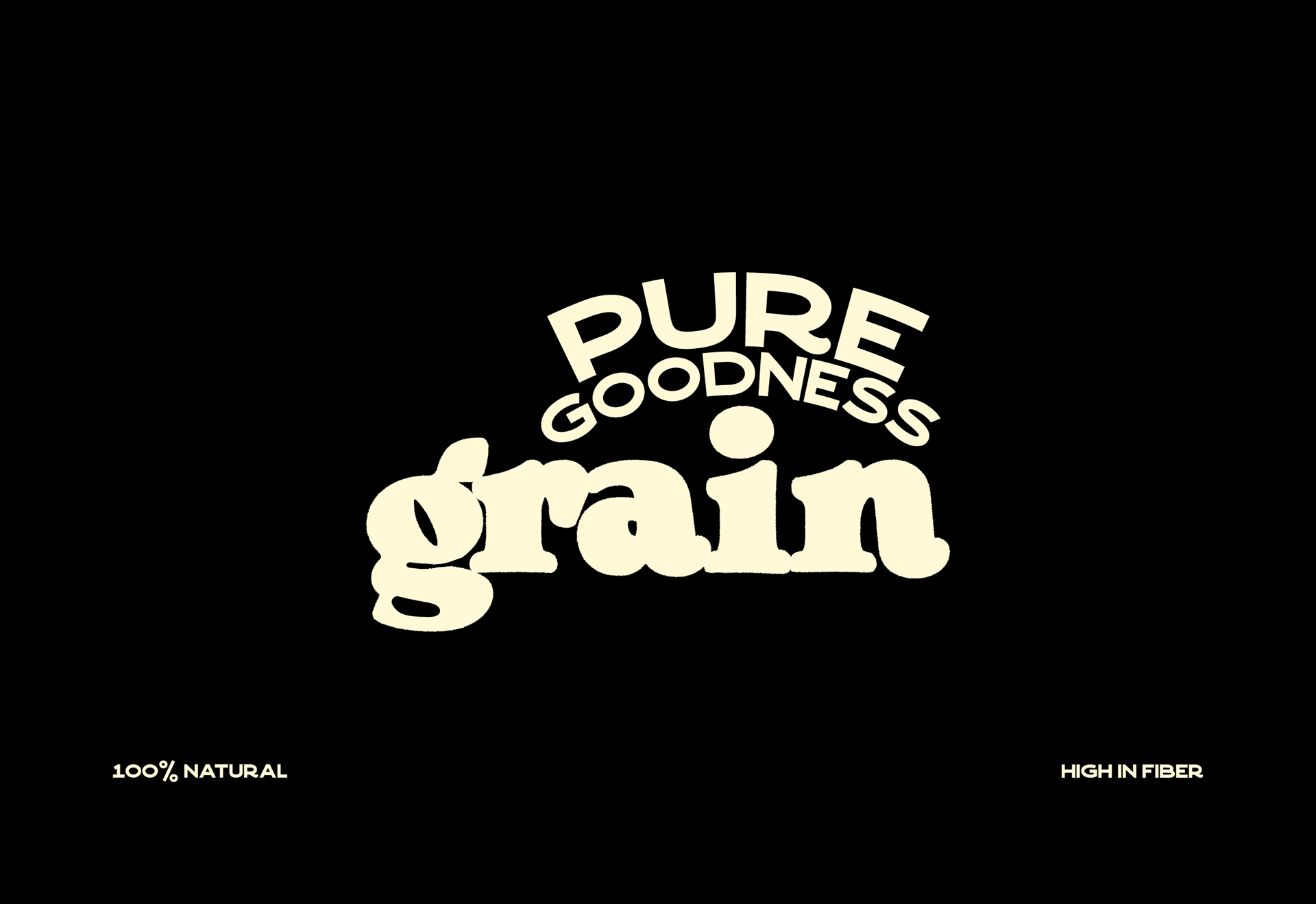
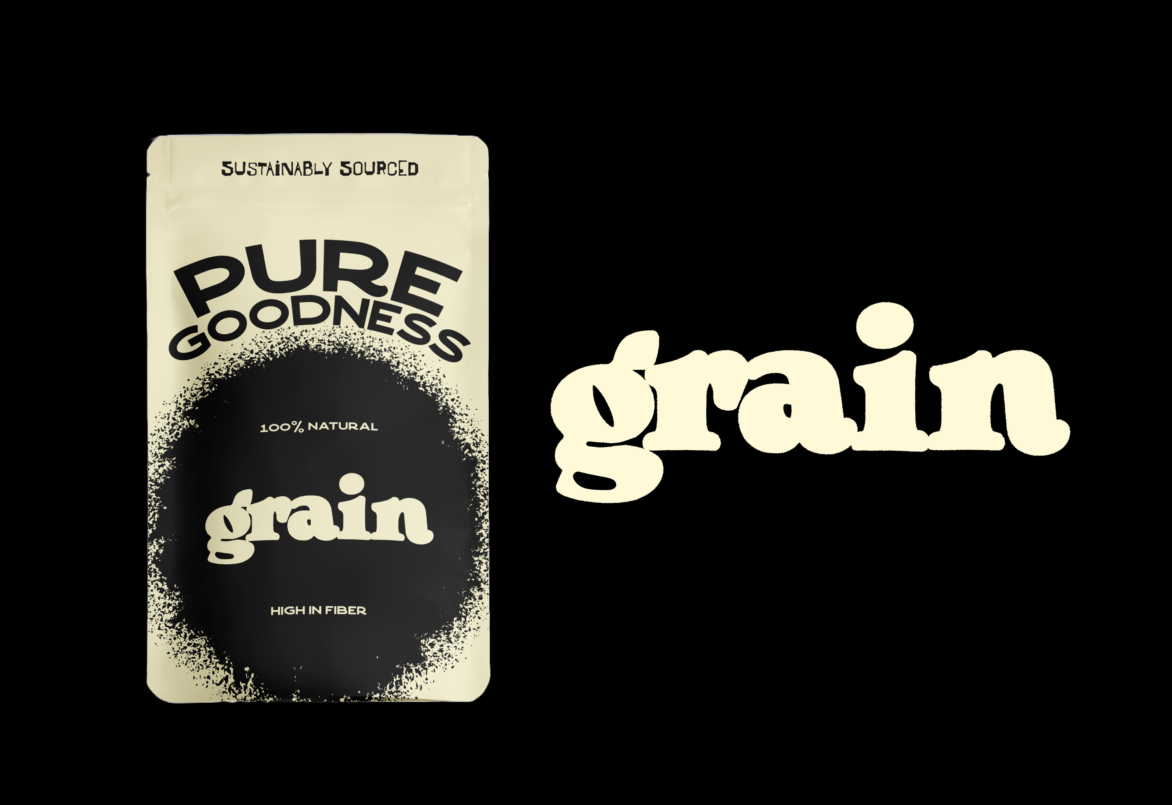
2. Logo & Typography
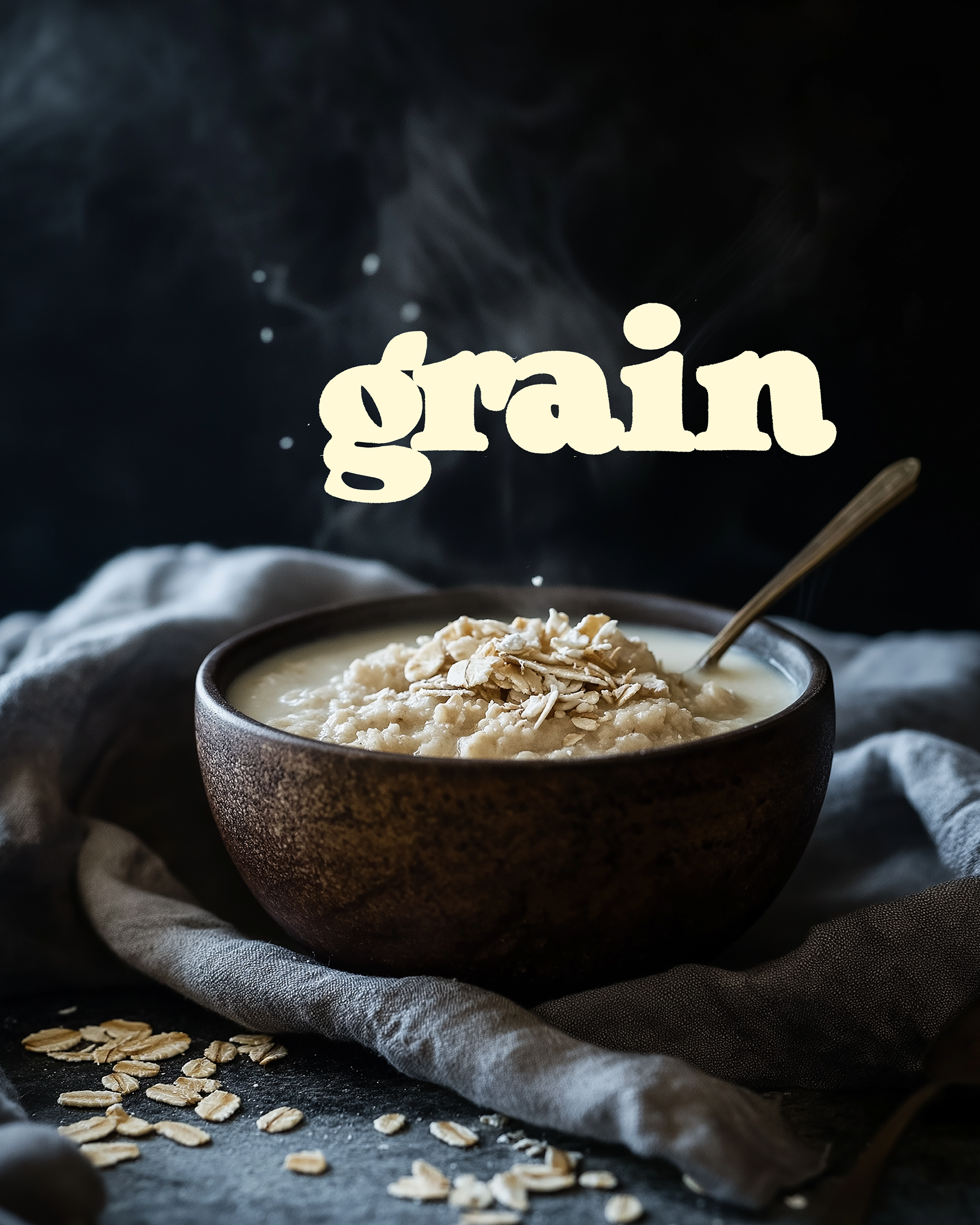
The logo for "Grain" was crafted to be friendly and organic. The subtle imperfections in the letterforms hint at the natural, unprocessed nature of oats.
3. Color Palette
Off-White/Cream: Represents the purity, providing a clean and inviting base.
Deep Charcoal/Black: Used for the main "Grain" logo and key information, providing strong contrast and a sense of groundedness.
4. Key Visual Elements
The "Splatter" Circle: A central, organic black circle with a textured, almost hand-stamped or splattered edge. This element serves as a focal point for the "Grain" logo and reinforces the natural, unrefined aspect of the product.
The Solution
The resulting brand identity and packaging convey a message of purity, natural ingredients, and wholesome goodness. The design is:
- Distinctive: The unique "splatter" graphic and circular text arrangement make Grain recognizable on the shelf.
- Honest: The natural color palette and organic textures communicate authenticity.
- Informative: Key product benefits are clearly highlighted, aiding consumer decision-making.
- Appealing: The overall aesthetic is modern, clean, and inviting, attracting health-conscious consumers.
This branding positions Grain as a trustworthy and desirable choice for those seeking a genuinely healthy and delicious oat-based snack.