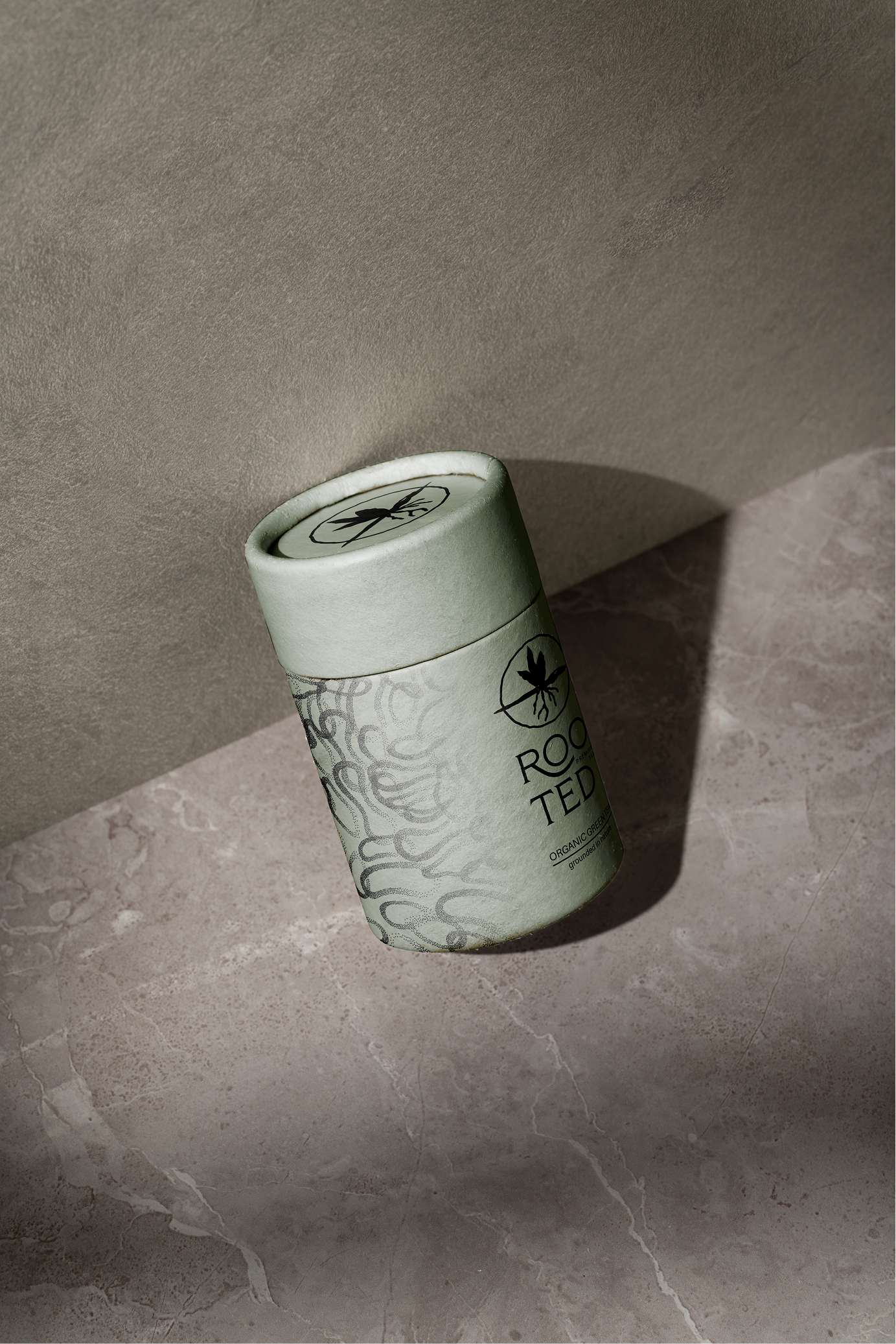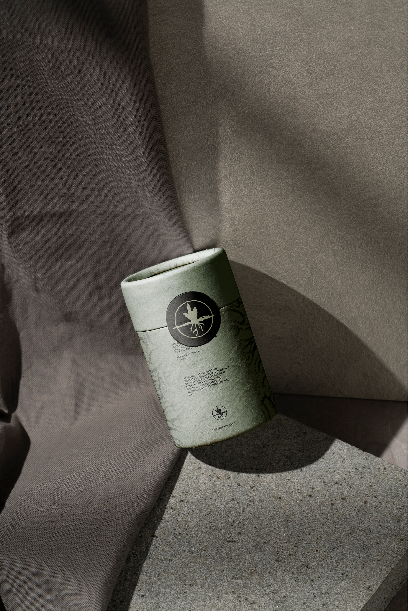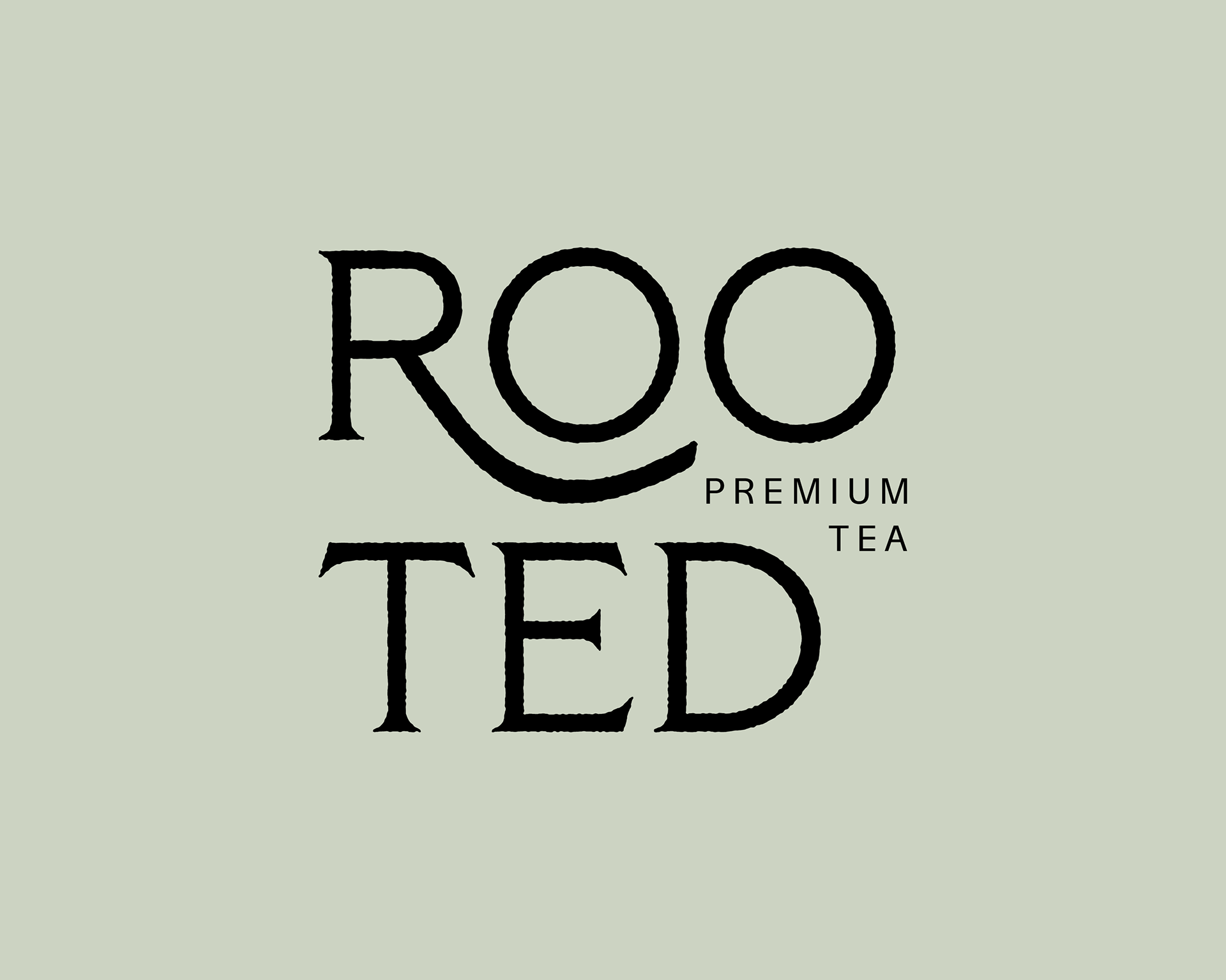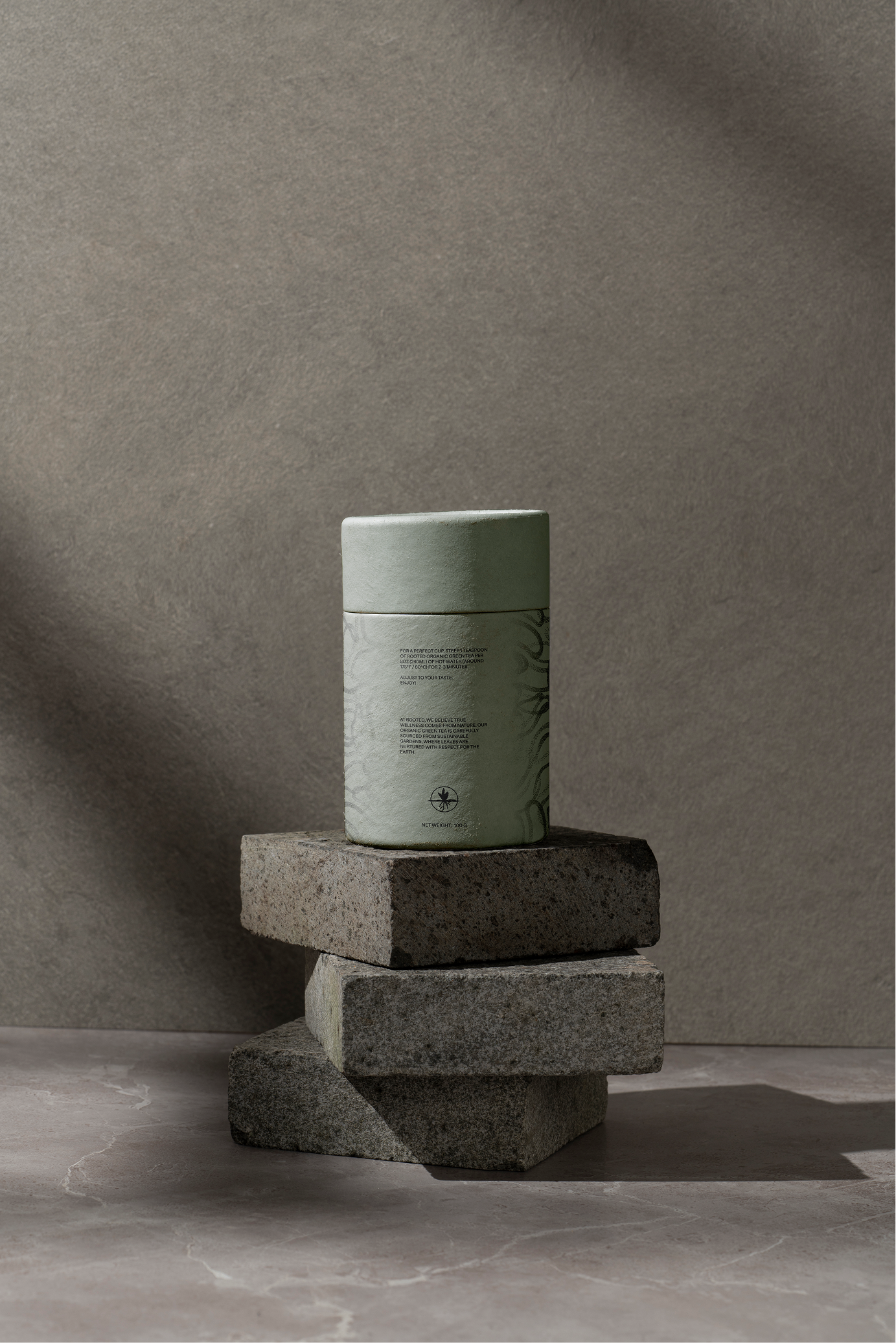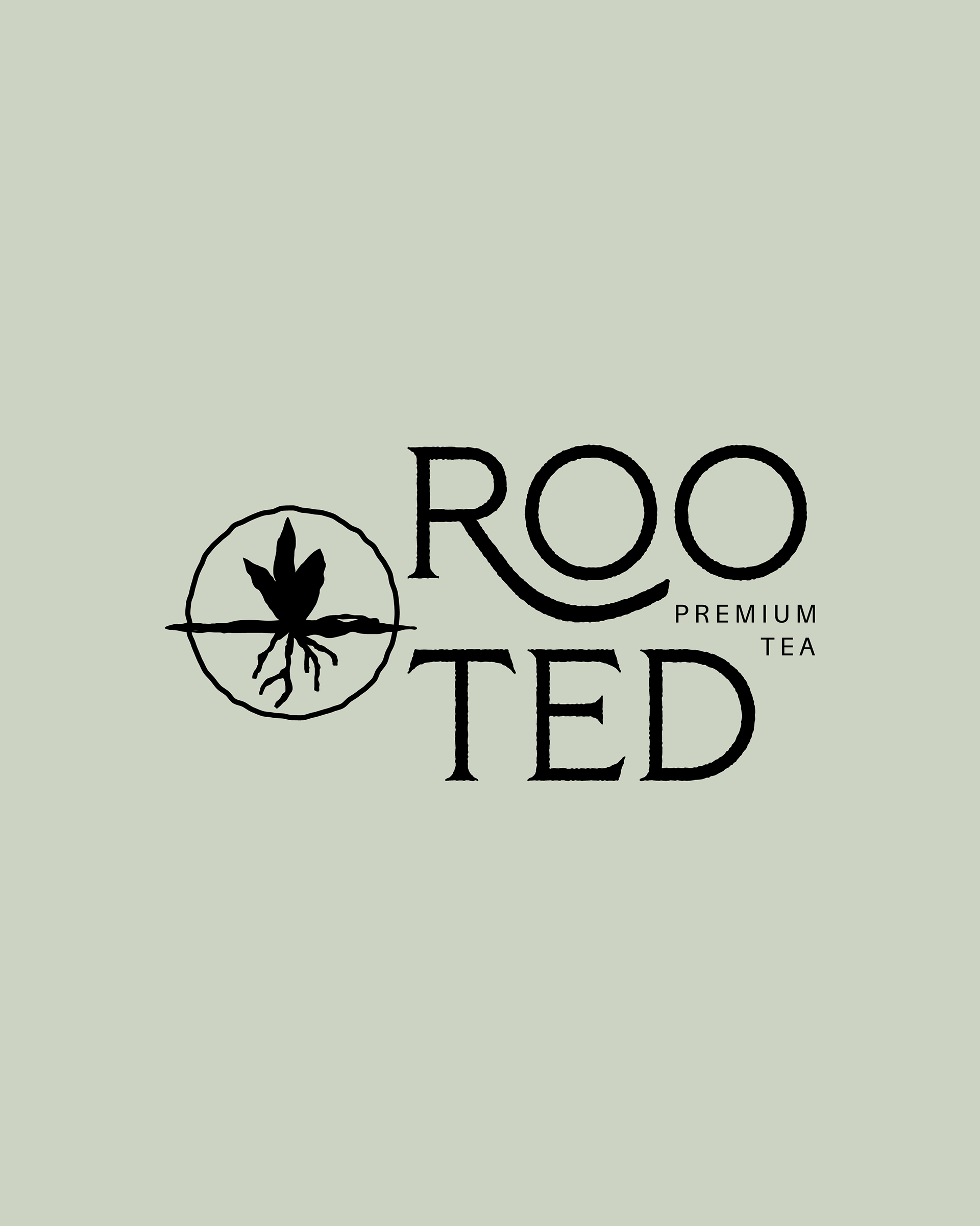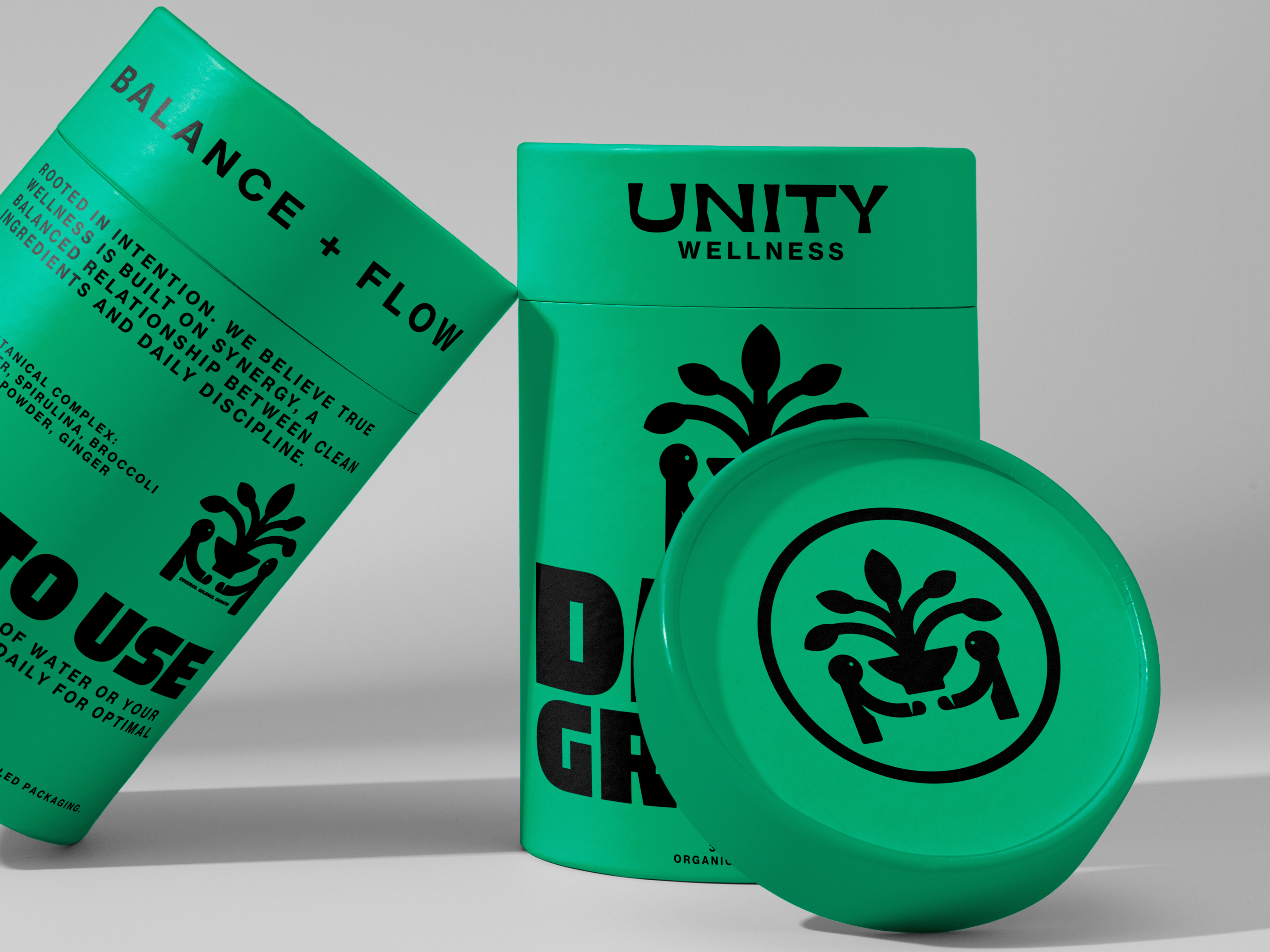
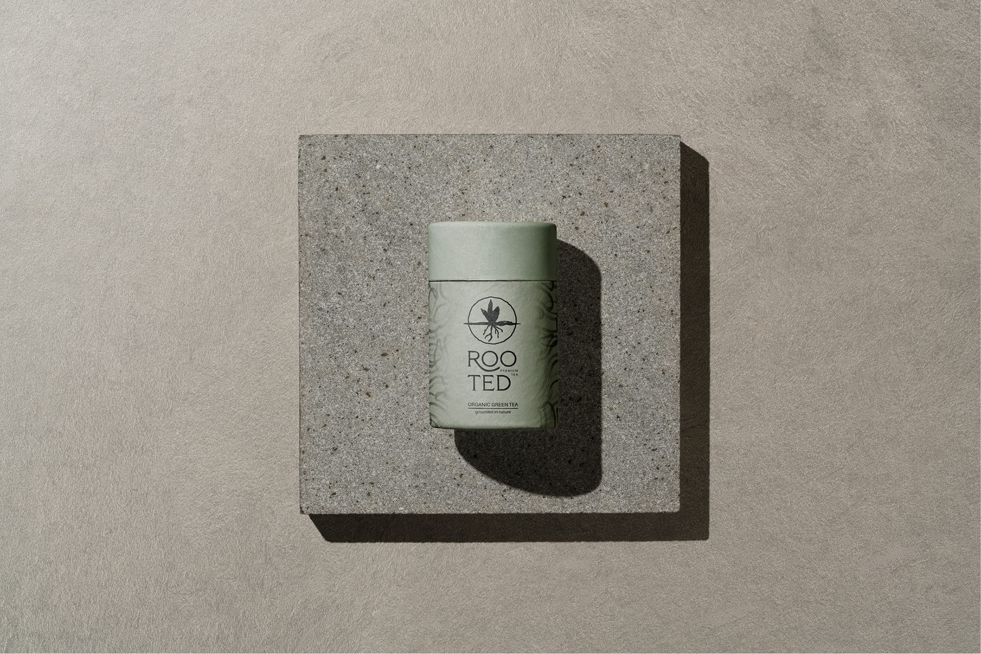
Rooted Tea is a premium tea brand dedicated to sourcing natural, high-quality ingredients with an emphasis on purity and origin. The design goal was to create a brand identity that immediately communicates natural origins and an authentic, grounded feel for a premium product. To achieve this, the logo centers on two key elements. First, the logotype for "ROOTED" uses a custom, slightly organic, almost handcrafted lettering. This deliberate choice avoids anything overly rigid or corporate, helping the name feel genuinely grounded and approachable. This attention to tactile detail establishes the brand's commitment to quality and natural simplicity right on the packaging.
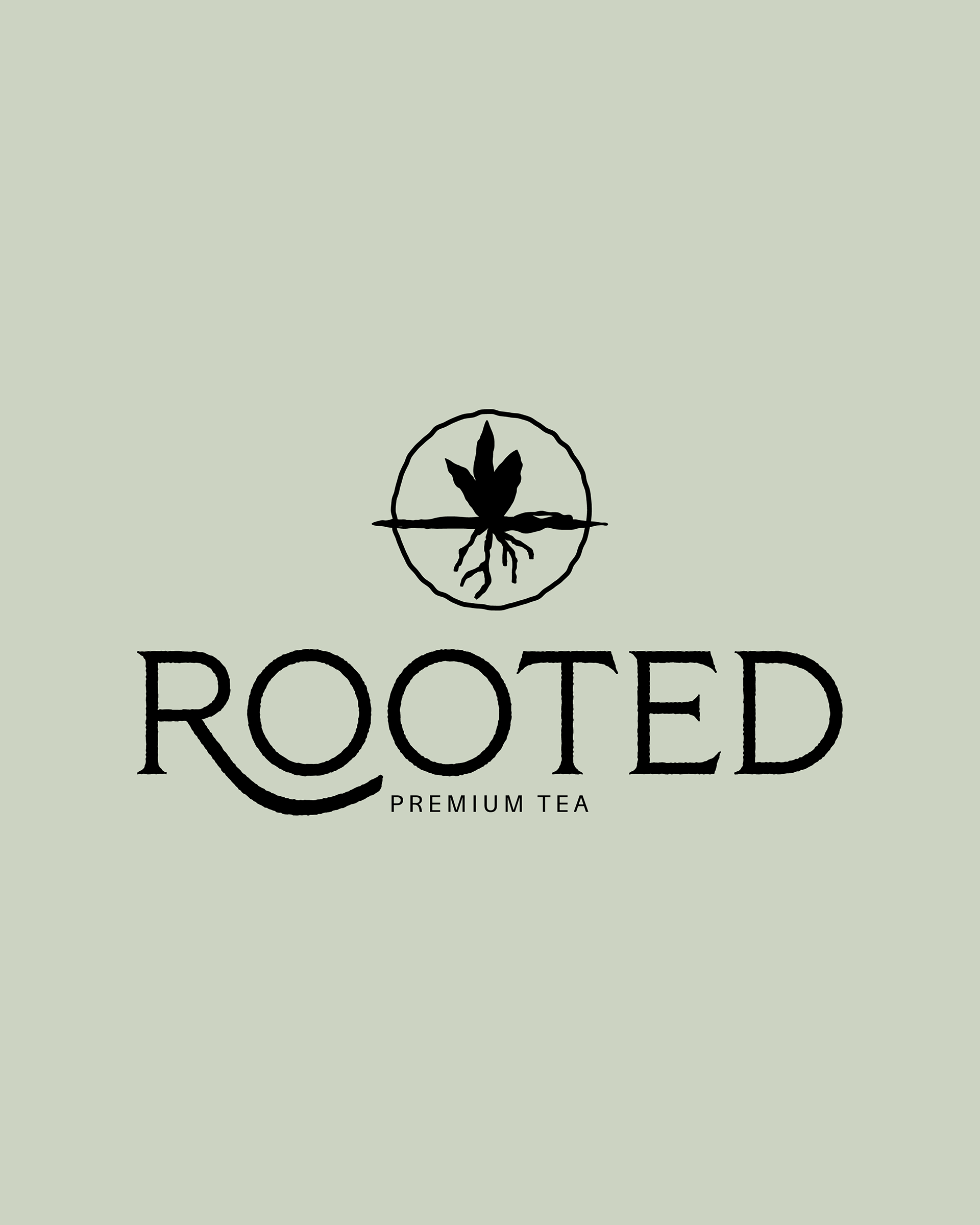

The handcrafted logotype is paired with a central rooted plant emblem. This illustration, which clearly shows both the leaf and the root structure, serves as a straightforward and powerful visual metaphor for natural growth, depth, and the authentic source of the tea ingredients. Applied to the earthy, minimalist packaging, these elements work together to convey a clear message: that ROOTED is a brand that is both real and deeply connected to its origins, appealing to the discerning consumer looking for genuine quality and purity.