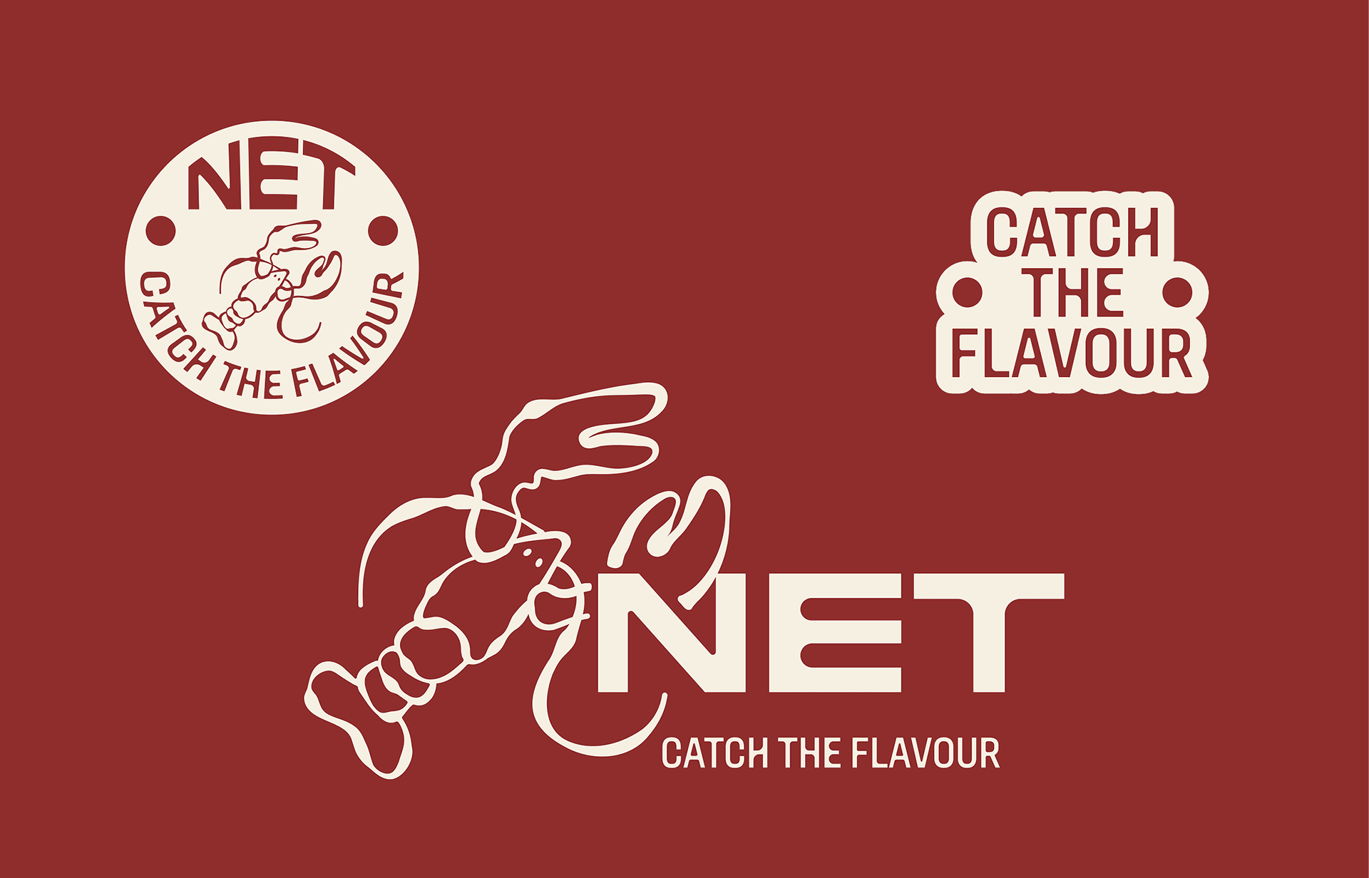
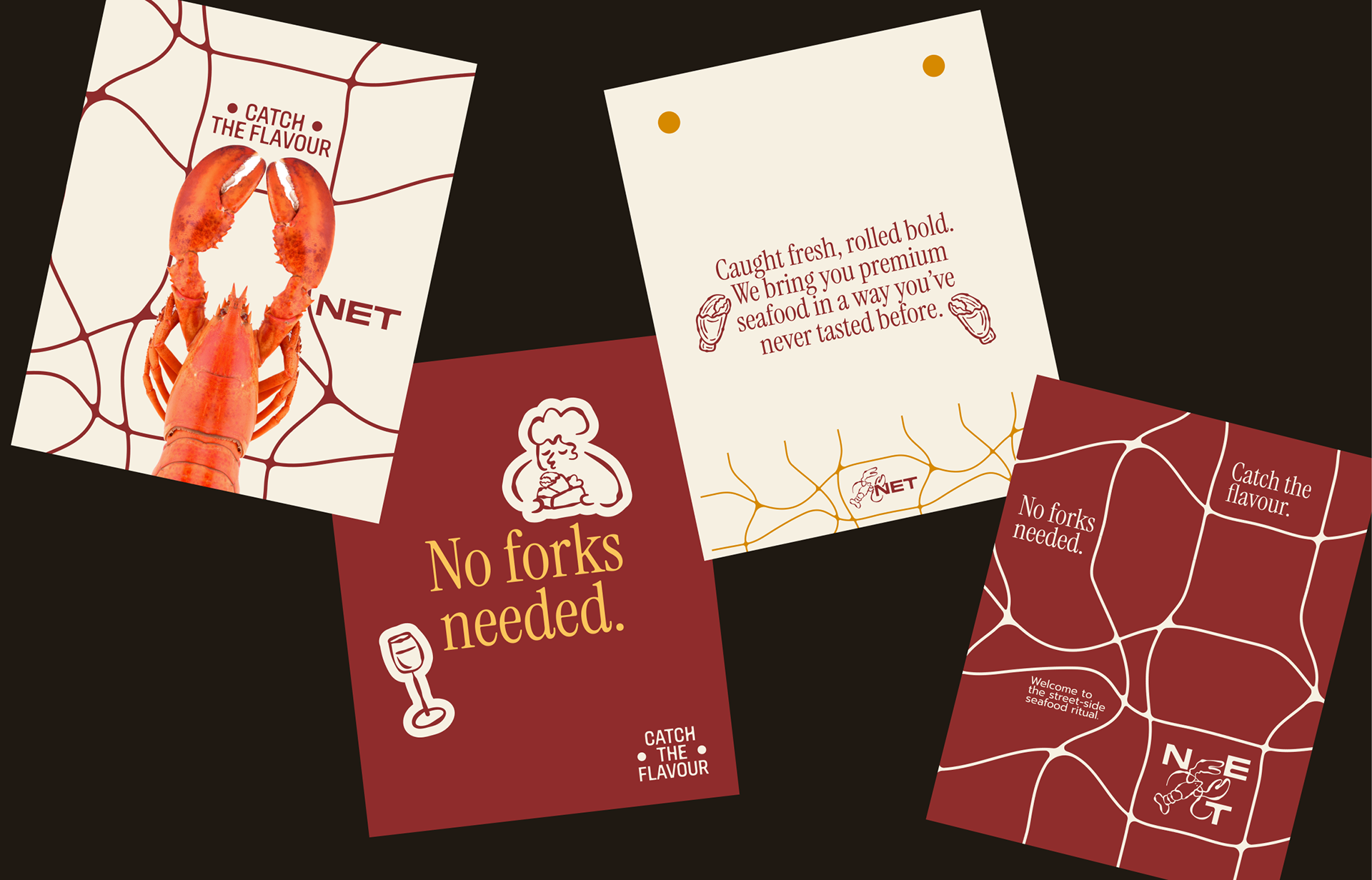
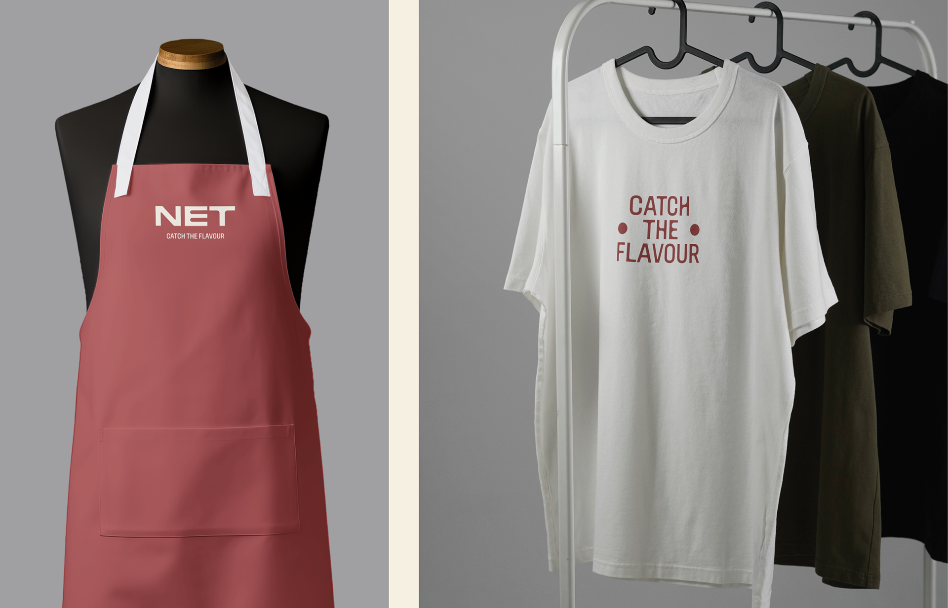
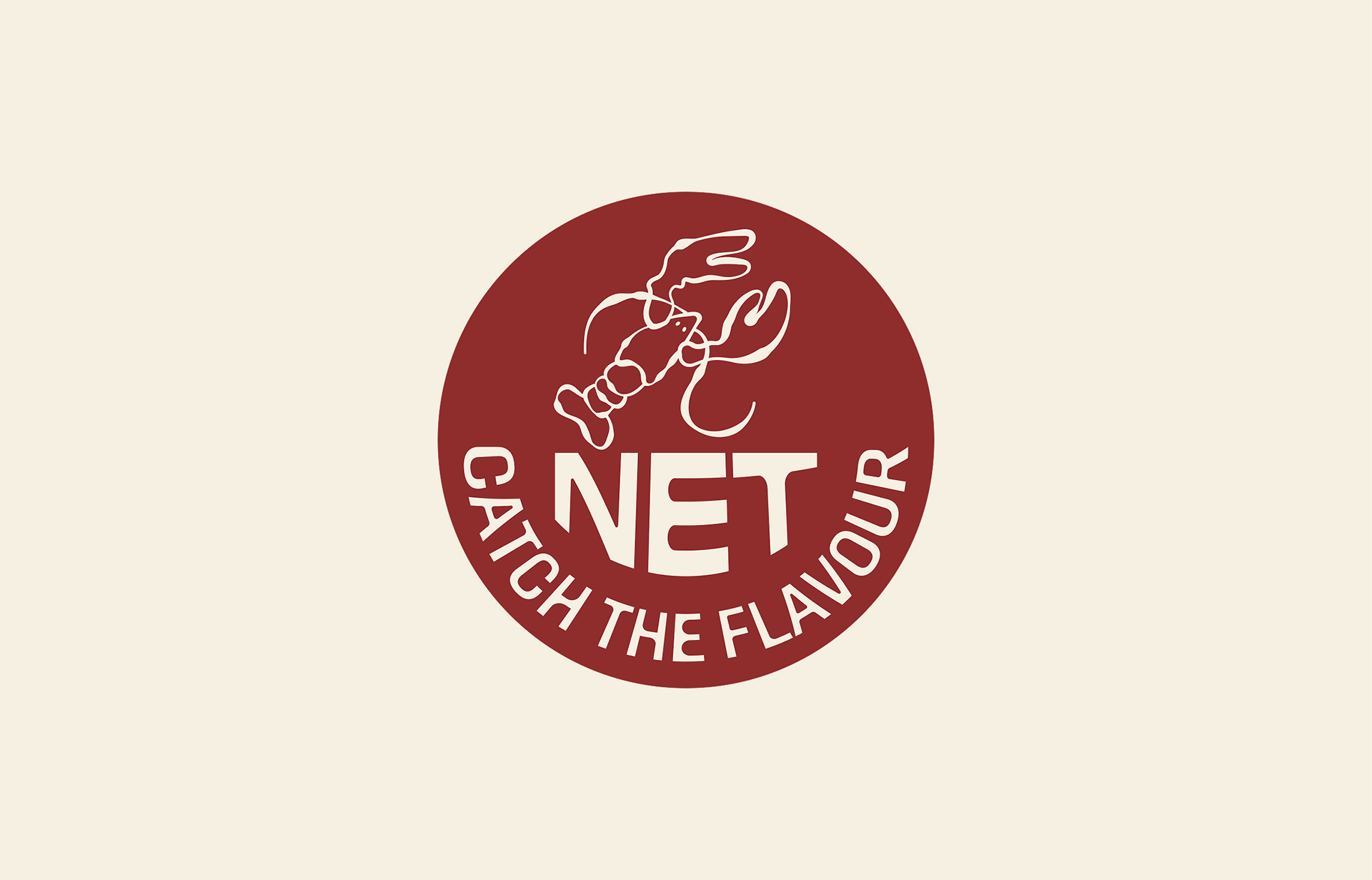
Excited to share the brand identity created for Net Athens, a premium seafood experience coming soon to the streets of Athens. NET aims to bring a playful yet elevated twist to street food, specializing in delicious lobster rolls and other sea-inspired dishes. This project focused on developing a comprehensive visual identity that reflects both the quality of the food and the playful, approachable nature of street food.
Logo & Brand Mark:
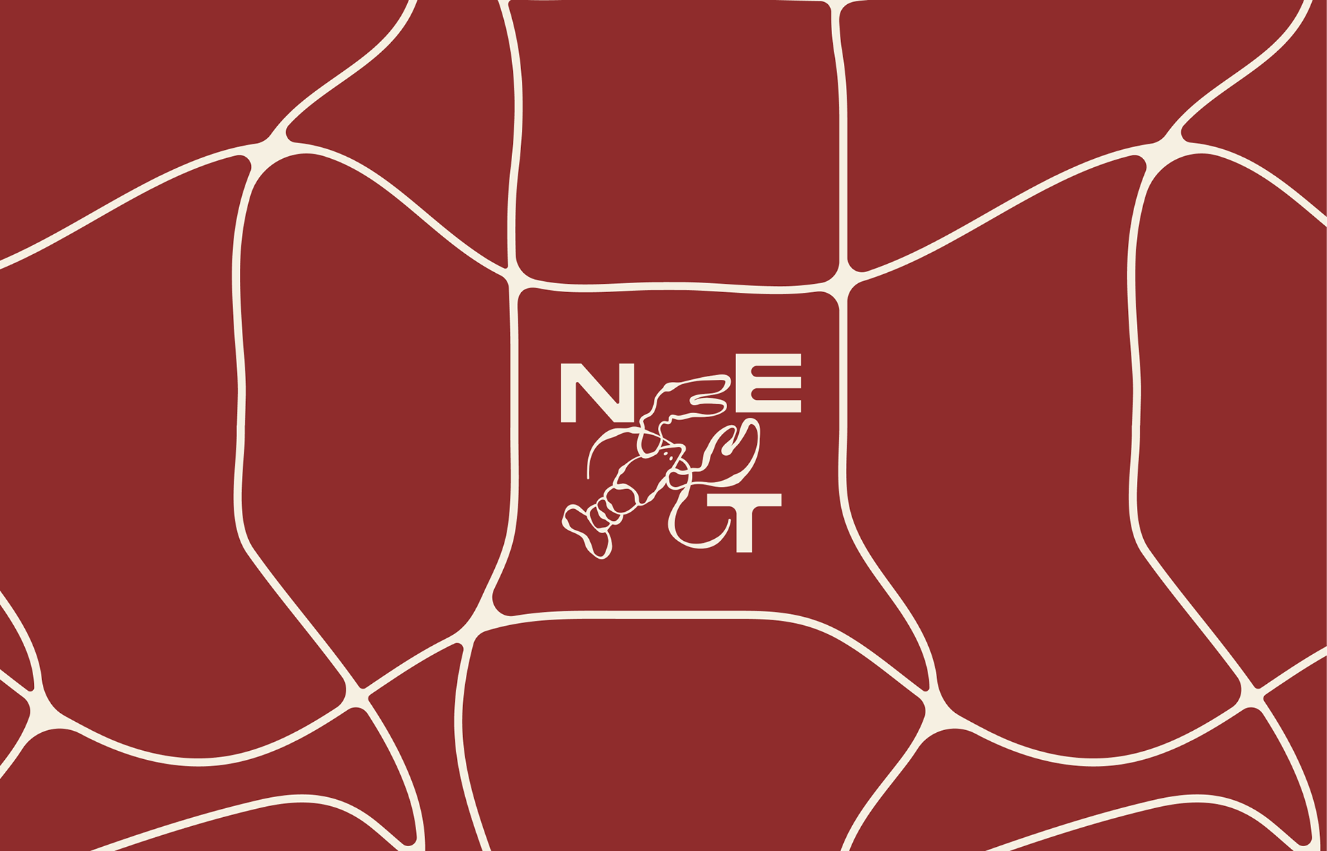
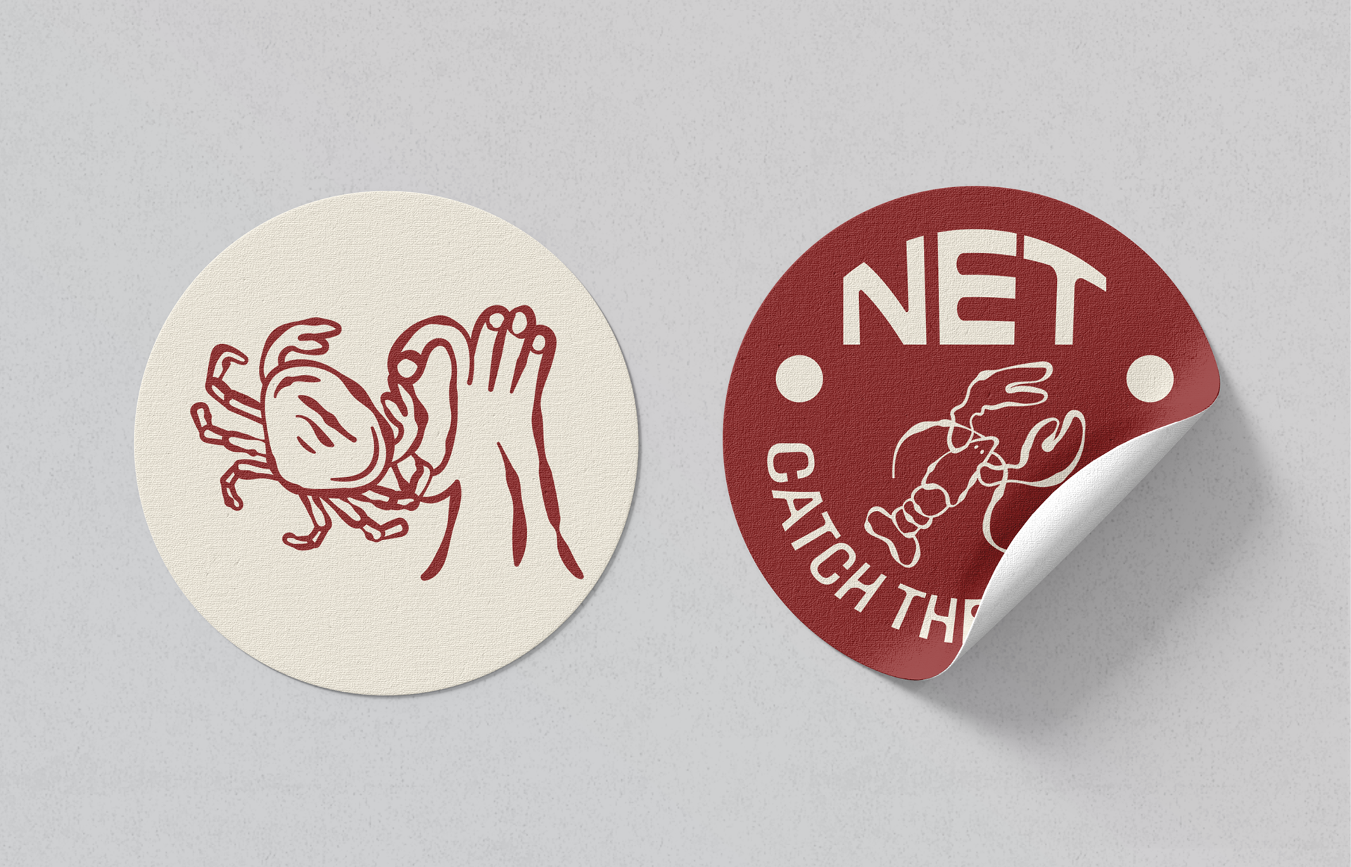
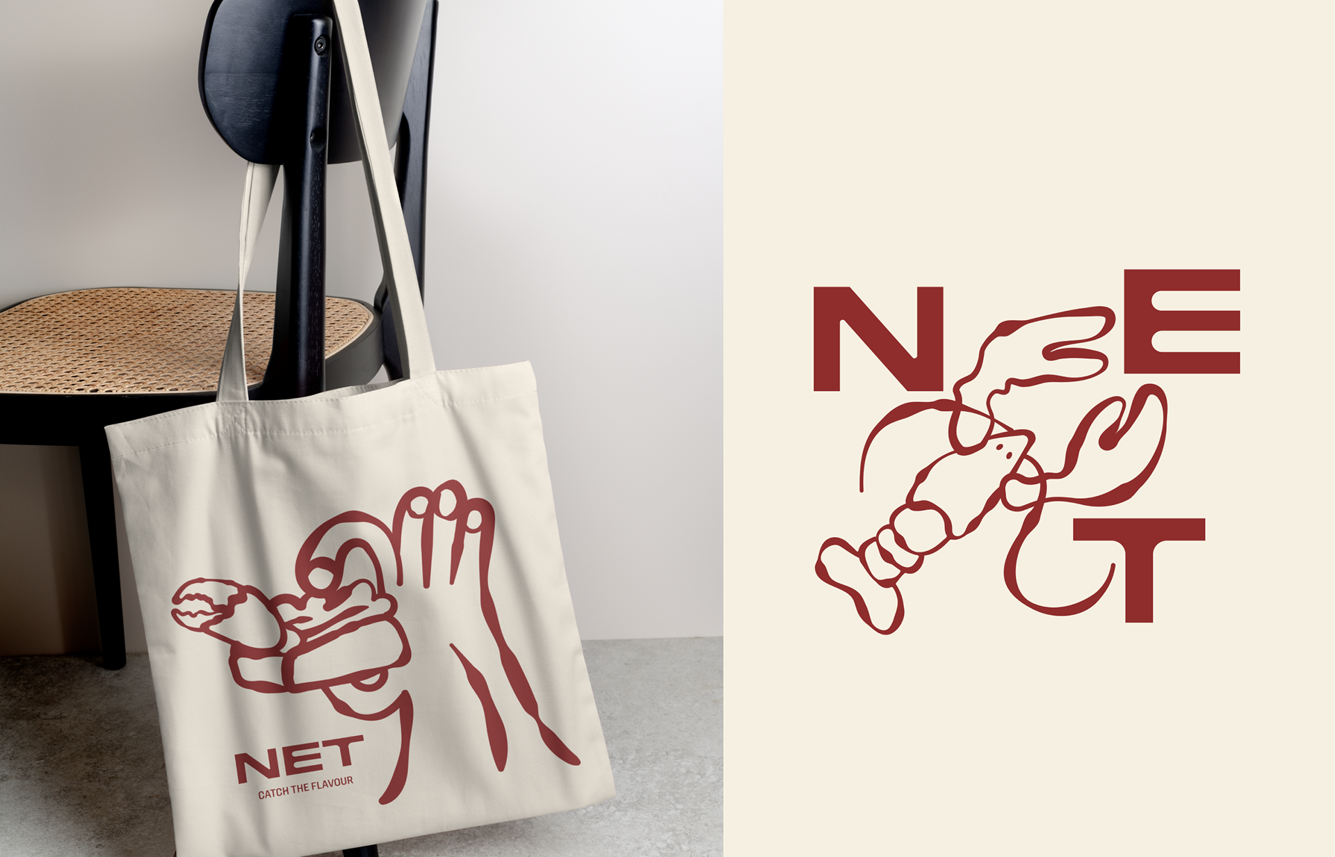
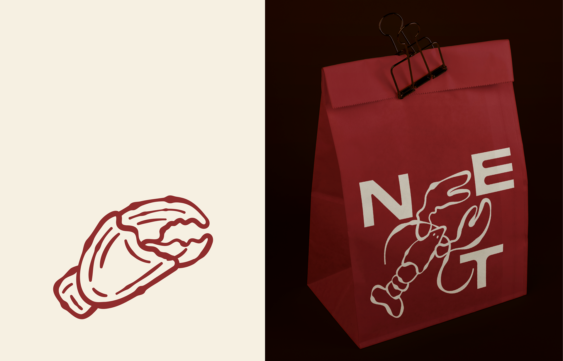
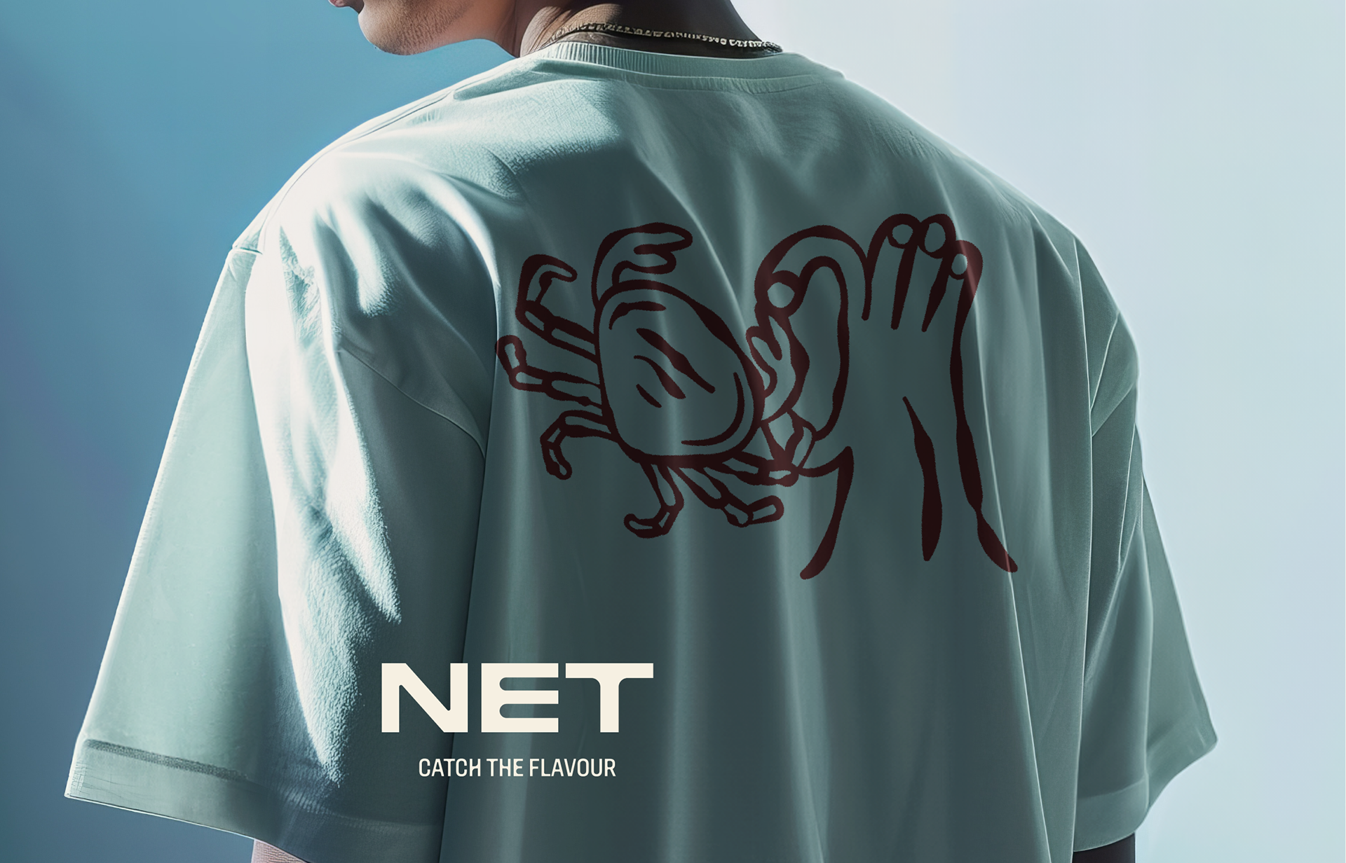
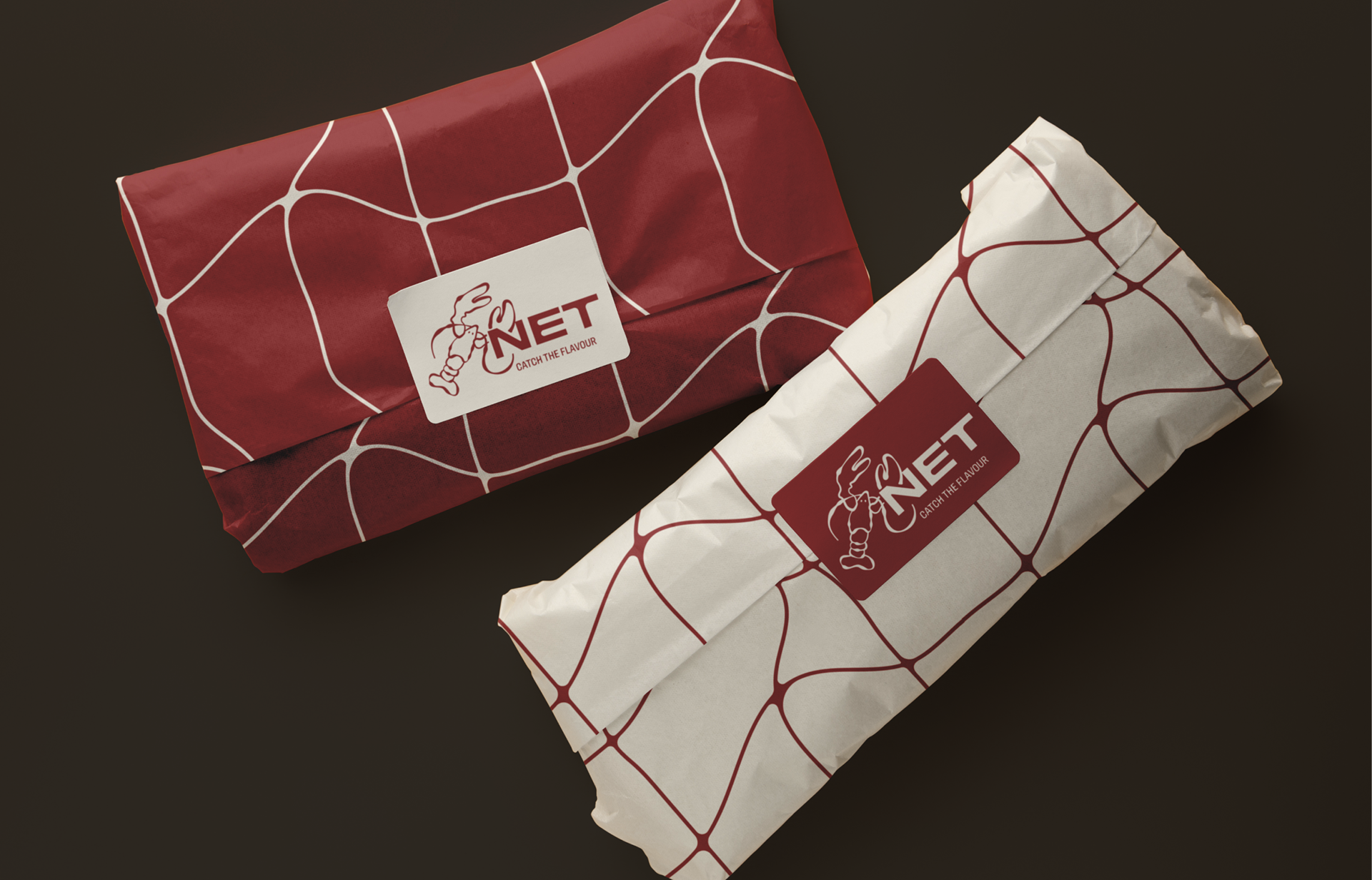
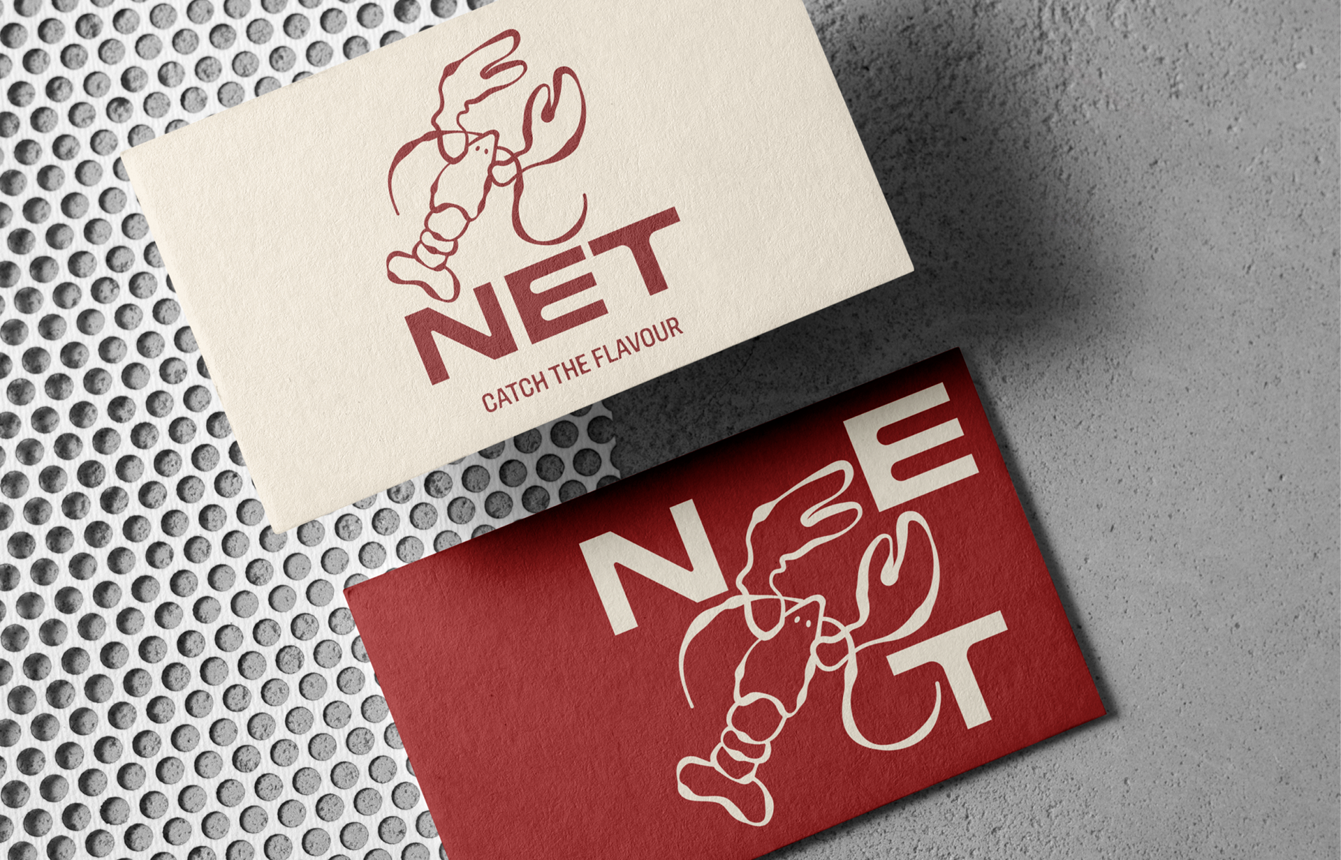
The core of the identity is a distinctive logo that integrates a lobster illustration with the brand name "NET."
Color Palette:
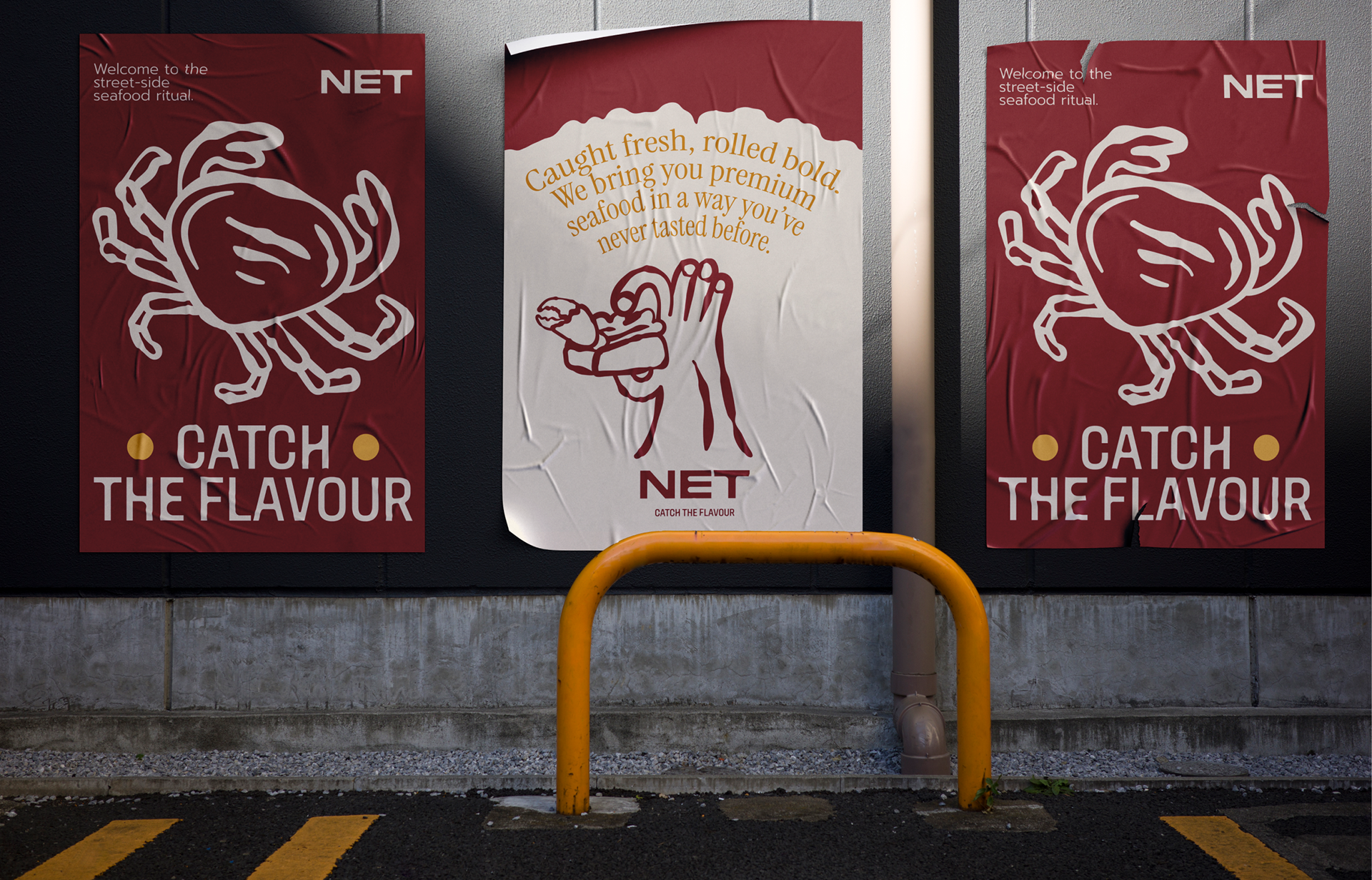
A rich, deep red (maroon/burgundy) is the primary brand color, evoking a sense of warmth, energy, and appetite. This is complemented by a creamy off-white, providing a clean contrast and a premium feel. Additionally, a warm, inviting yellow is introduced as an accent color, adding a touch of playfulness and further enhancing the street food vibe.
Typography:
The typography is clean, modern, and legible, ensuring clarity across all applications. The main typeface for "NET" is bold and strong, while the tagline and other supporting text use a complementary sans-serif font for readability.
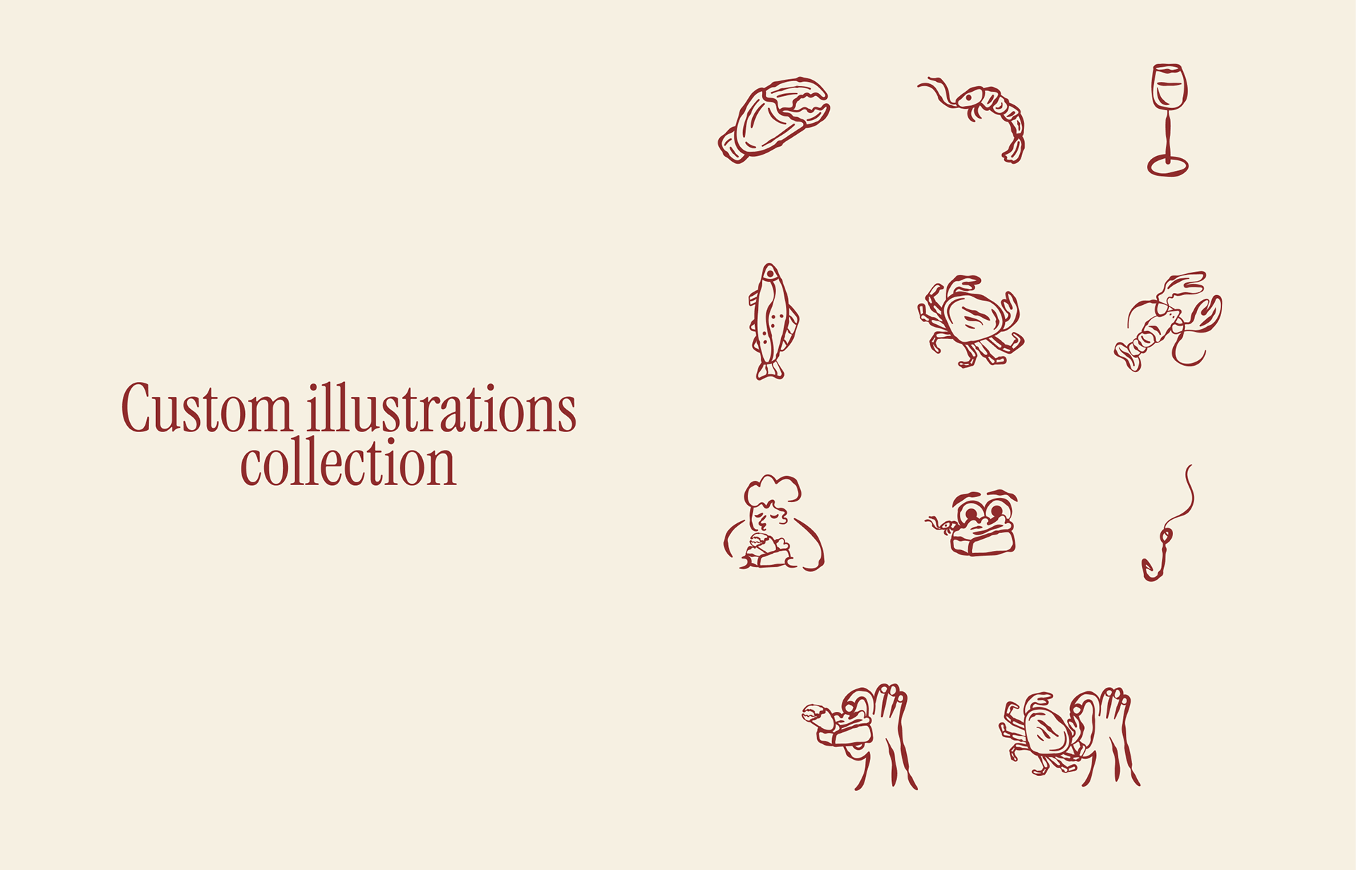
Custom Illustrations:
A key element of the brand's playful personality is the collection of custom, hand-drawn illustrations. These illustrations depict various seafood elements and playful conceptual images like hands interacting with a crab. These illustrations add character and can be used flexibly across marketing materials.
https://www.instagram.com/net.athens/