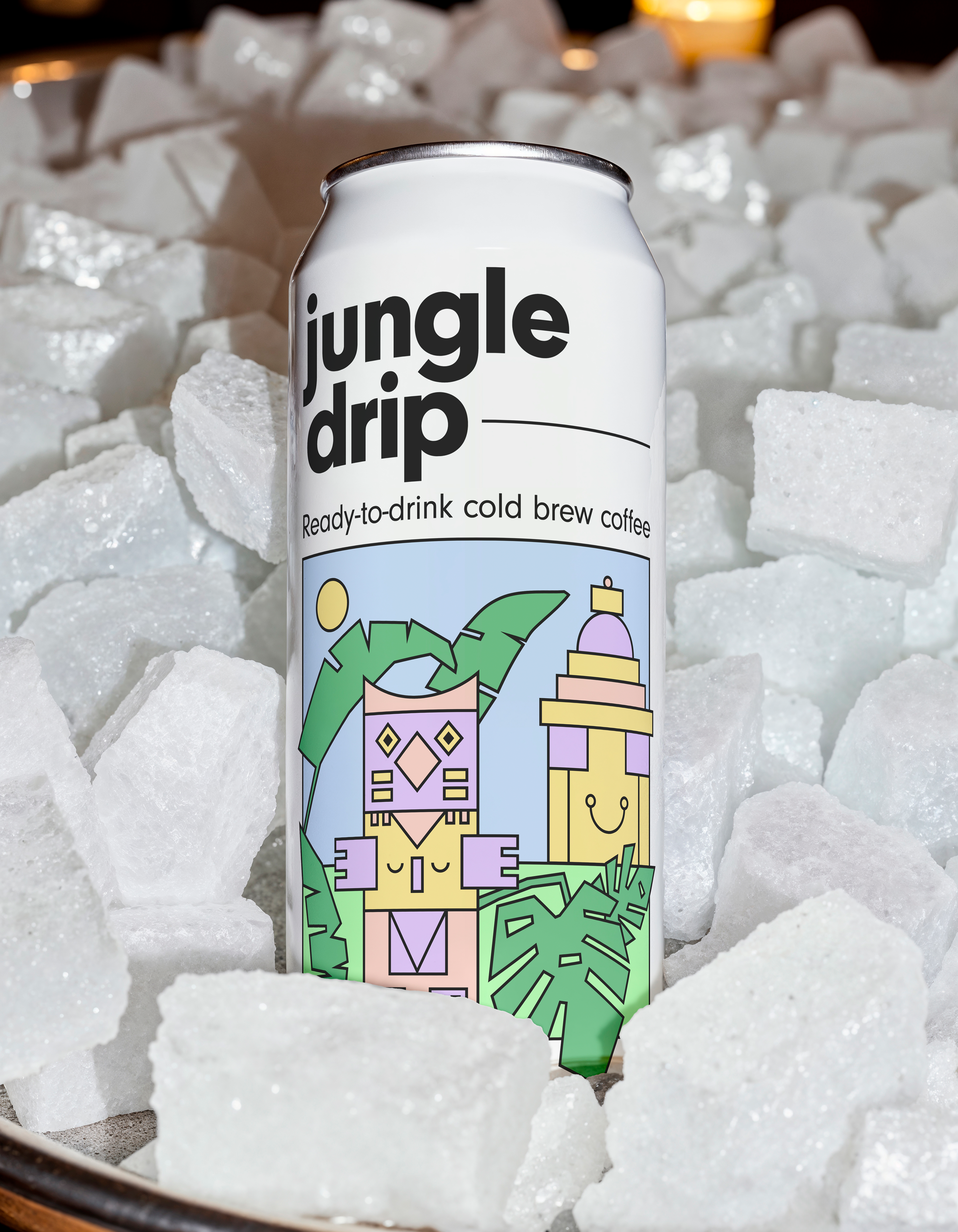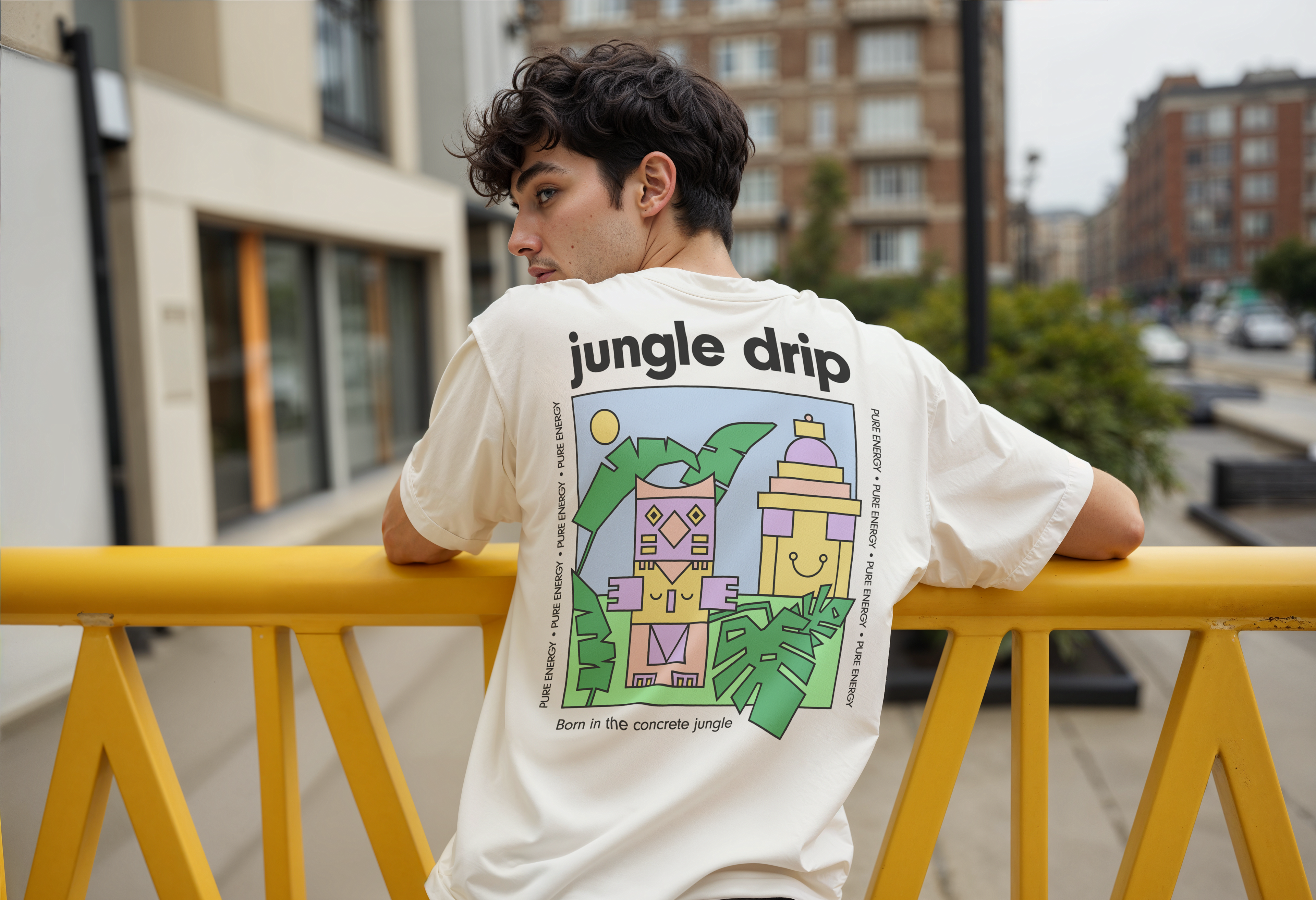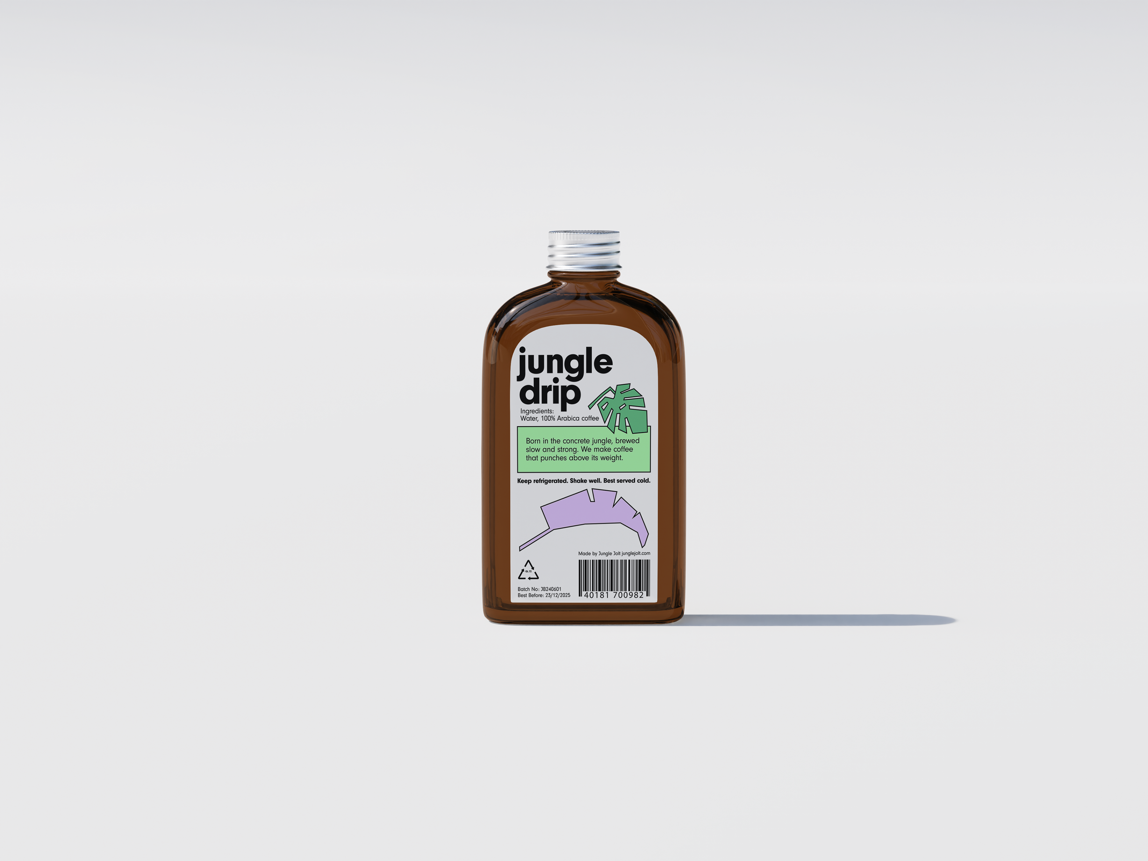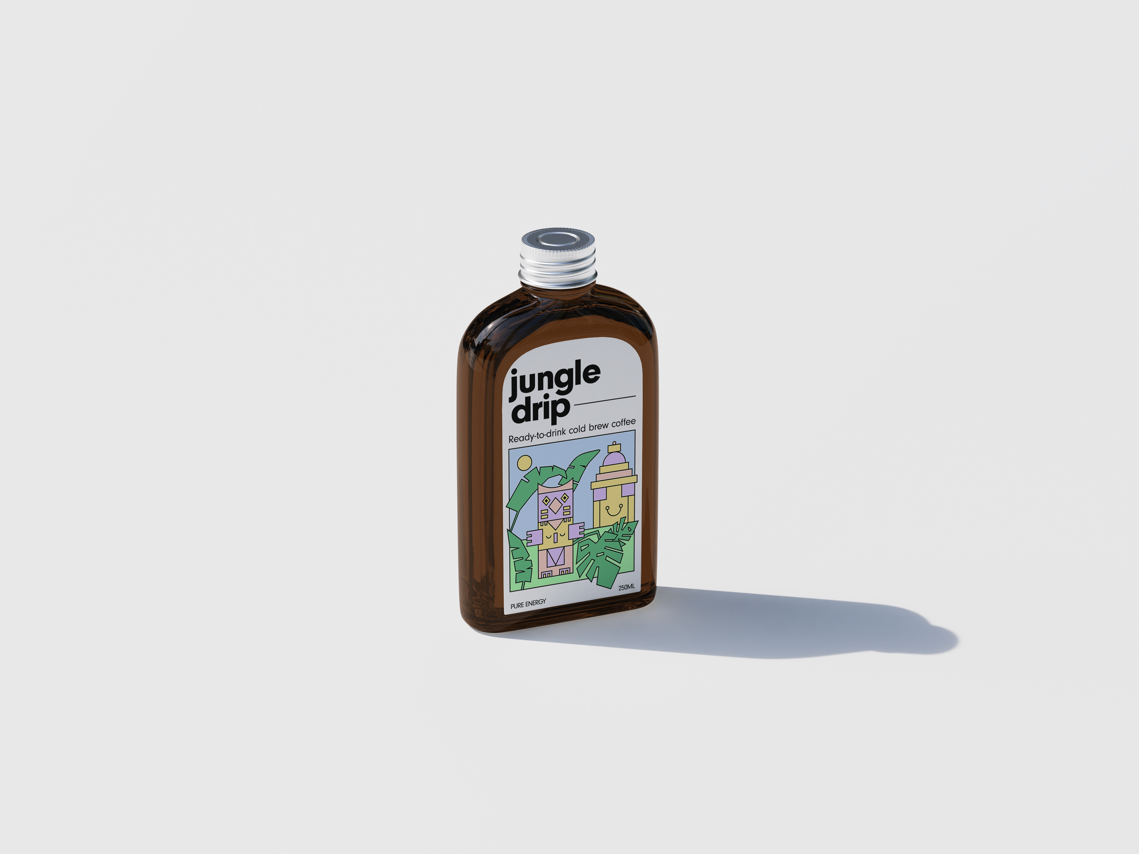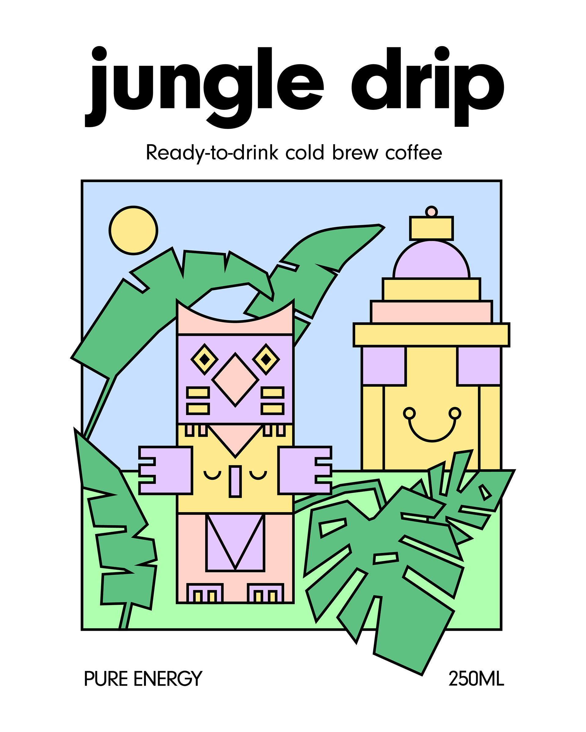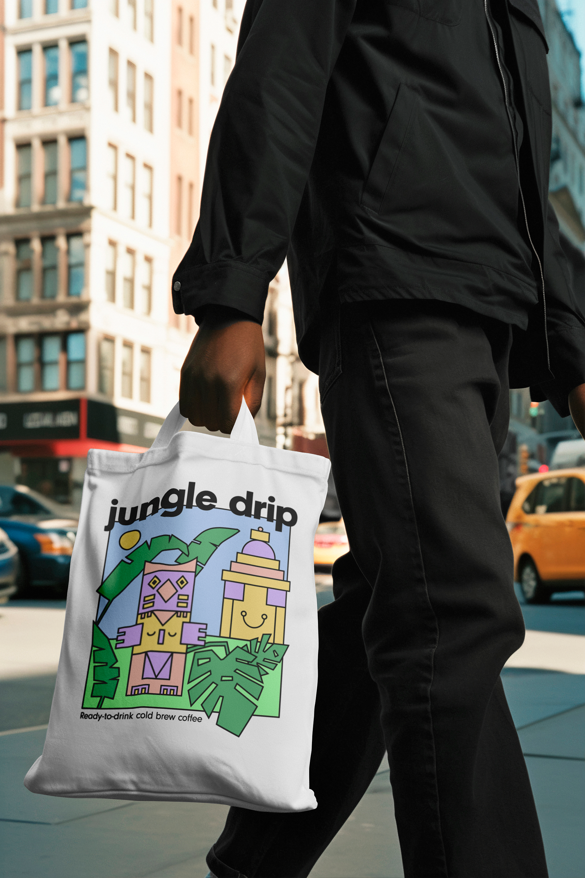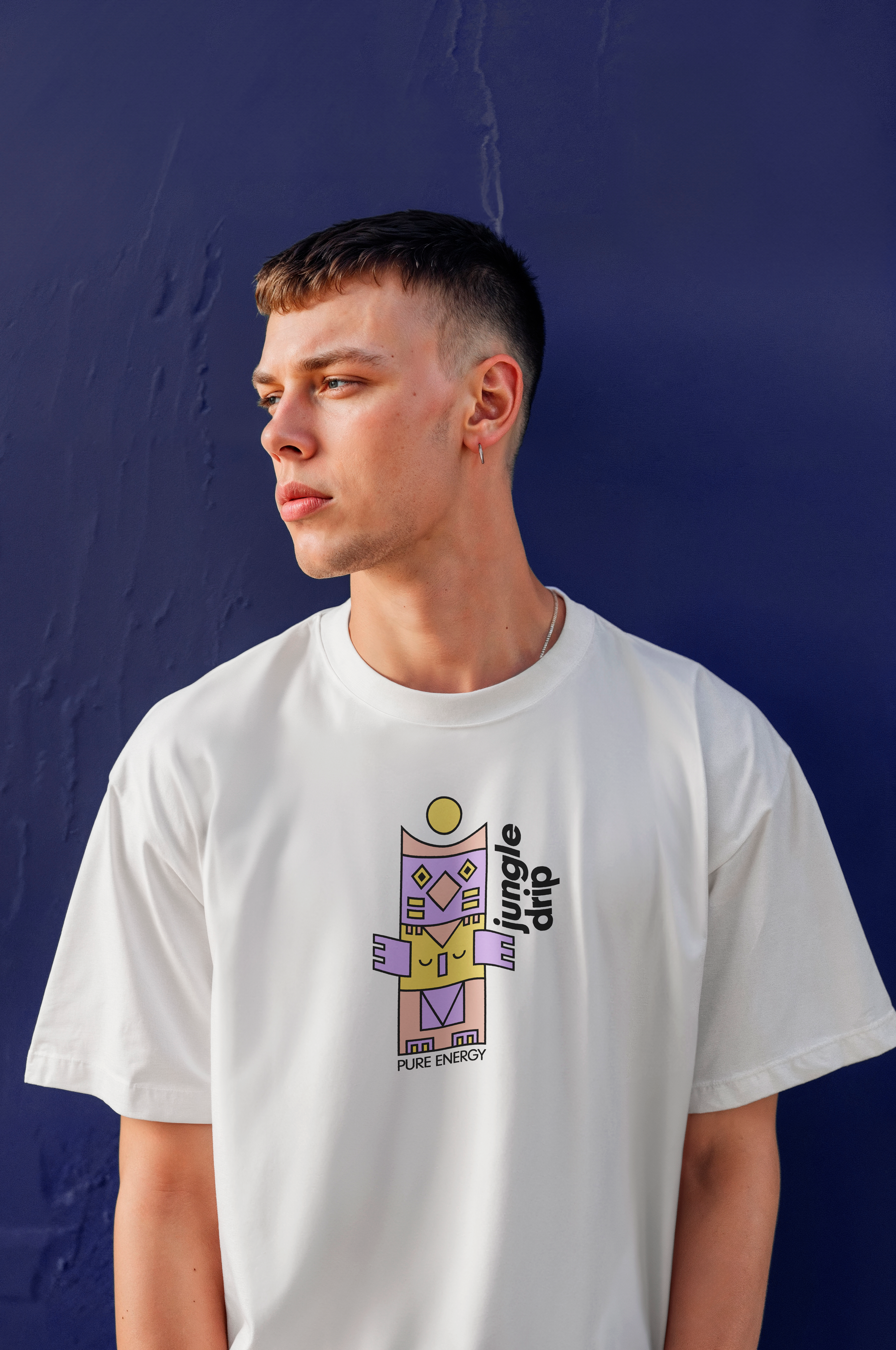
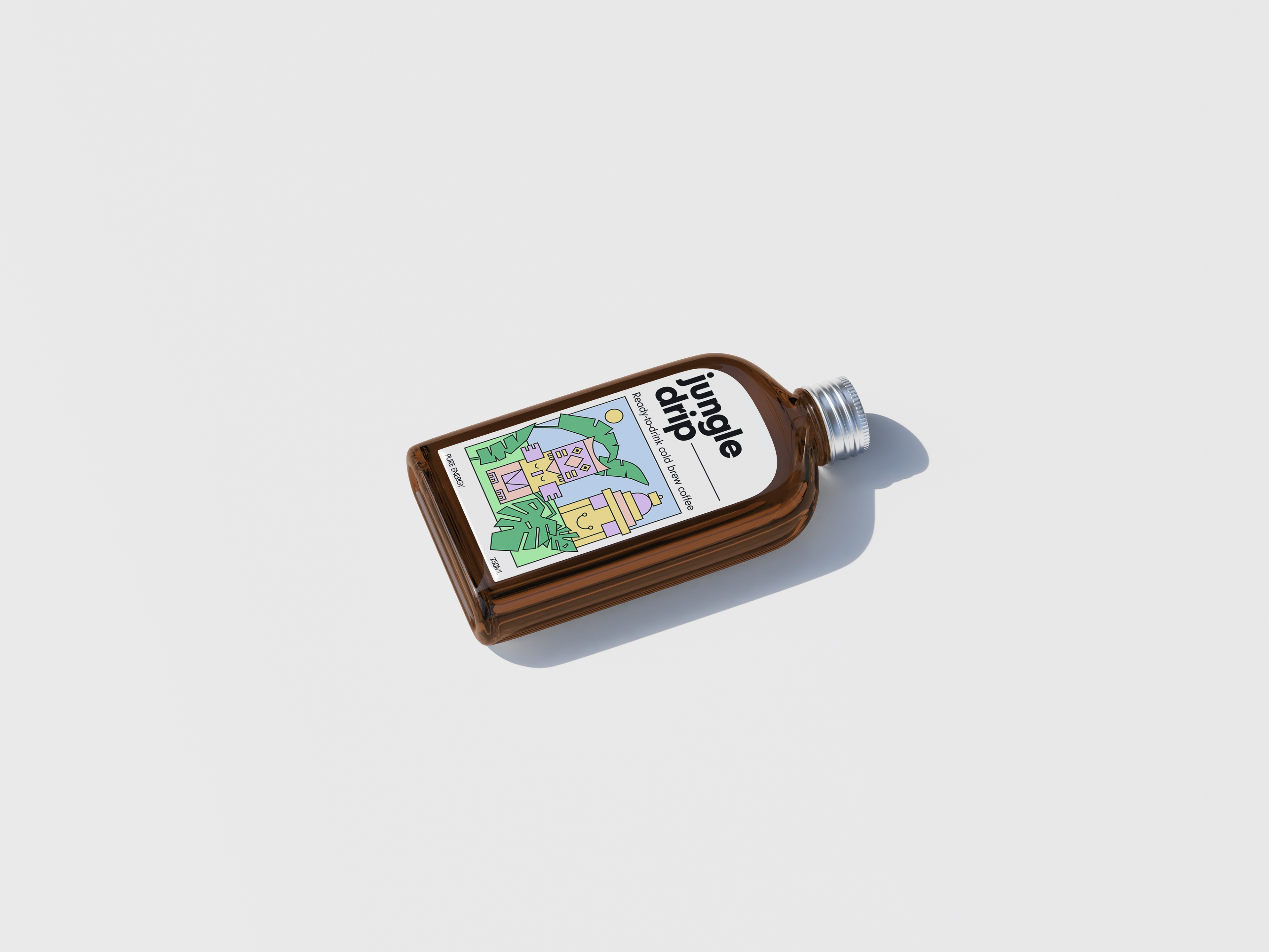
The custom illustration is definitely the hero here and at its heart is that distinctive totem-like figure. I opted for a bold, geometric style with clean lines and distinct shapes. This approach allowed to create a visually rich image that still feels uncluttered and modern.
The color palette was carefully chosen to evoke the jungle theme without being overly literal or busy. The soft blue, playful purple, sunny yellow, and green work together to create a fresh, inviting, and slightly whimsical vibe. It hints at exotic origins and the natural energy the cold brew provides.
For the typography, a strong, clean font was used for "Jungle Drip" that’s highly legible and has a friendly yet confident presence. The supporting text like "Ready-to-drink cold brew coffee" is kept concise and clear, ensuring that the product's essence is immediately understood.
For the typography, a strong, clean font was used for "Jungle Drip" that’s highly legible and has a friendly yet confident presence. The supporting text like "Ready-to-drink cold brew coffee" is kept concise and clear, ensuring that the product's essence is immediately understood.