Client: Pappus House Kea
Concept: The core concept revolves around blending nostalgic retro aesthetics with the charm of island life. The designs aim to evoke feelings of relaxation, enjoyment, and a laid-back summer lifestyle, encapsulated by the phrases "Drink More, Worry Less".
Design Elements & Rationale:
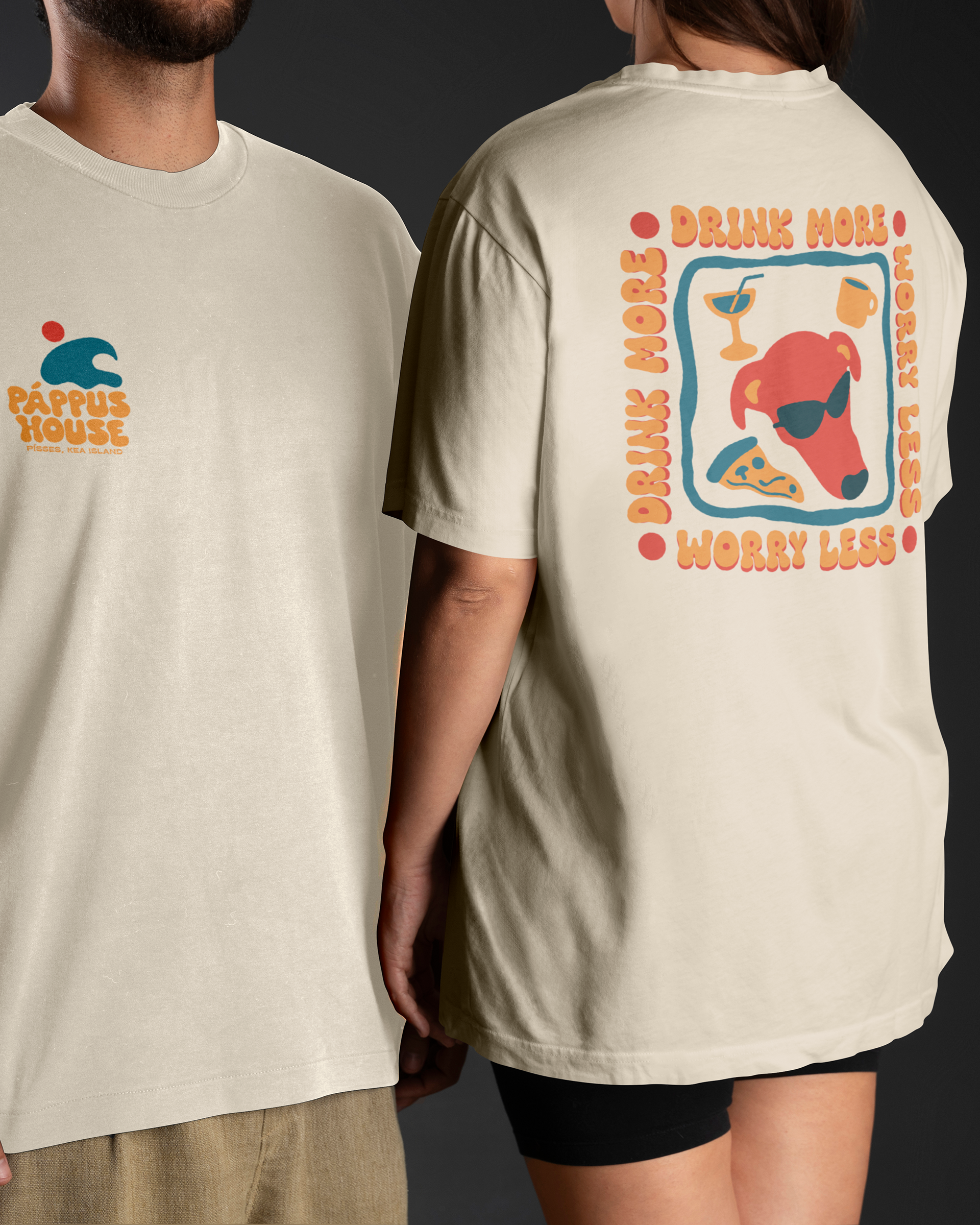
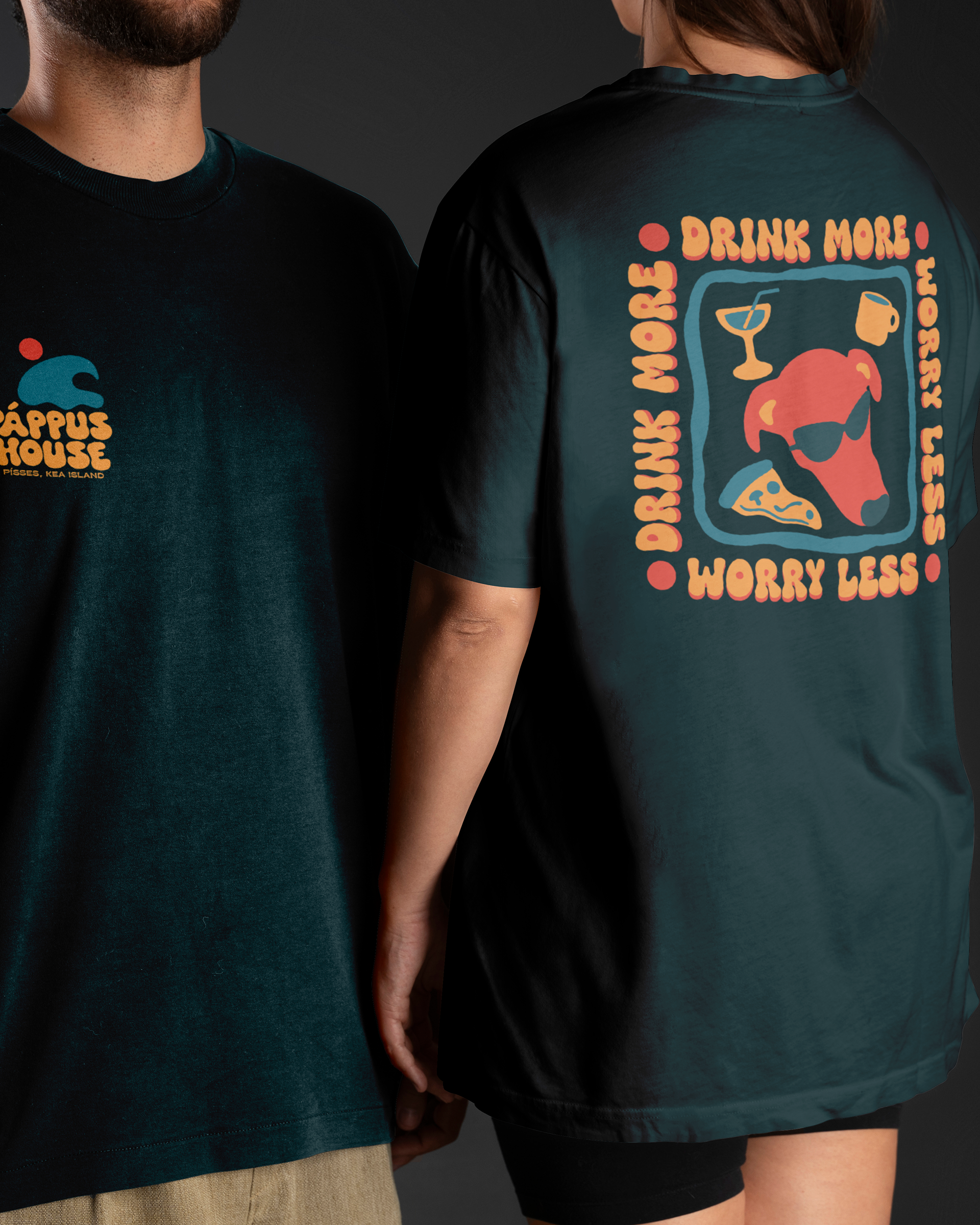
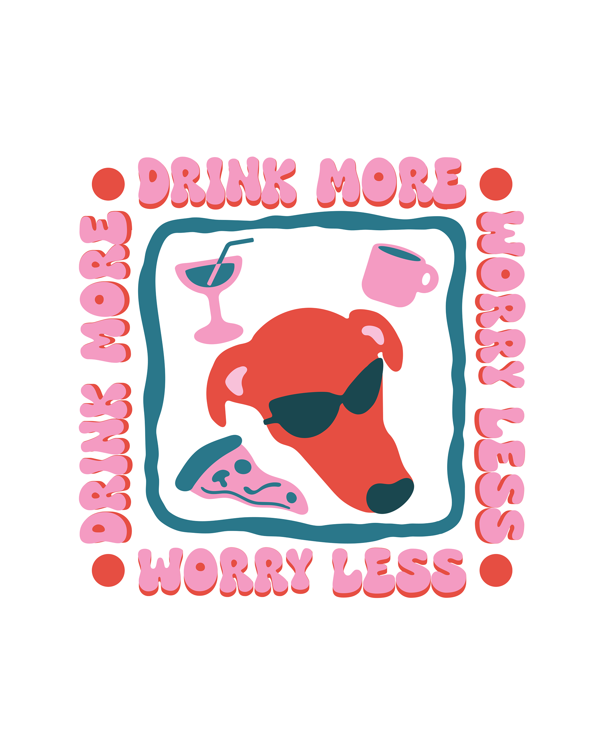
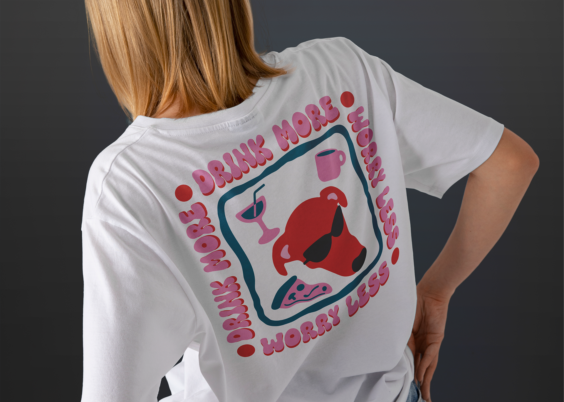
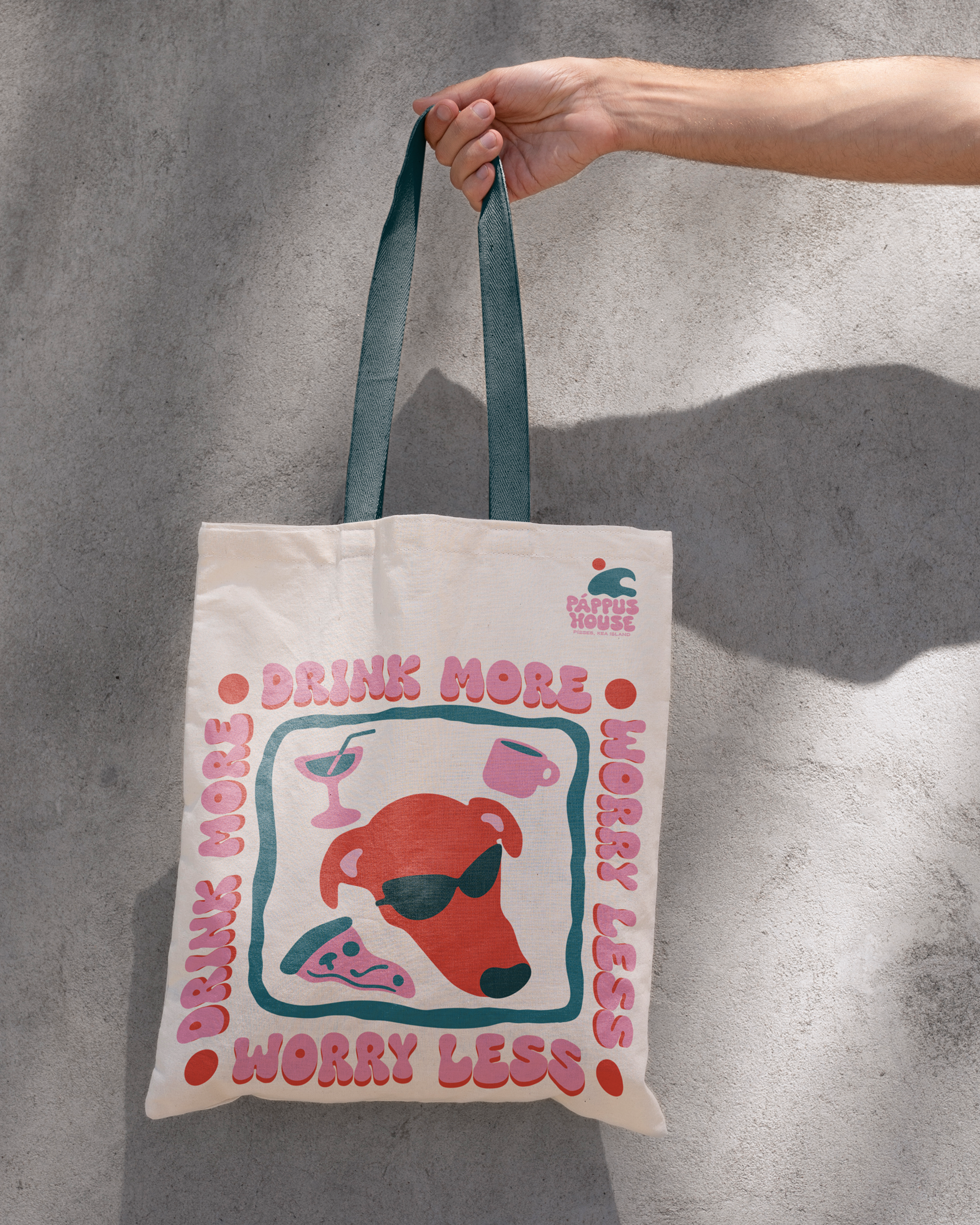
1. "Drink More, Worry Less" Graphic:
Visuals: This central graphic features a stylized red dog (It's inspired by the owner's dog, usually hanging out at the bar) wearing cool sunglasses, a cocktail glass, coffee and a slice of pizza, all enclosed within a playful, squiggly border.
Color Palette: The use of vibrant and somewhat muted retro colors (red, teal, pink, orange, light blue) creates a nostalgic and cheerful feel.
Typography: The curvy, bubbly font used for "Drink More" and "Worry Less" further enhances the retro aesthetic and contributes to the lighthearted mood.
Symbolism:
- Dog with Sunglasses: Represents a cool, carefree, and fun-loving attitude.
- Cocktail Glass and coffee: Signifie enjoyment, relaxation, and perhaps the availability of refreshing beverages at Pappus House.
- Pizza Slice: Highlights the "good food" aspect, suggesting casual and enjoyable dining.
- Overall Message: The phrase "Drink More, Worry Less" perfectly encapsulates the desired vacation mindset and the easygoing atmosphere of Kea Island.
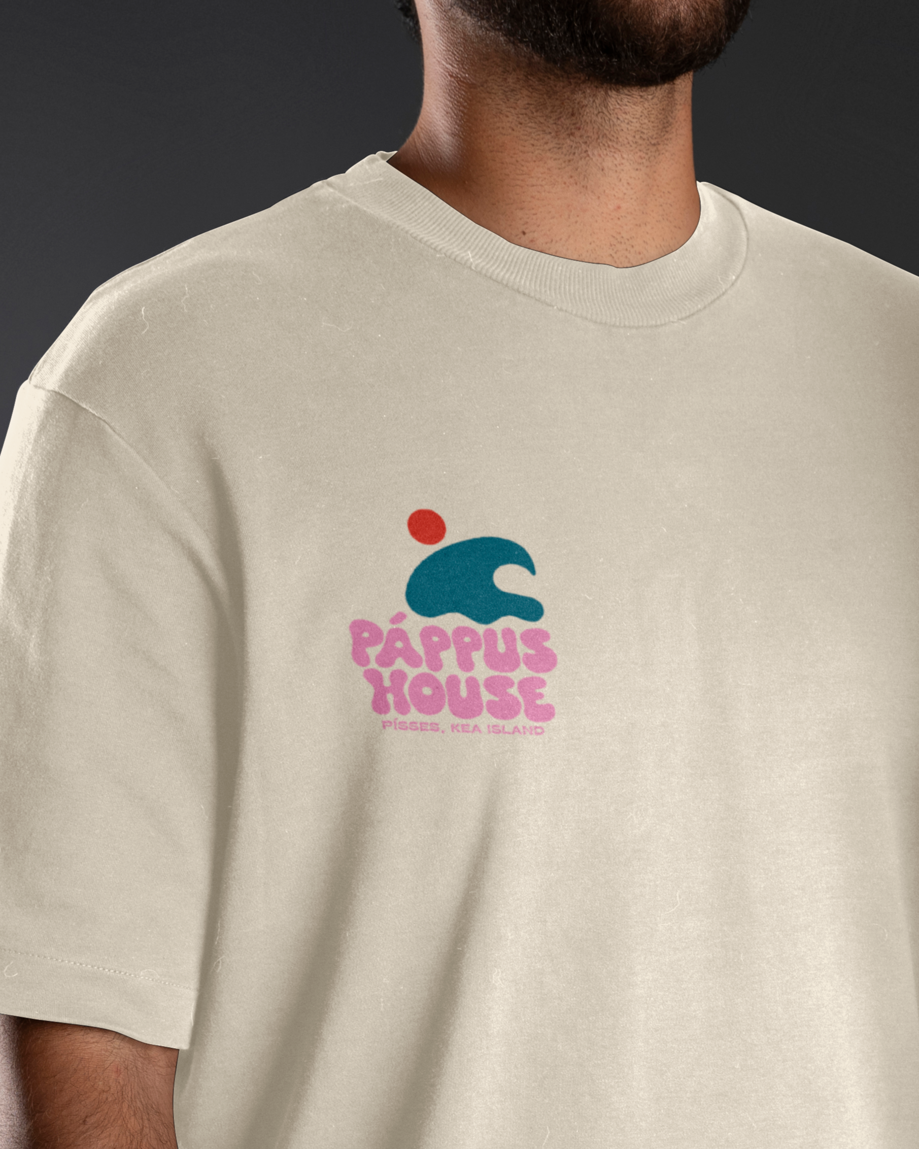
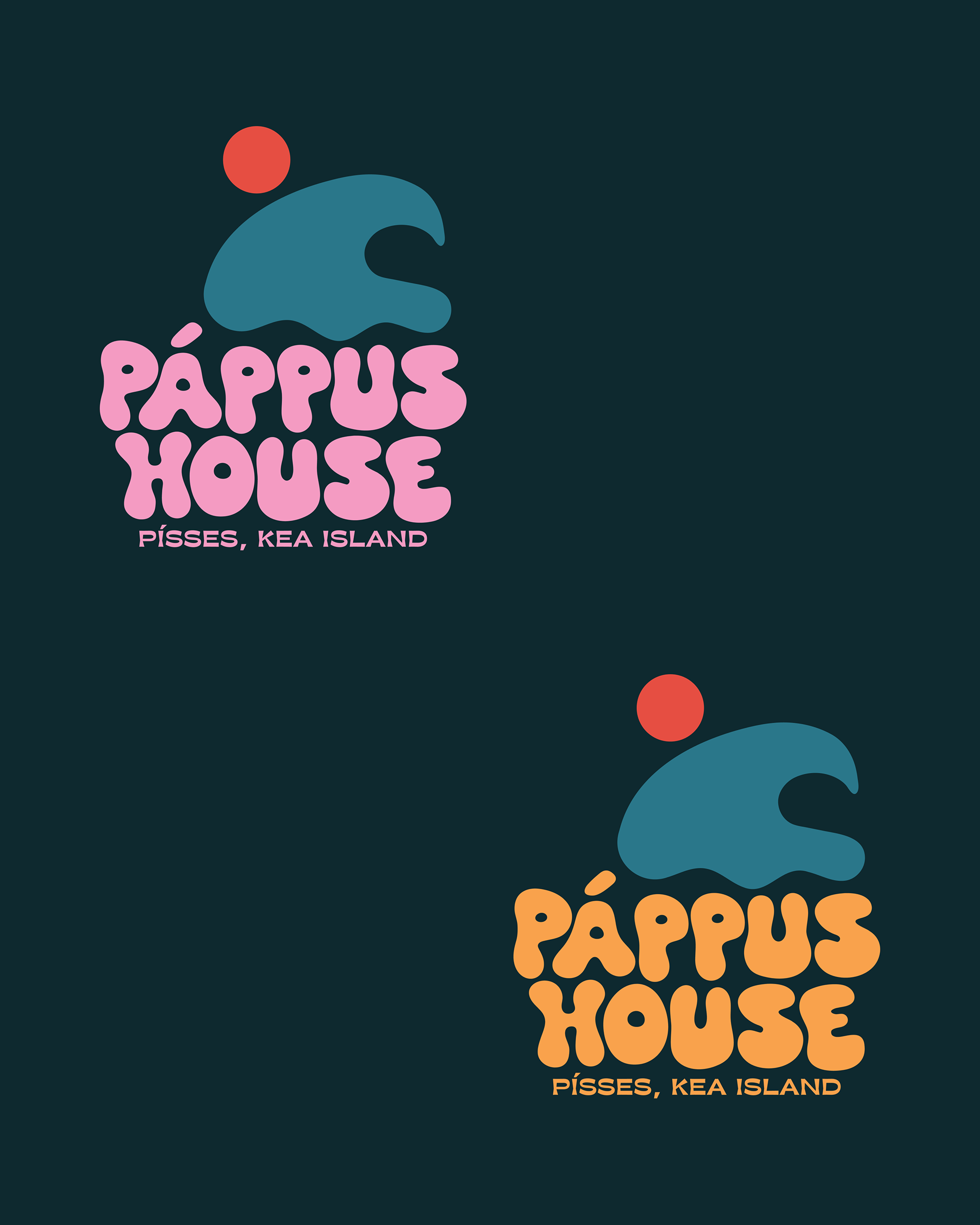
2. Pappus House Logo Merch Edition:
Design: The logo created specifically for the merch designs, features a stylized wave-like shape with circle above it symbolizing the sun.
Symbolism:
- Wave: Represents the island and its coastal environment.
- Red Circle (Sun): Evokes the warmth of summer and sunny days.
- Playful Font: Aligns with the overall fun and relaxed brand identity.