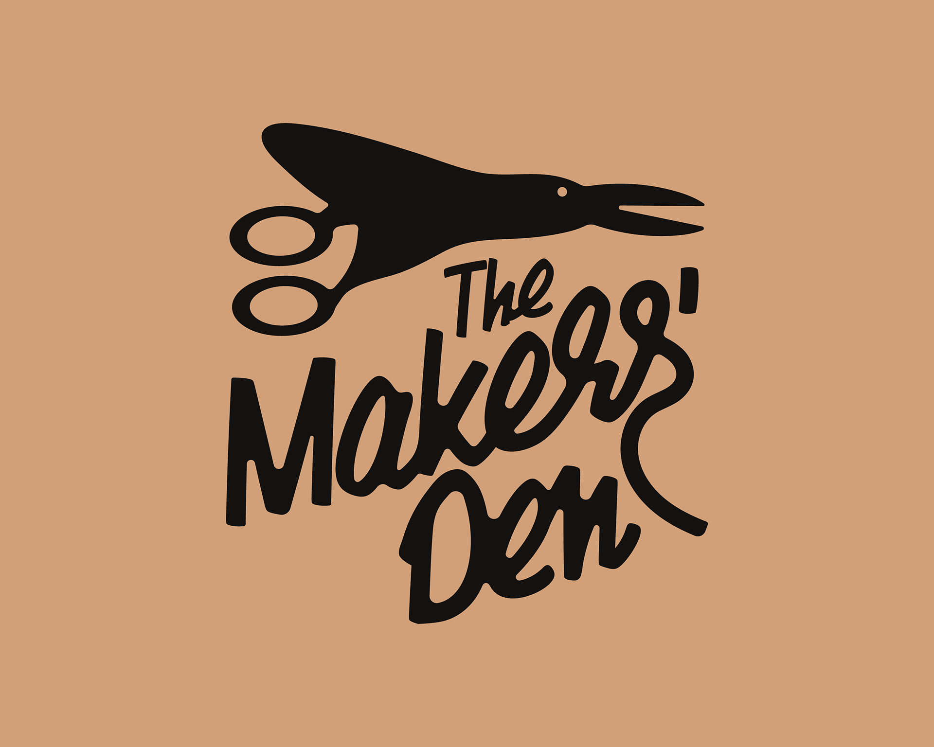
Project overview
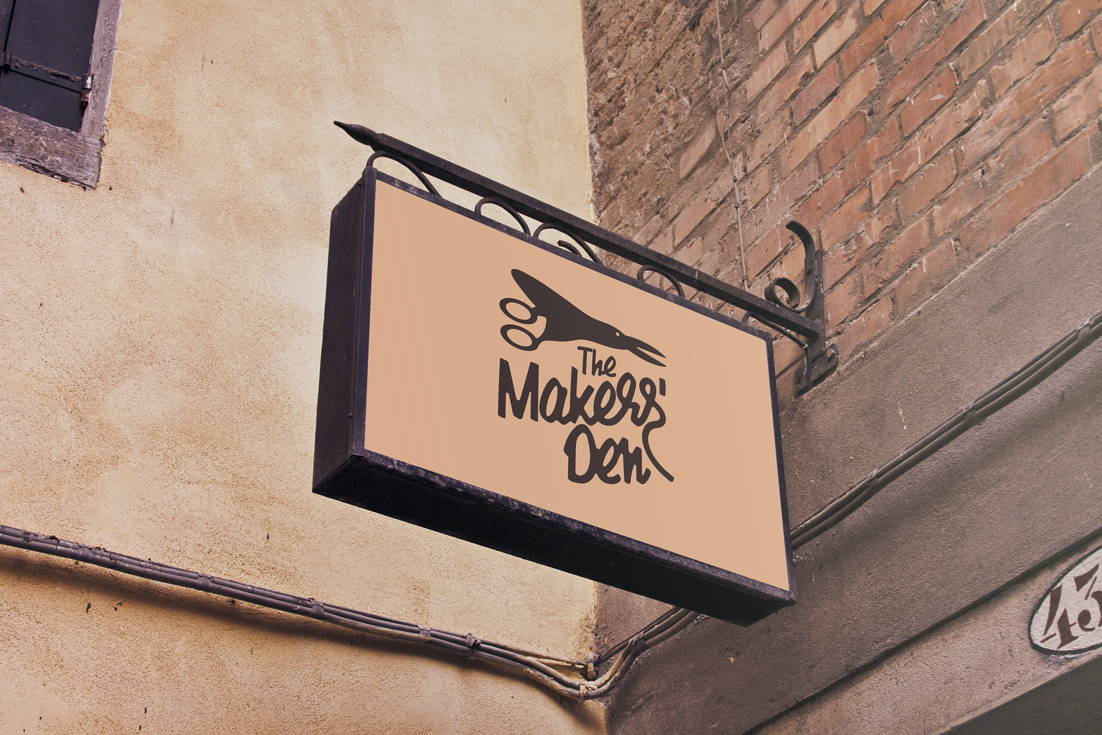
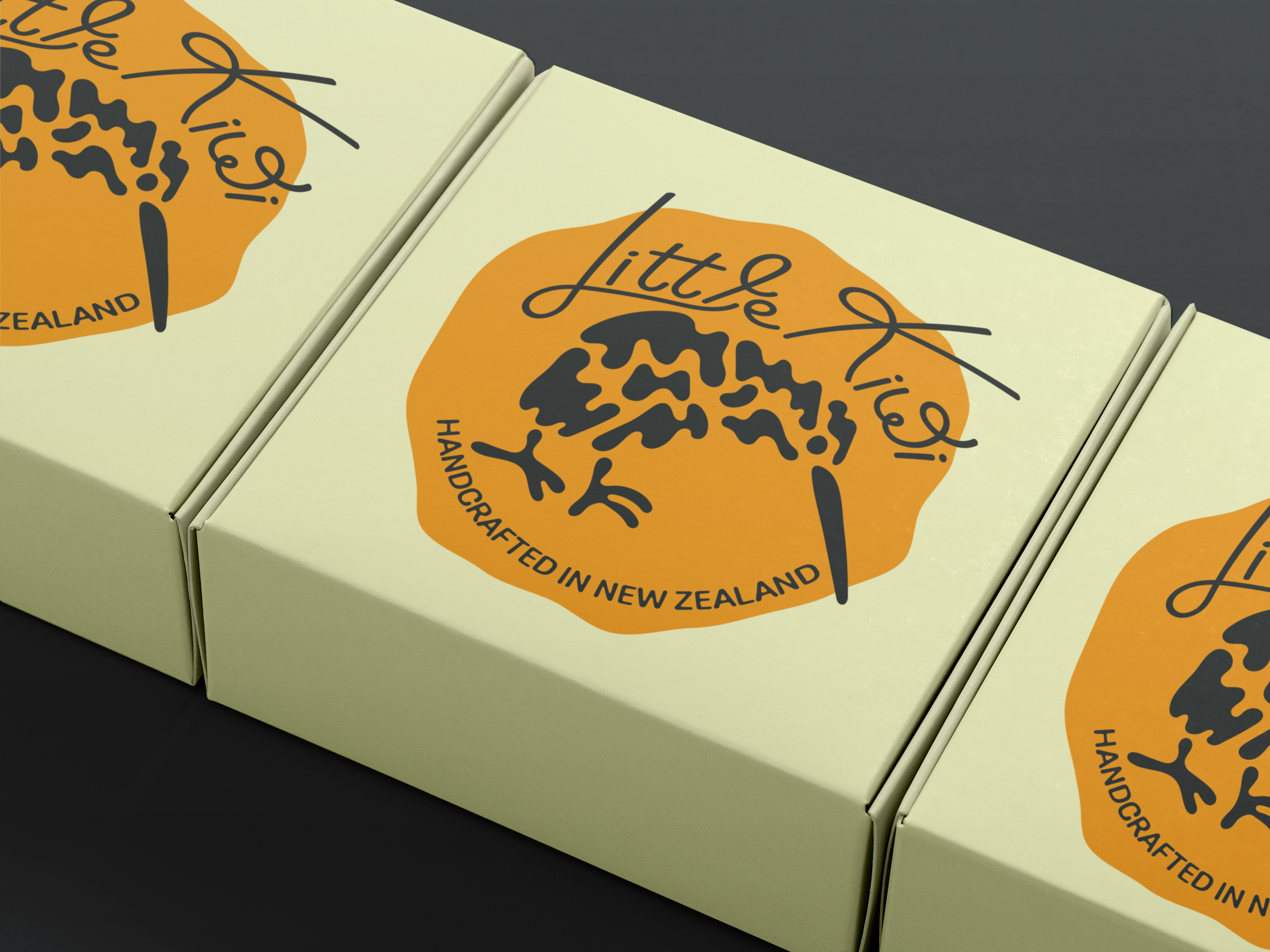
The Makers' Den is a lively place where people can learn crafts and buy supplies. It's a friendly spot for everyone, no matter their skill level. They sell craft materials, DIY kits, and teach workshops. My client wanted a brand new look that felt old-fashioned and cozy, but also fresh and modern. The main goal was a logo that felt timeless and new, showing the warmth of handmade things and the joy of creating.
The biggest challenge was to combine two different styles: the warm, charming feel of retro design with the clean look of modern branding. I wanted to avoid common looks from either style. Instead, I aimed for a special mix that would help them stand out. The logo needed to show creativity, community, and good quality, attracting both experienced crafters and new learners.

Design elements & symbolism
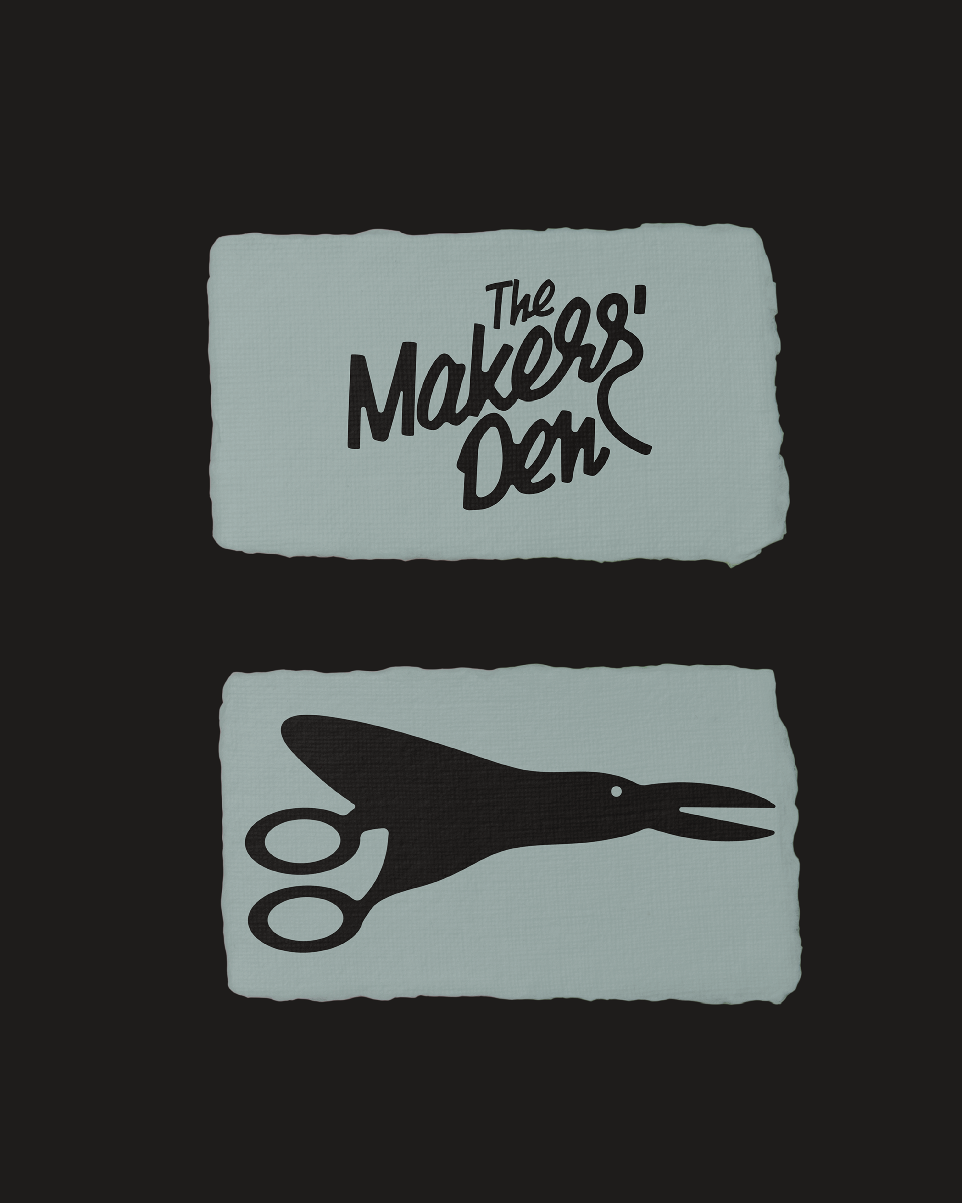
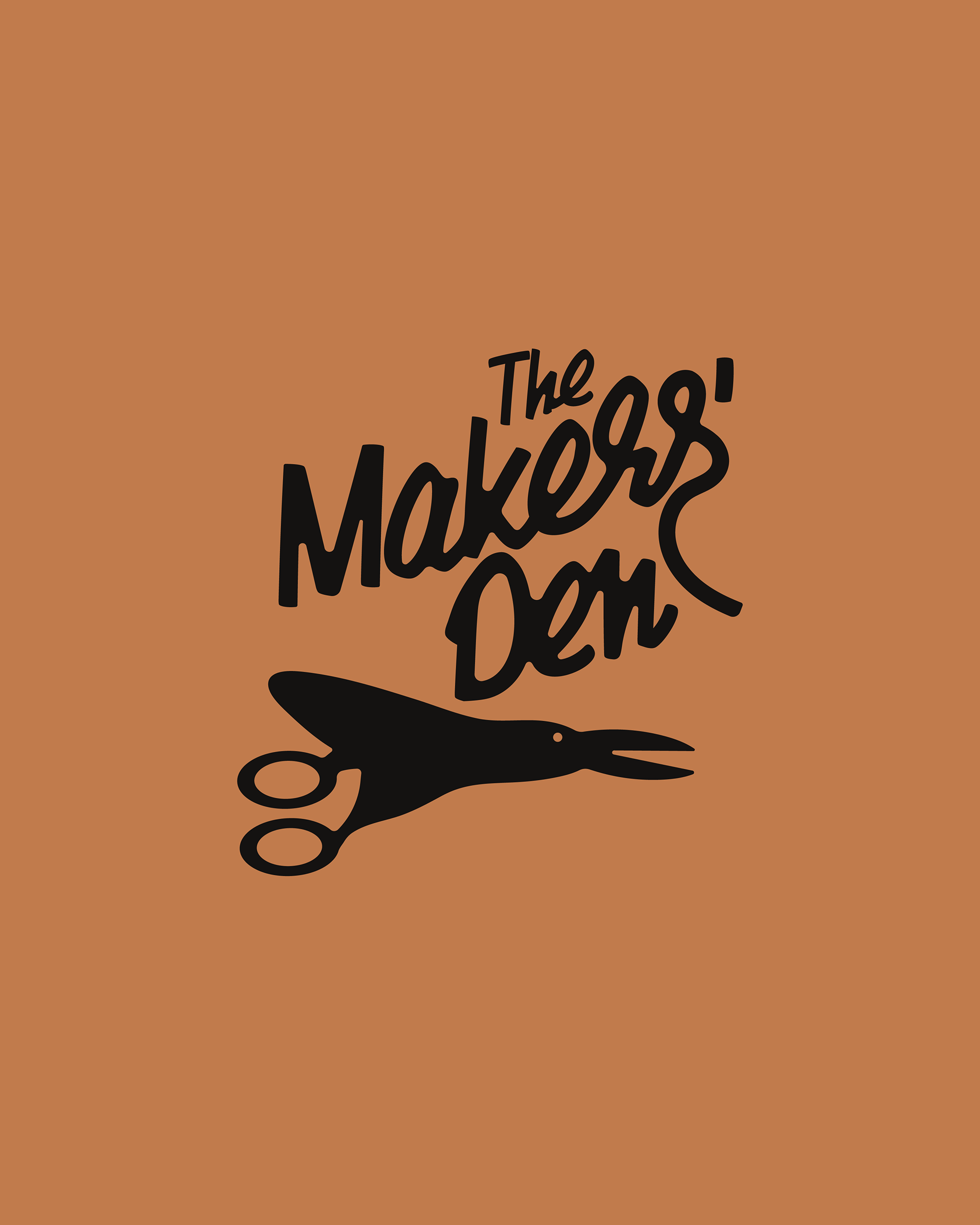
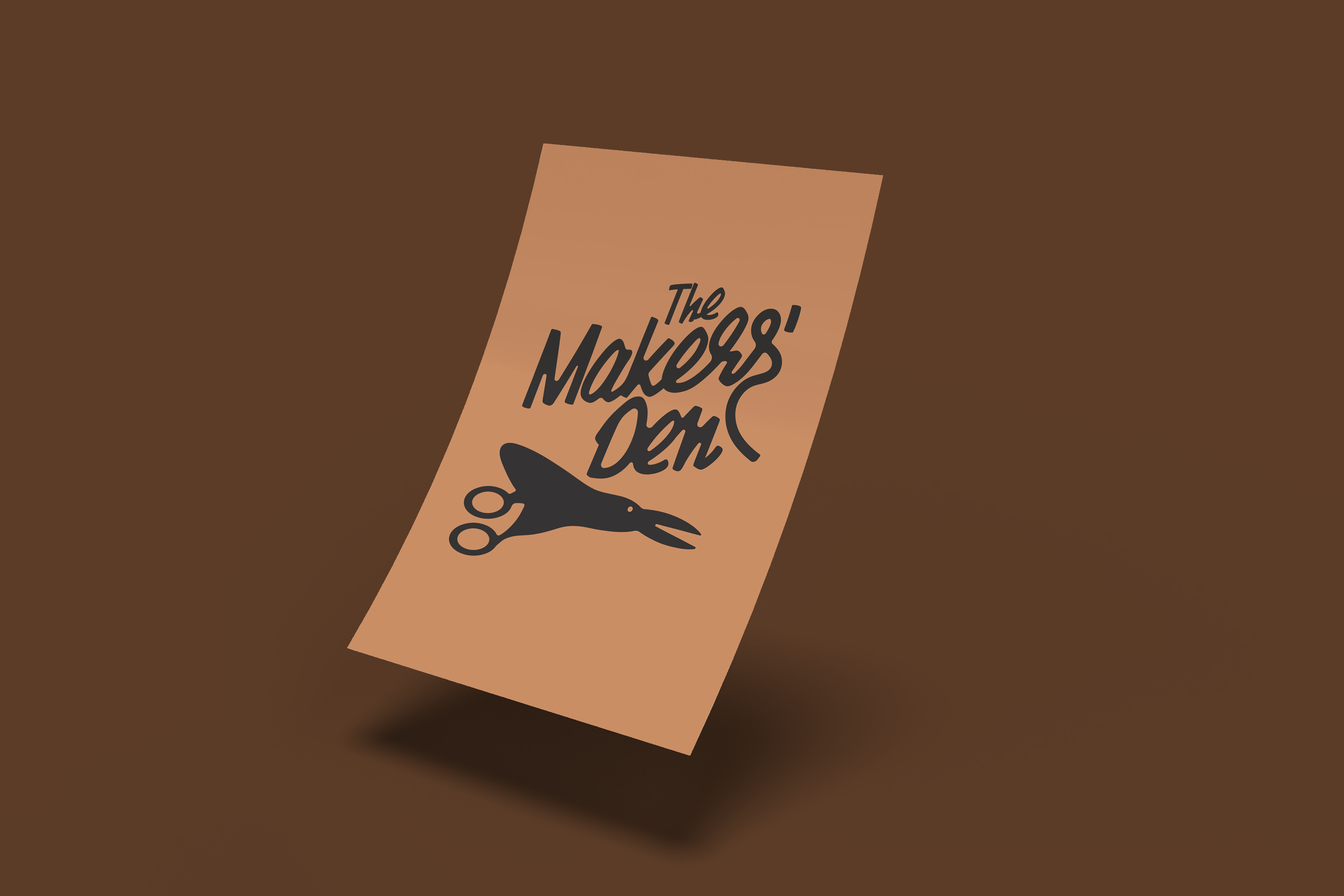
* A clever hint of craftsmanship and a welcoming "den": Through the unique icon that merges a pair of scissors with a bird.
* A feeling of community and warmth: Through the hand drawn, inviting style of the wordmark.
* Retro style: Achieved with the specific font choice and a carefully picked color palette.
* Modern clarity: Making sure the logo was clean, easy to use at different sizes, and flexible.
Making a lasting impression
The Makers' Den brand identity successfully mixes the cozy charm of retro design with the clean look of modern style. The finished logo is a visual promise of creativity, community, and quality. It shows The Makers' Den as a welcoming place where old school crafts meet new ideas, inviting everyone to find the joy of making.