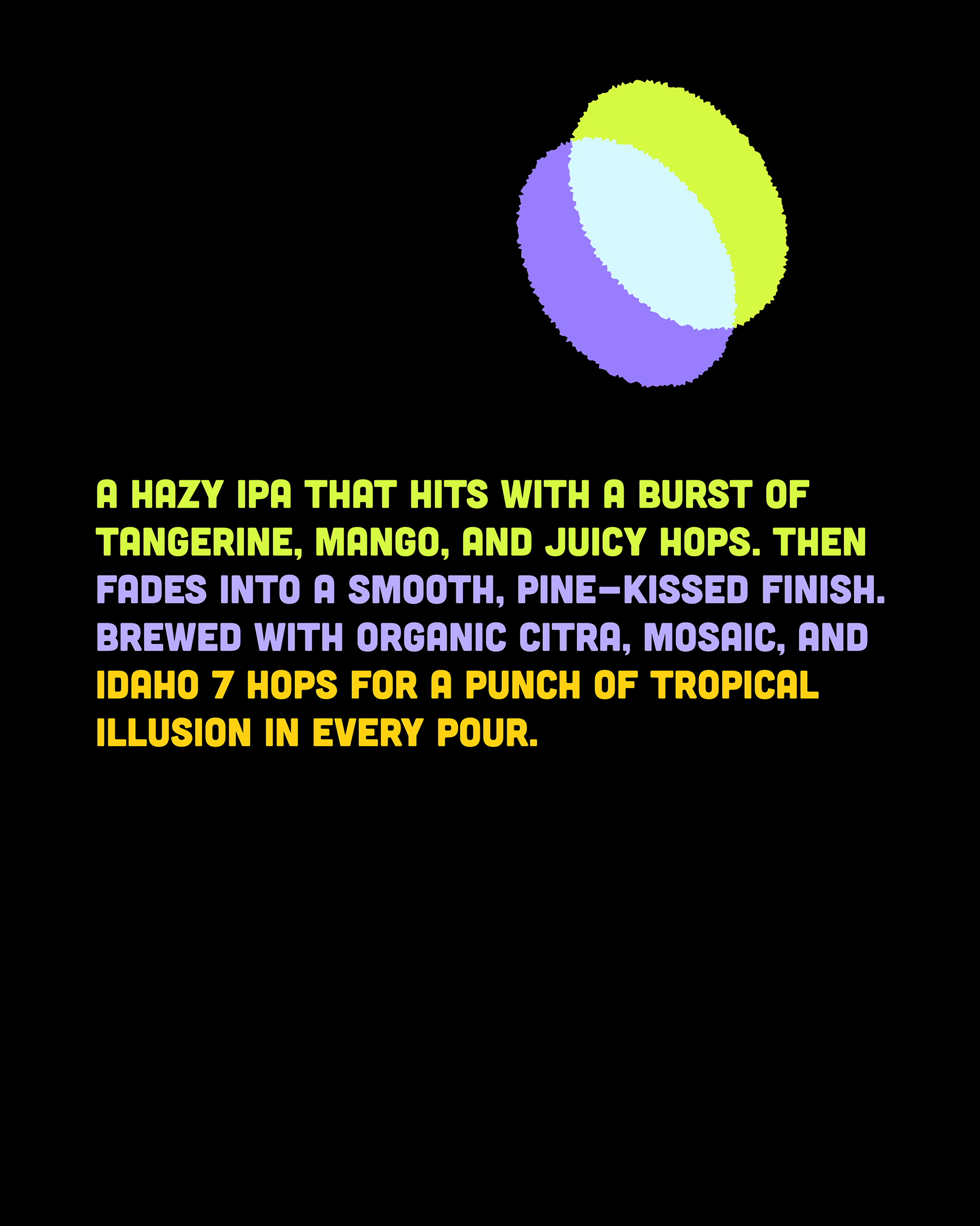
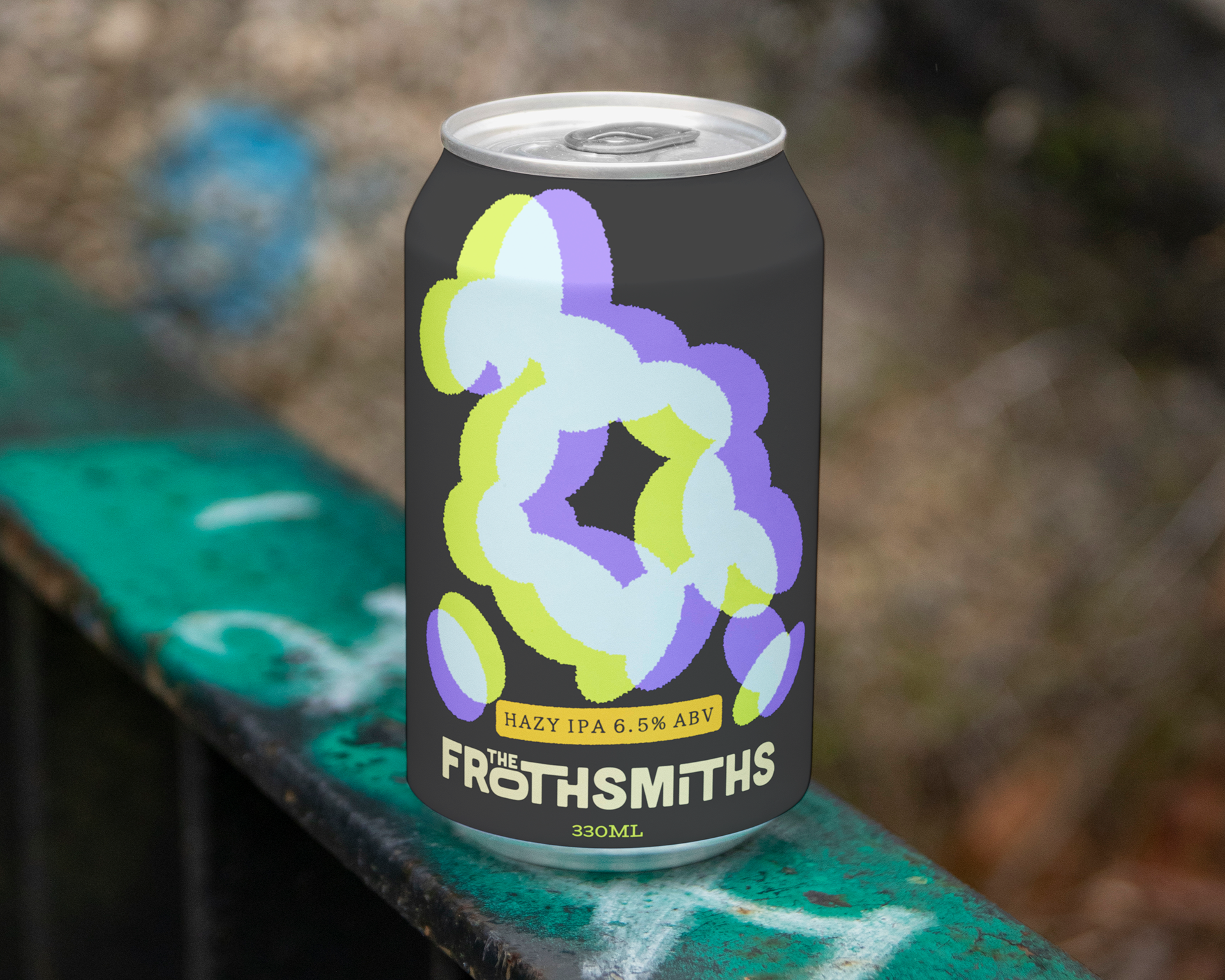
Packaging design for "The Frothsmiths" Hazy IPA, a craft beer aiming to stand out in a vibrant and competitive market. The goal was to create a design that visually communicates the beer's unique flavor profile: a tropical, juicy, and hazy experience, while establishing a bold and memorable brand identity.

My approach focused on creating a design that is as dynamic and flavorful as the Hazy IPA itself. I developed a visual language centered around abstract, organic forms and a vibrant, contrasting color palette. This design aims to evoke the "tropical illusion" mentioned in the beer's description, offering a visual burst that mirrors the taste experience.
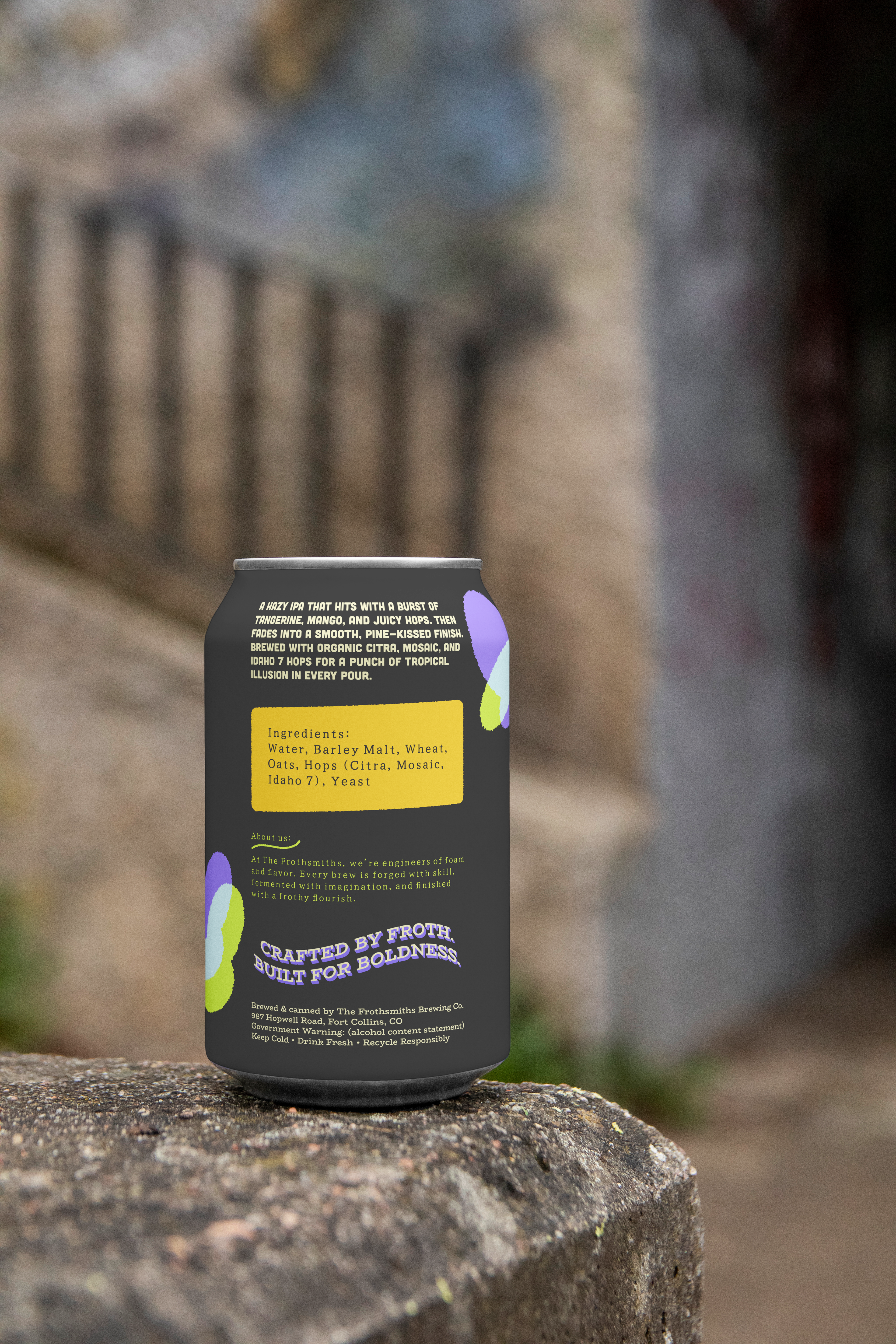
The core of the design is a series of interconnected, fluid shapes in neon green, light blue, and purple. These abstract elements are inspired by the hazy nature of the IPA and the juicy, tropical hop notes (Citra, Mosaic, Idaho 7). They create a sense of movement and depth, suggesting the layers of flavor within the beer.
A bold and contemporary palette of vibrant neon green, soft light blue/white, and deep purple set against a dark, almost charcoal grey can provides high contrast and visual impact. This combination ensures shelf appeal and communicates the beer's modern, energetic character.