CLIENT: CORK
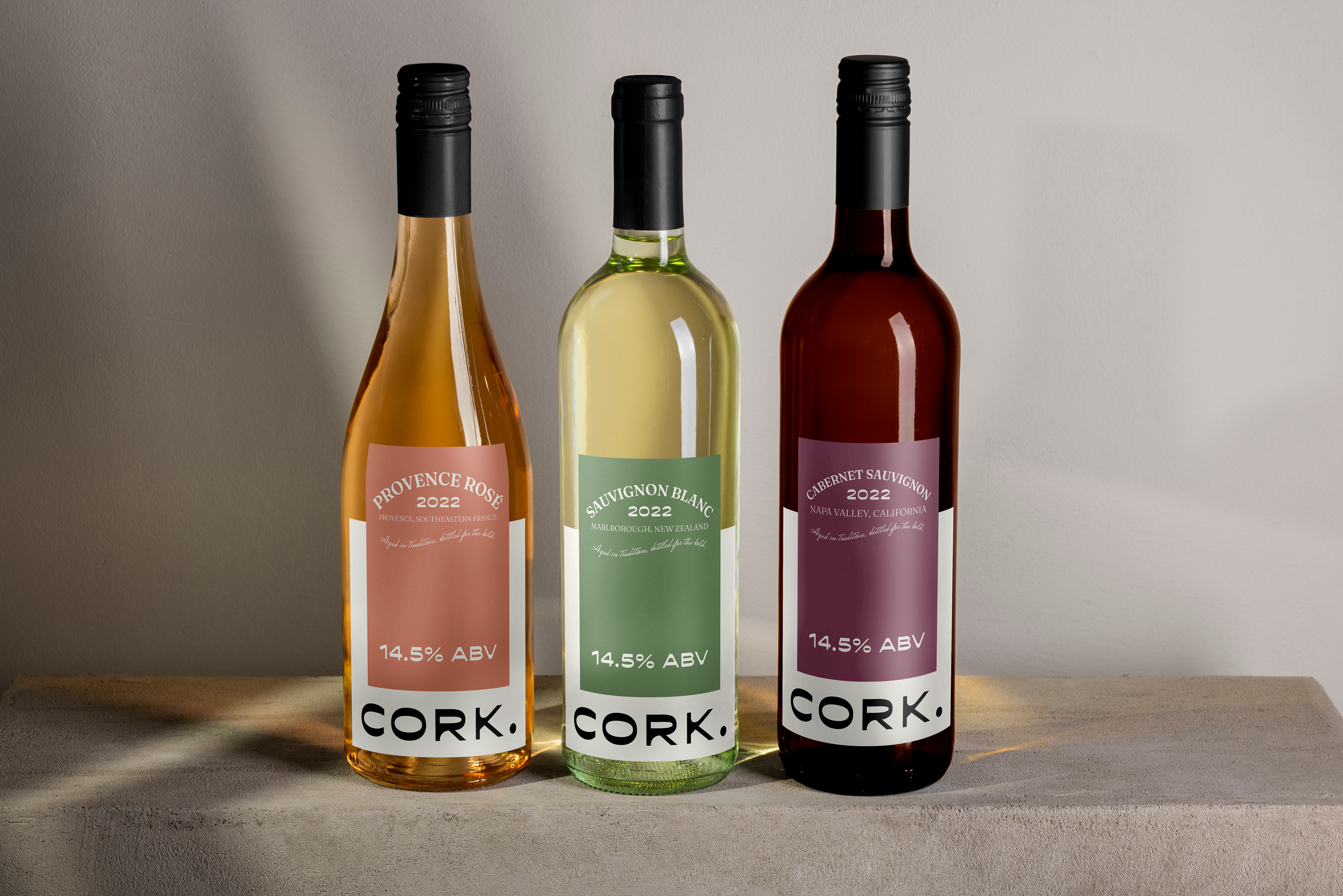
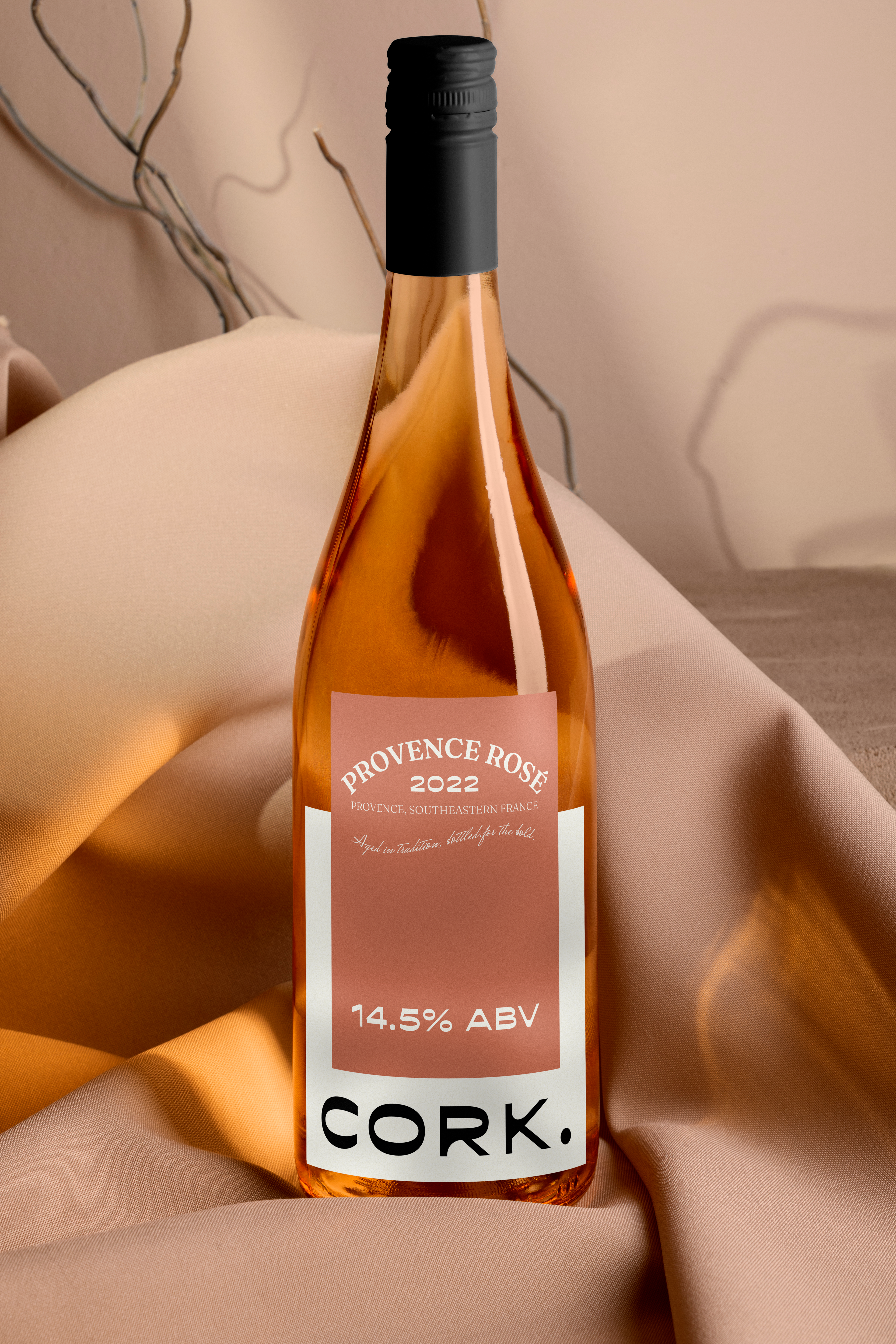
This project involved creating a fresh and elegant label design for "Cork.", a new wine brand. The goal was to develop a design that is both modern and timeless, appealing to a broad audience while reflecting the quality of the wine.
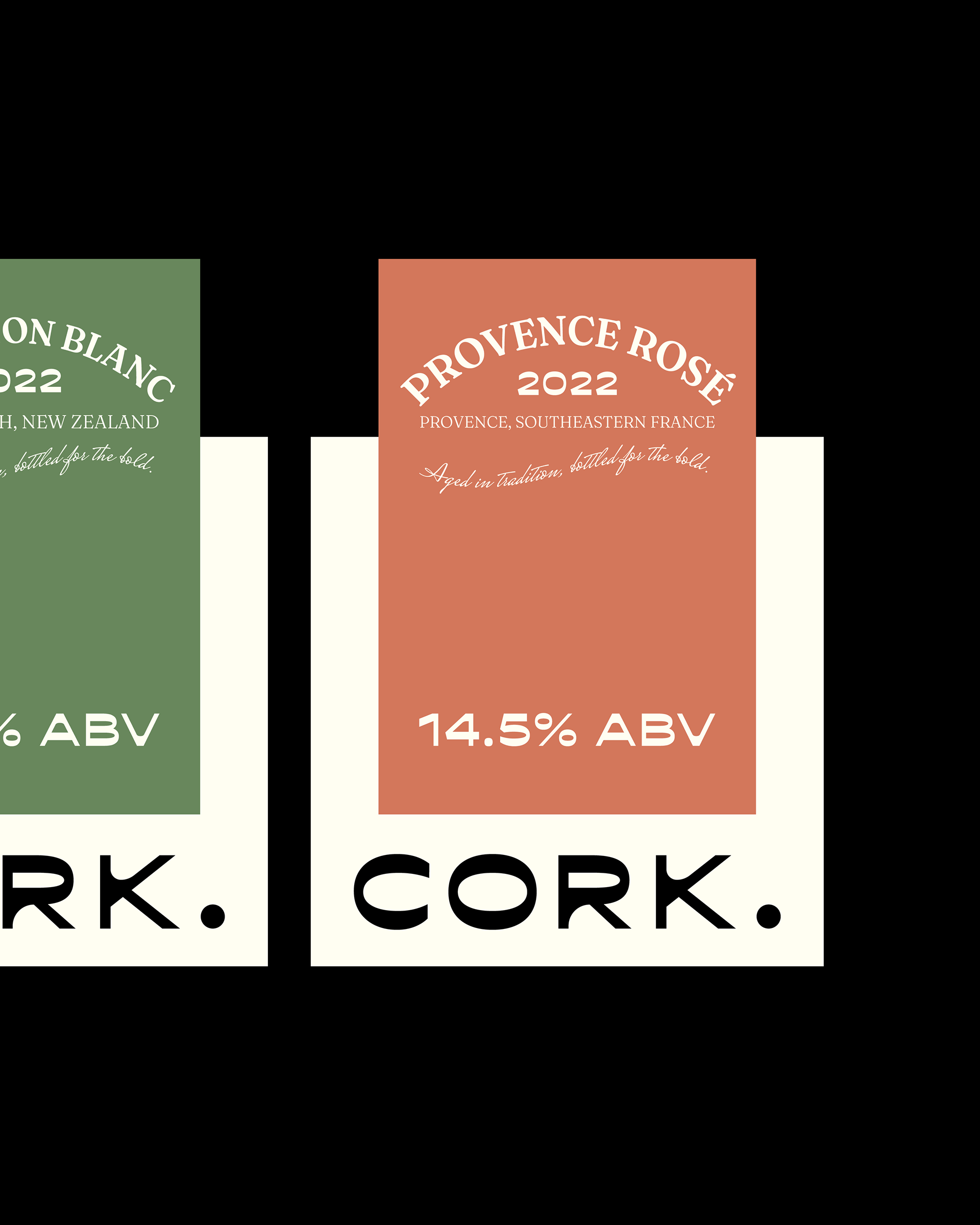
Solution
The solution focused on a minimalist yet impactful design. Key elements include:
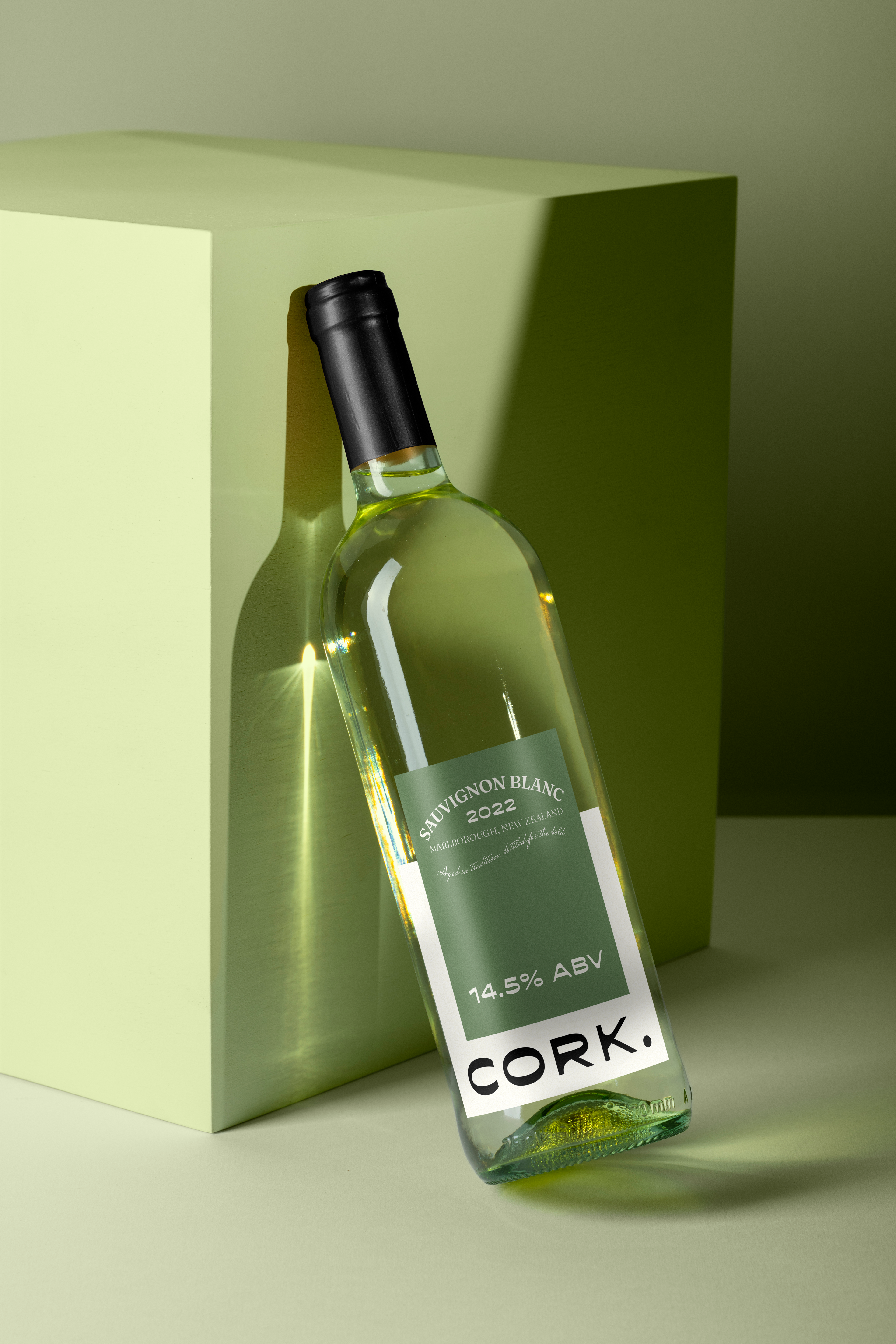
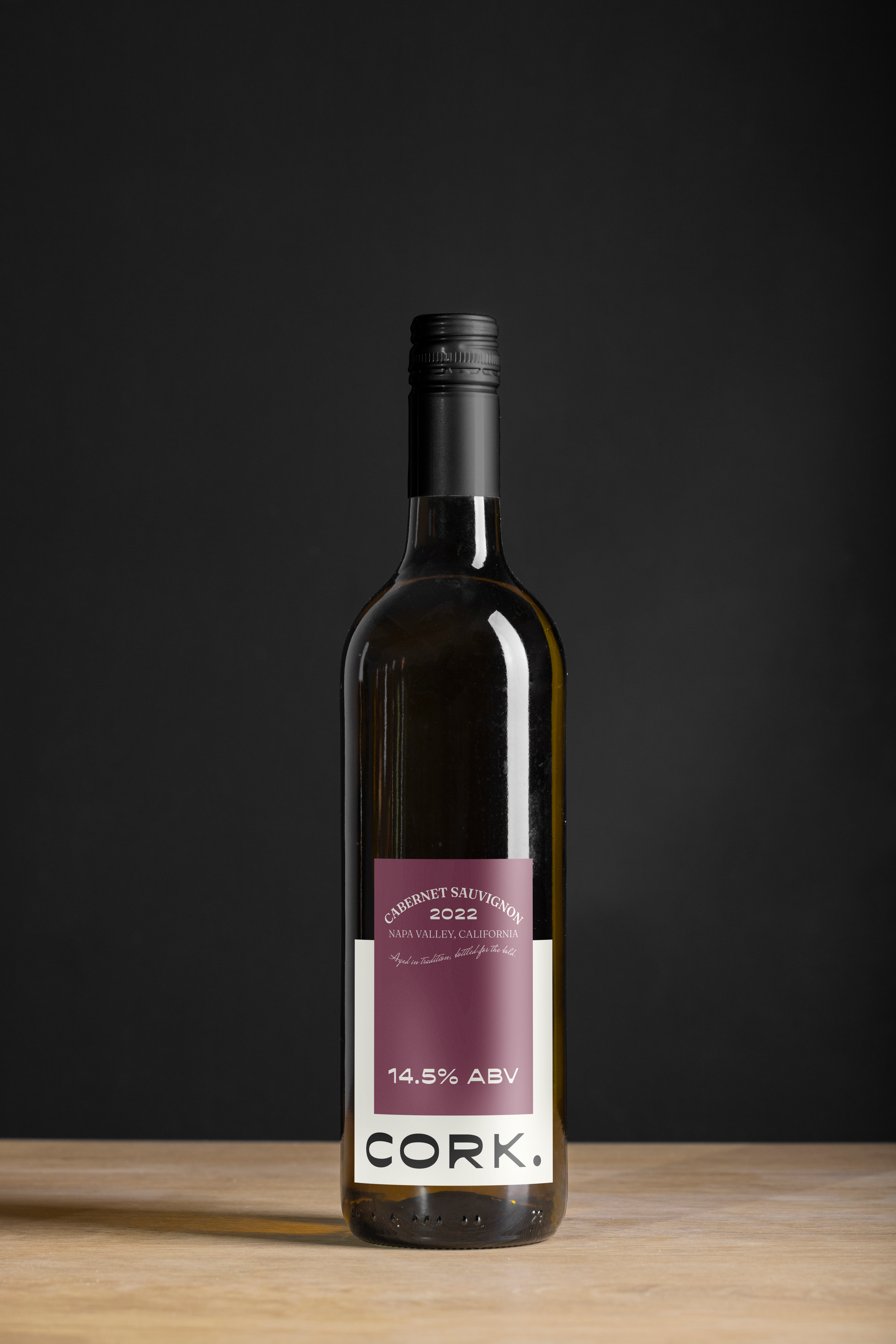
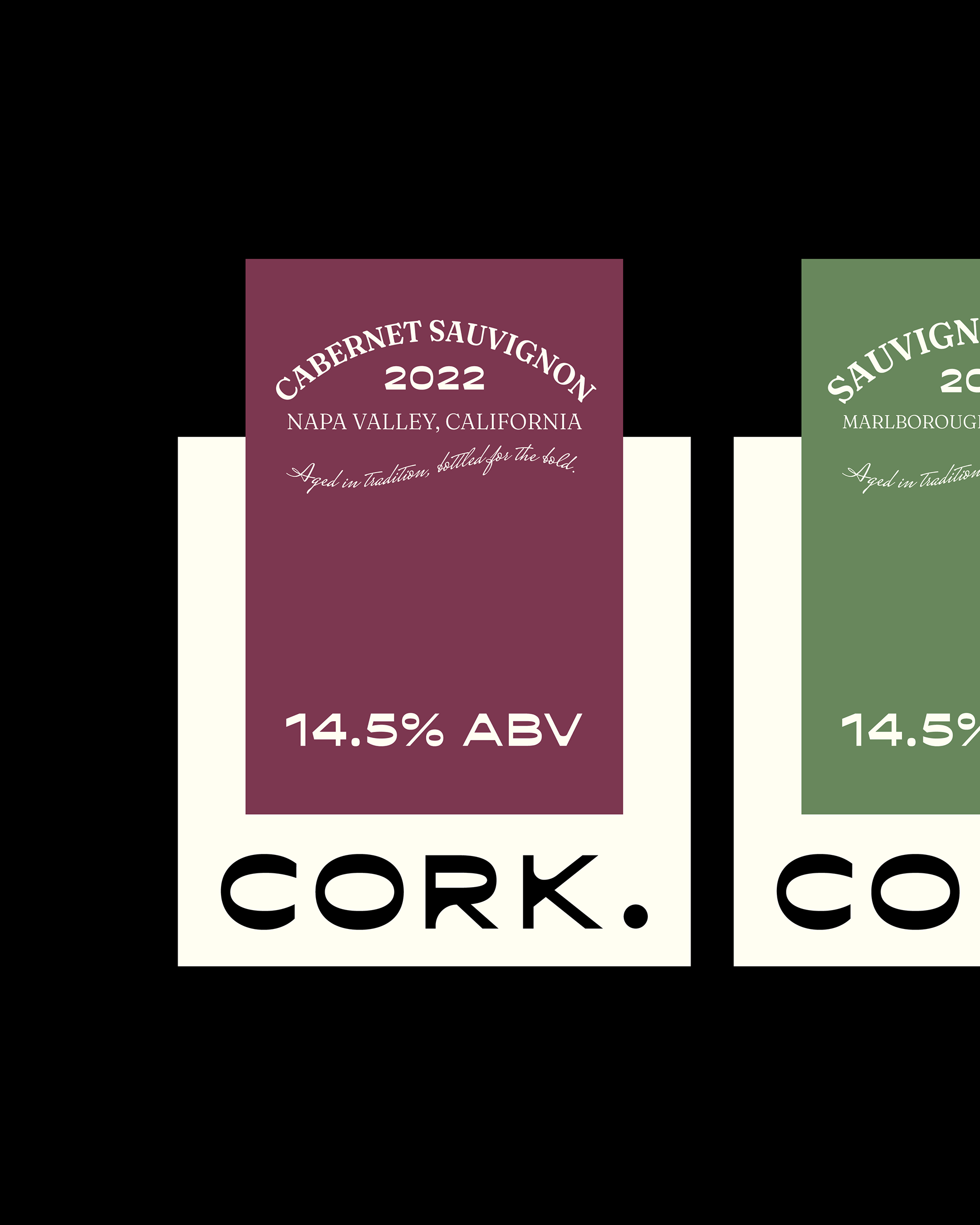
- Clean Typography: A modern customized sans-serif font for the brand name "CORK." ensures legibility and a contemporary feel.
- Elegant Color Palette: Each varietal is distinguished by a unique color block ( a soft rose for Provence Rosé, a muted green for Sauvignon Blanc, and a deep burgundy for Cabernet Sauvignon). These colors evoke the wine's character.
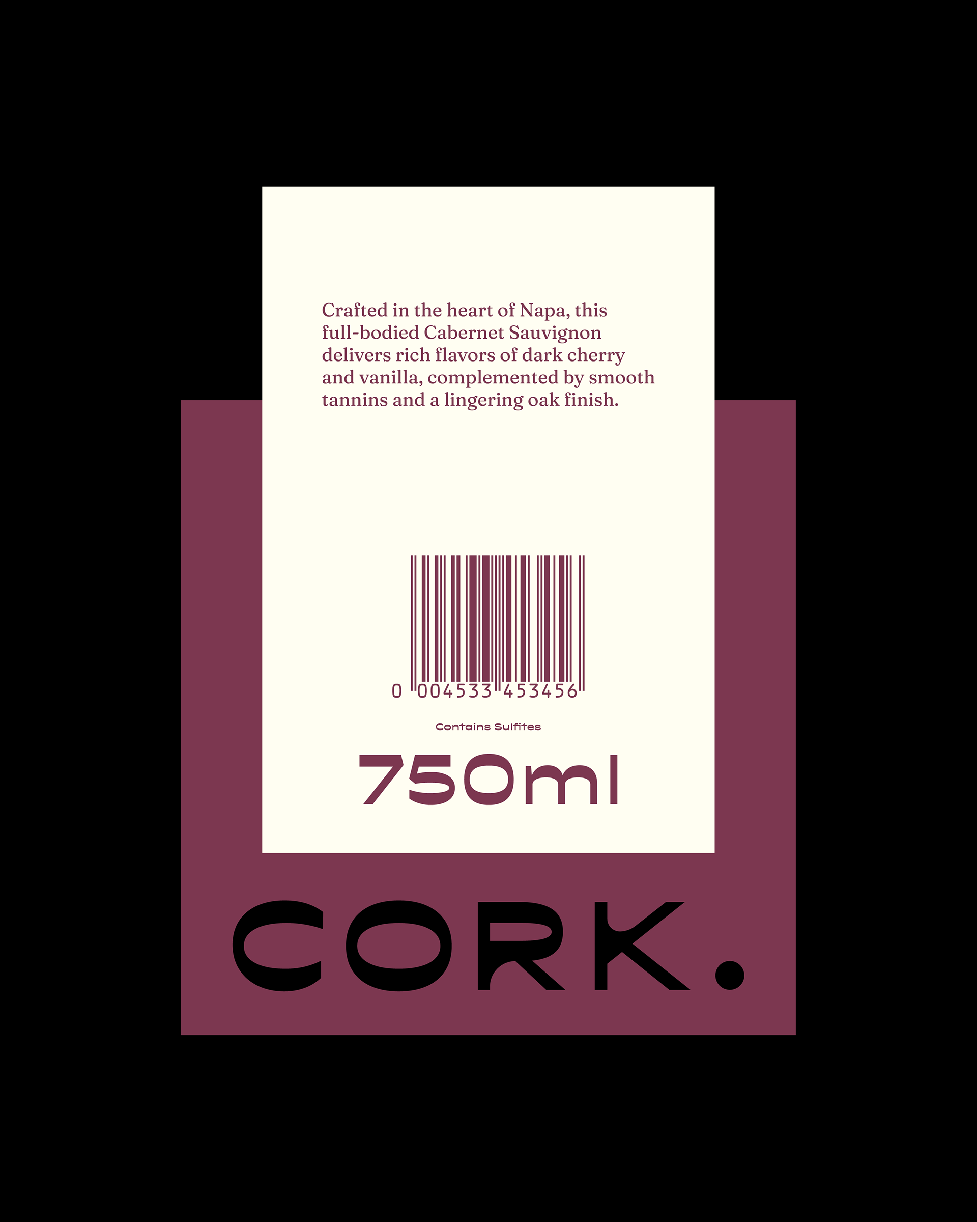
- Subtle Details: A delicate script font is used for the vintage year and origin, adding a touch of traditional elegance. The alcohol by volume (ABV) is prominently displayed with clear, concise text.
- Simple Layout: The information is structured clearly and concisely, preventing visual clutter and ensuring key details are easily digestible.
The "Cork." labels are distinctive, visually appealing, and effectively communicate the brand's commitment to quality and contemporary style. The consistent design across varietals builds strong brand recognition, making "Cork." identifiable and memorable on the shelf.