CLIENT: Hymn
For 'hymn', the objective was to create a brand identity that embodies a sophisticated duality: the softness of introspection versus the strength of structure, and the timelessness of tradition versus the freshness of modernity. This case study details the strategic design choices that brought 'hymn's ethos of mindful elegance to life.
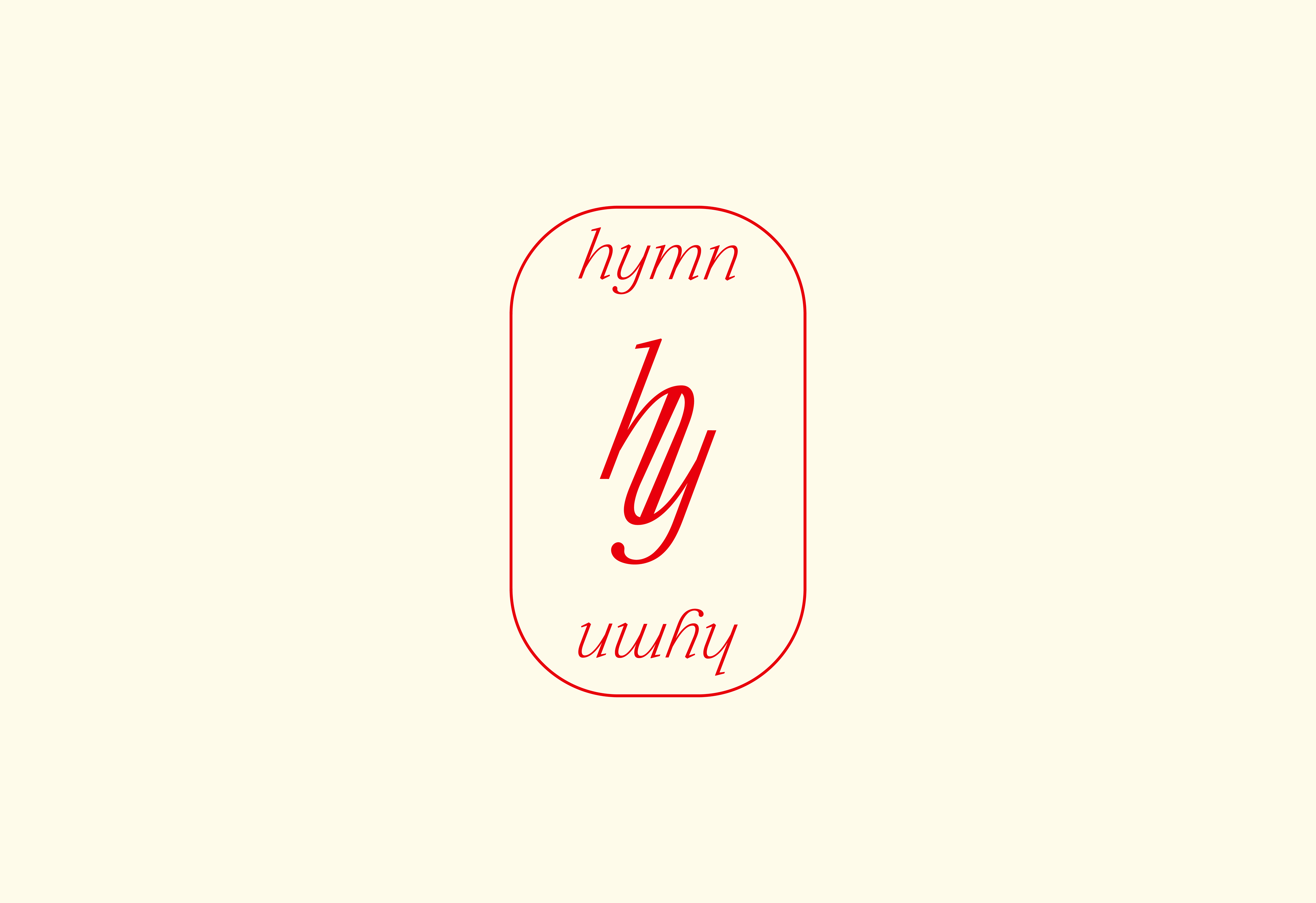
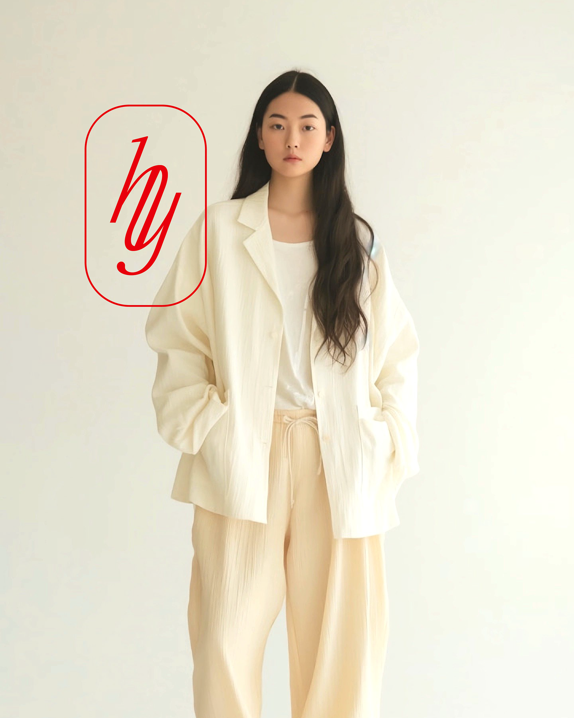
Logomark: Typographic Expression
The 'hymn' logomark is a bespoke typographic expression, meticulously crafted as a custom ligature merging the letters "h" and "y". This unique fusion forms a distinctive symbol that is both elegant and memorable.
Enclosed within a soft, rounded capsule form, the logomark evokes a sense of calmness, containment, and refined simplicity. It subtly references traditional seals or monograms, adding a touch of classic sophistication while maintaining a contemporary feel.
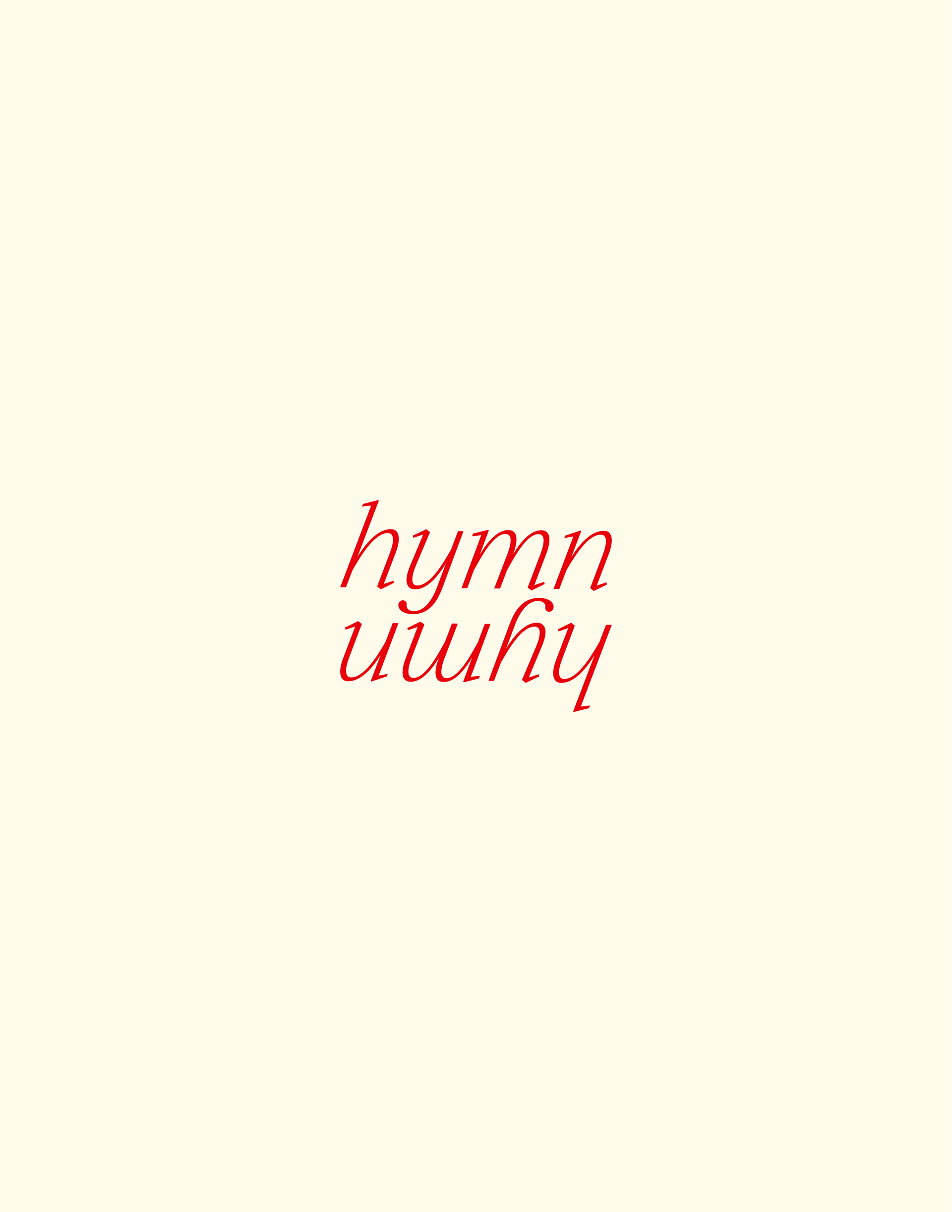
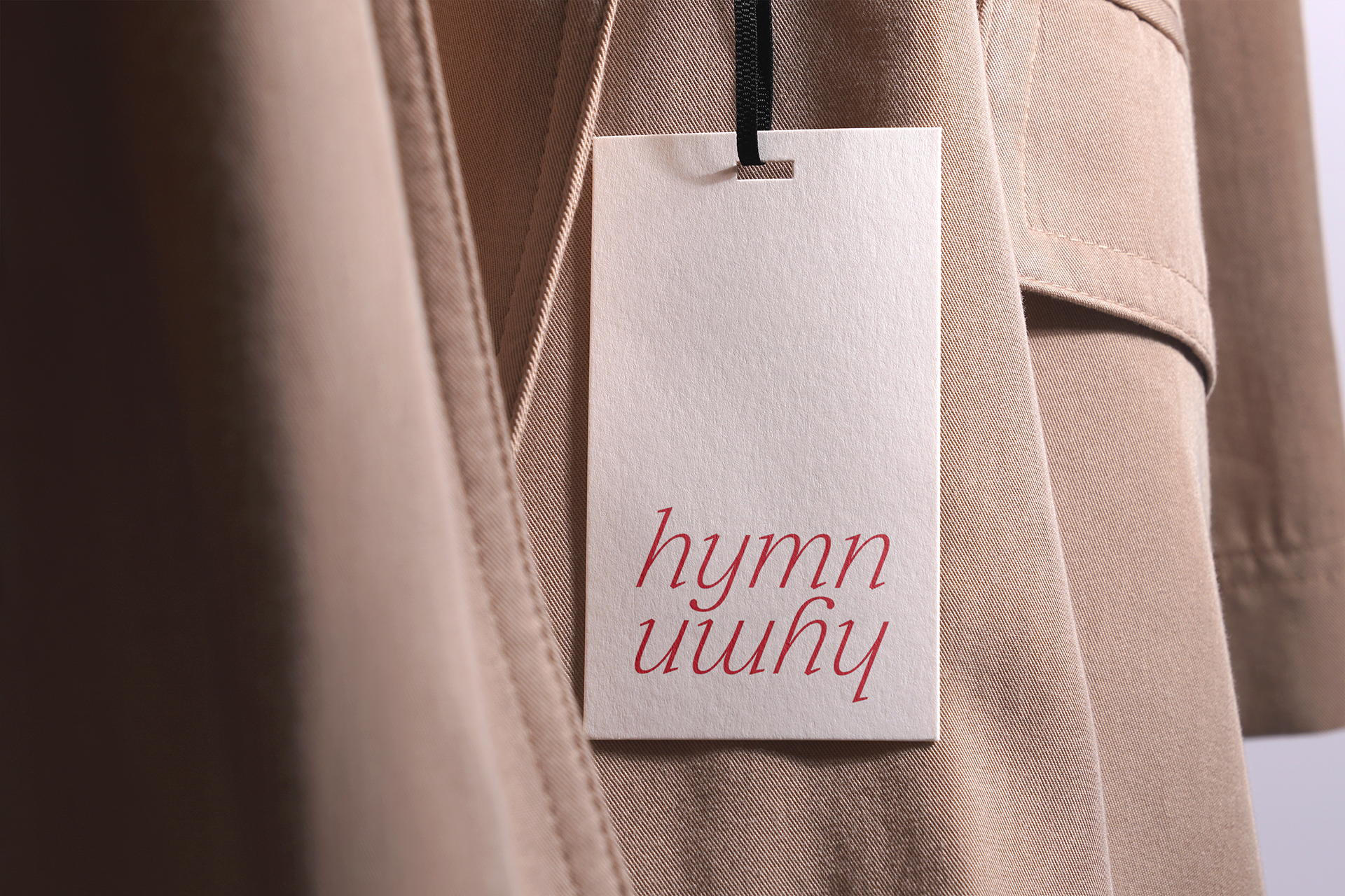
Wordmark: Symmetry & Introspection
The mirrored wordmark, "hymn / ɯuʎɥ", plays a crucial conceptual role in the brand's identity. This deliberate mirroring reflects themes of symmetry and introspection, serving as a subtle nod to self-awareness and reflection. This design choice deeply aligns with 'hymn's core ethos of mindful elegance, inviting the viewer to look deeper and consider the brand's thoughtful approach.
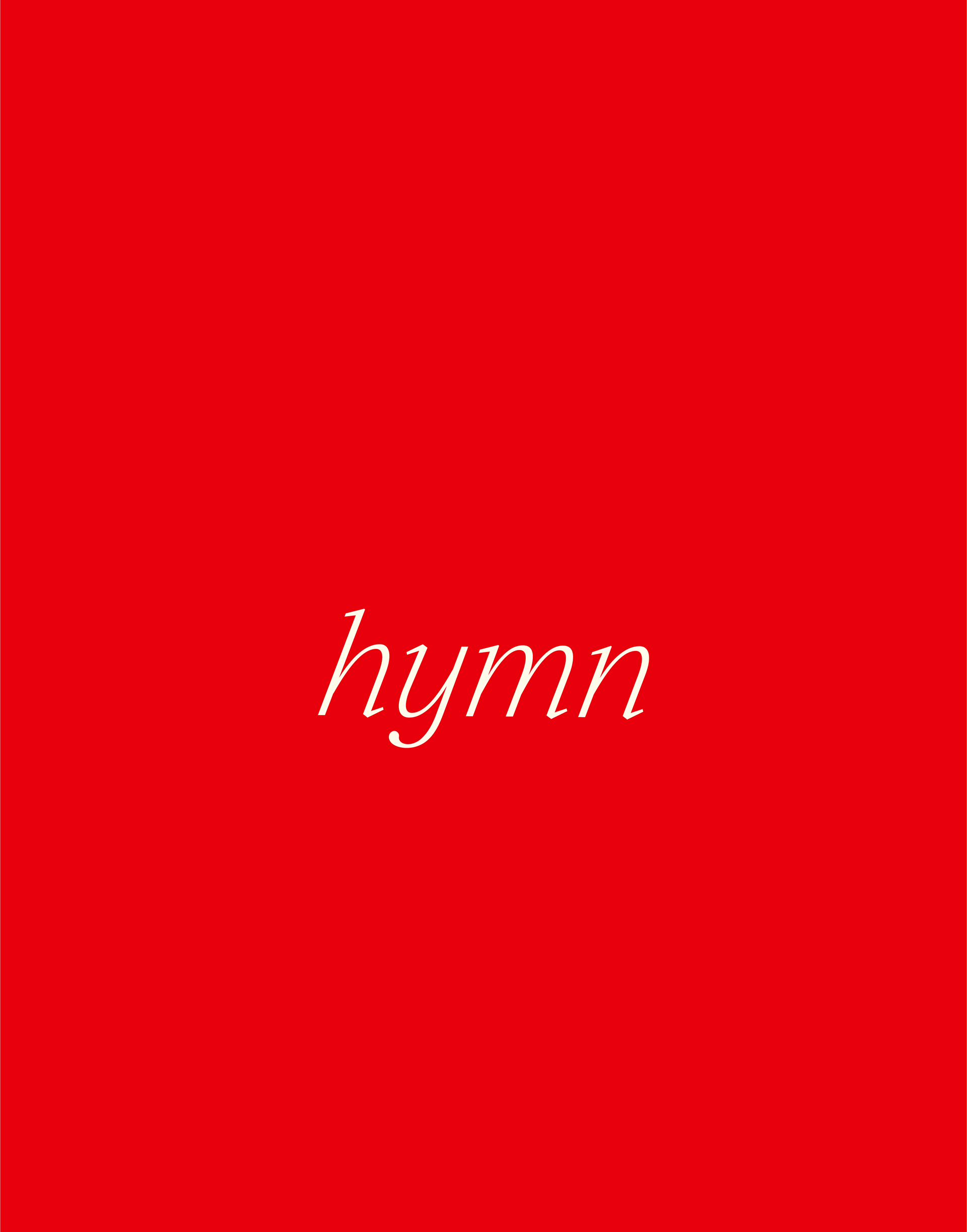
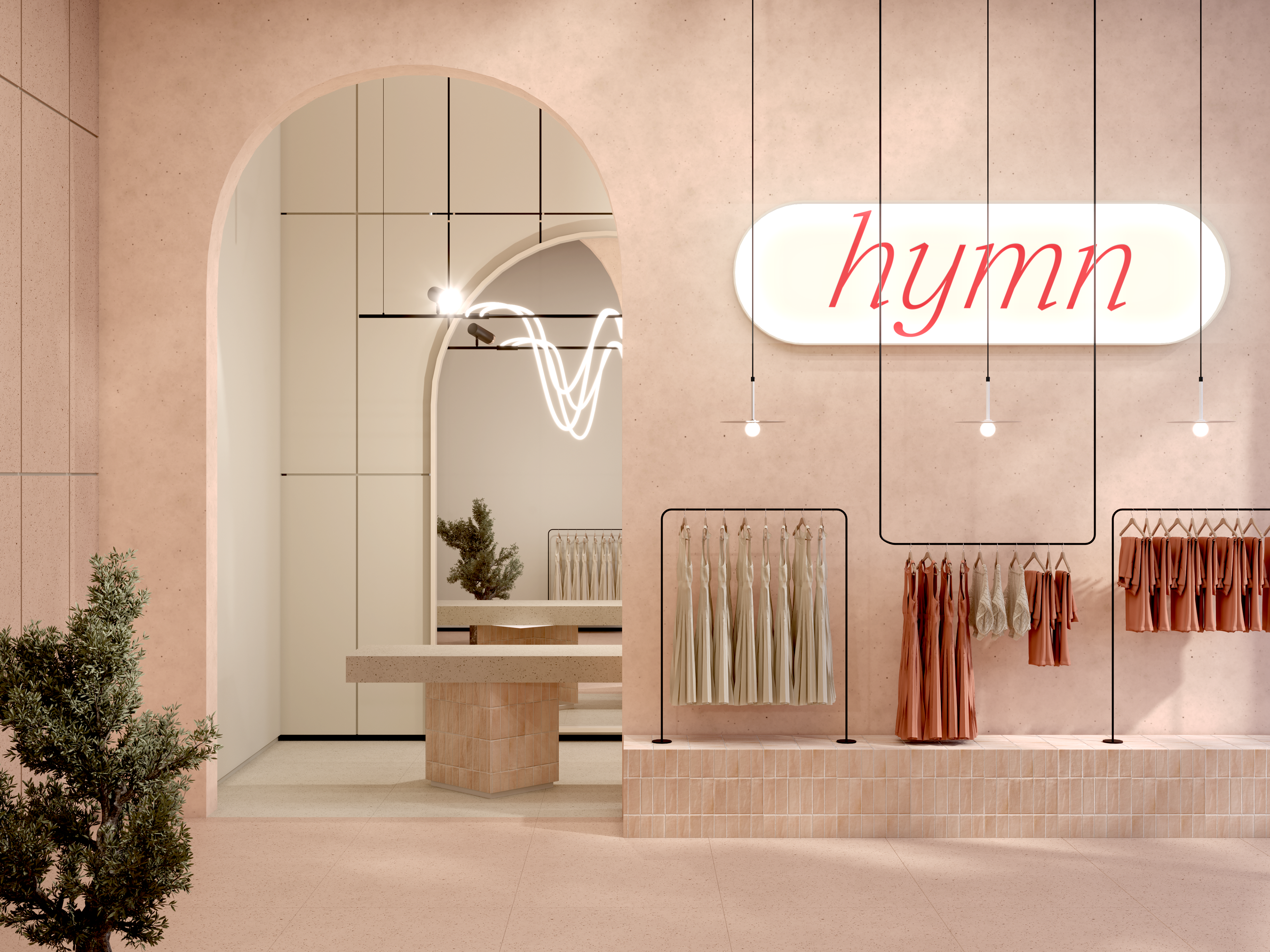
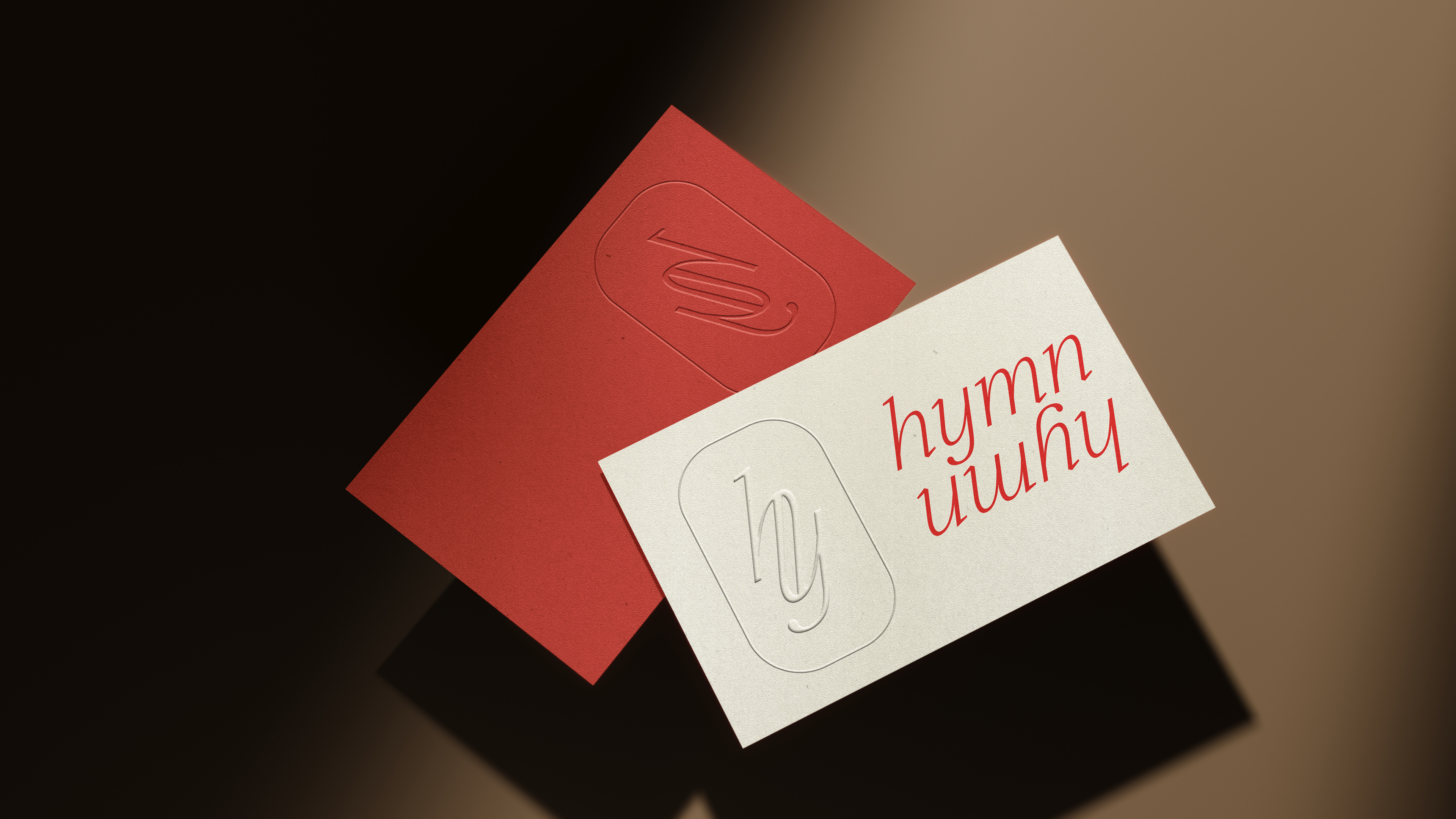
Color Palette:
A strategically minimal color palette was chosen to underscore the brand's gentle authority. Off-white establishes a quiet, sophisticated foundation, creating a sense of calm and purity.
This serene base is thoughtfully punctuated by a deep red accent. This vibrant yet refined hue conveys confidence, passion, and warmth without overwhelming the overall aesthetic. The balance between the soft neutral and the confident red reinforces 'hymn's ability to be both gentle and distinct.