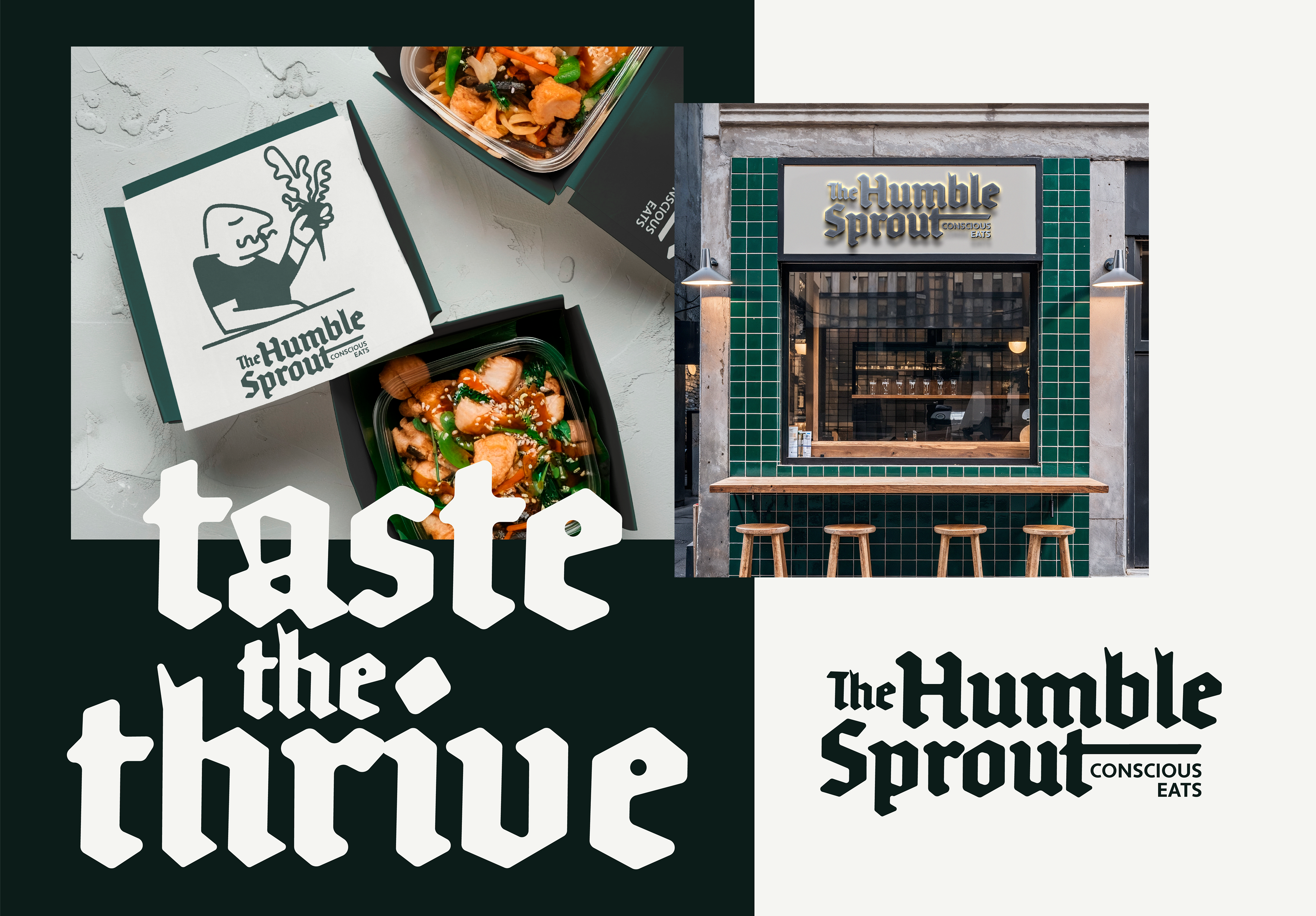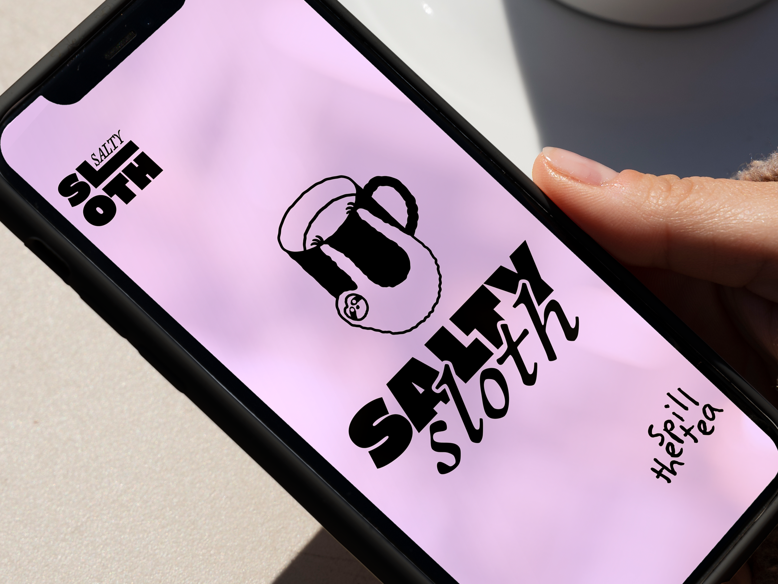
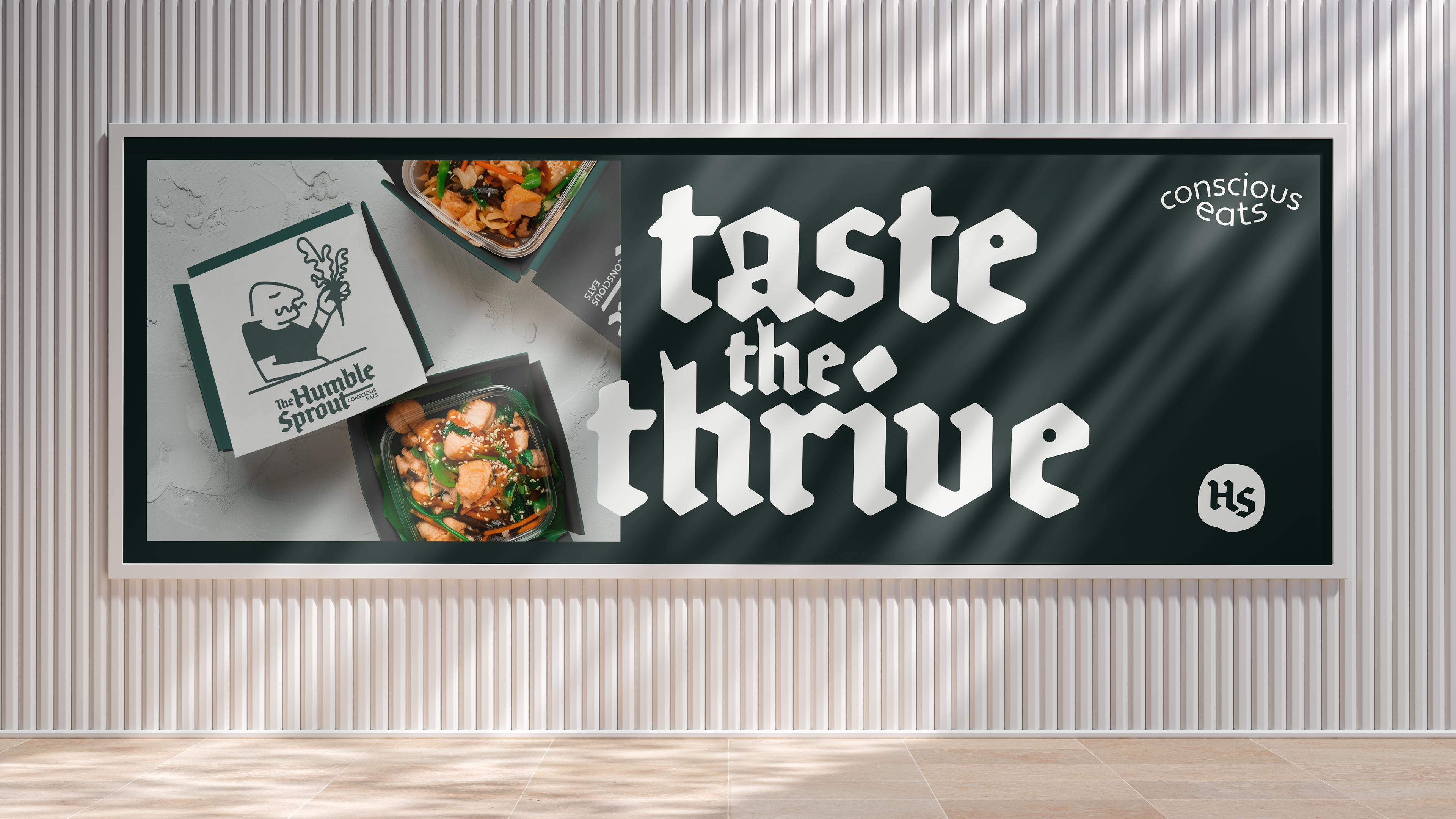
Brand Identity for The Humble Sprout.
My goal was to create a visual language that truly embodies their commitment to wholesome, conscious eating.
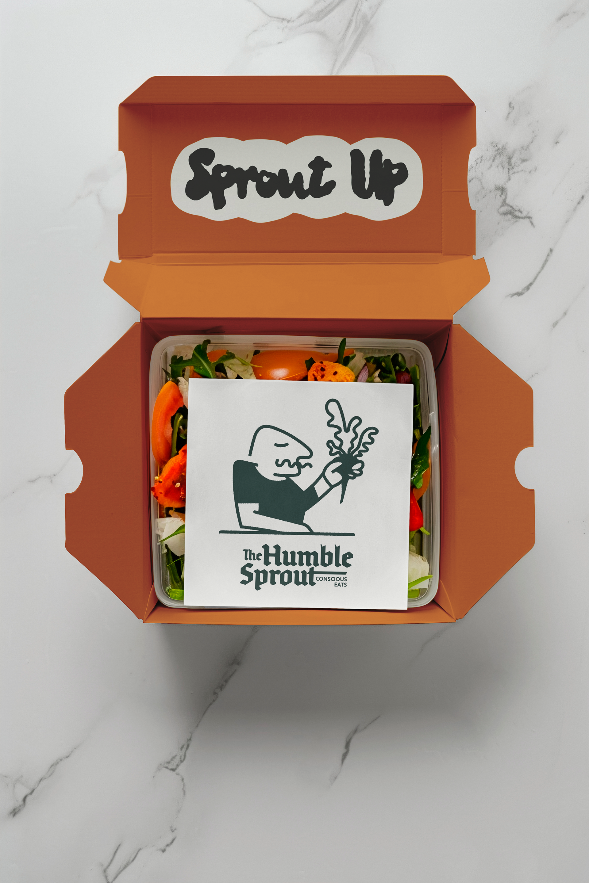
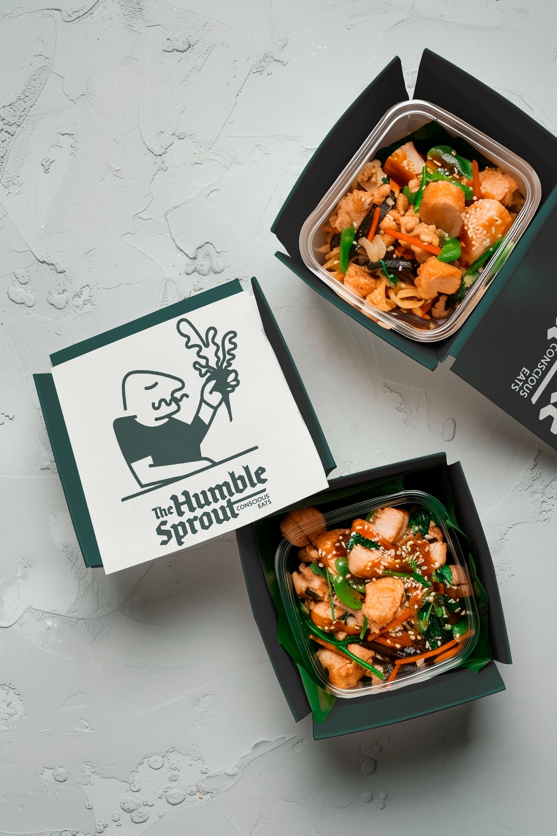
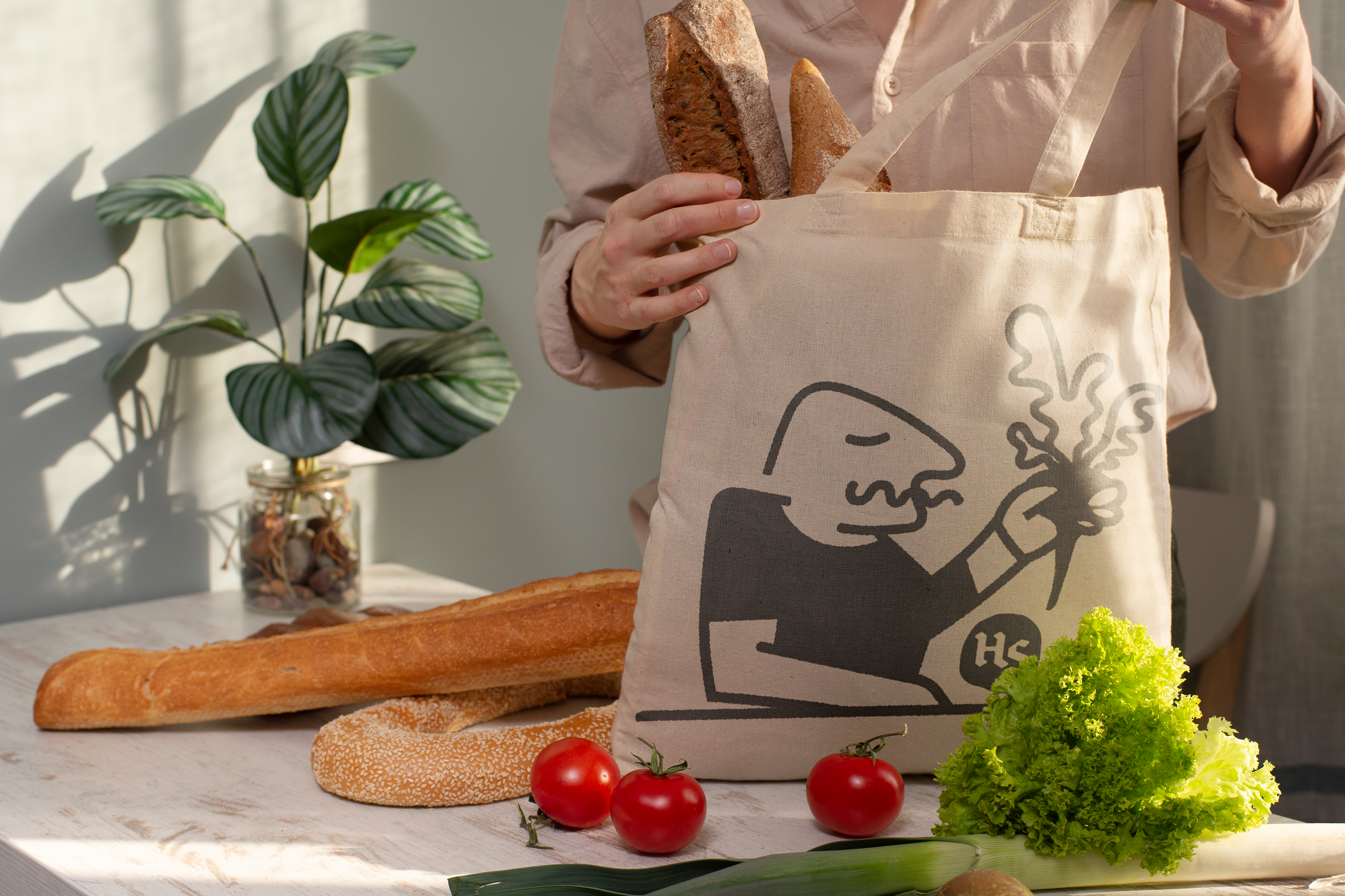
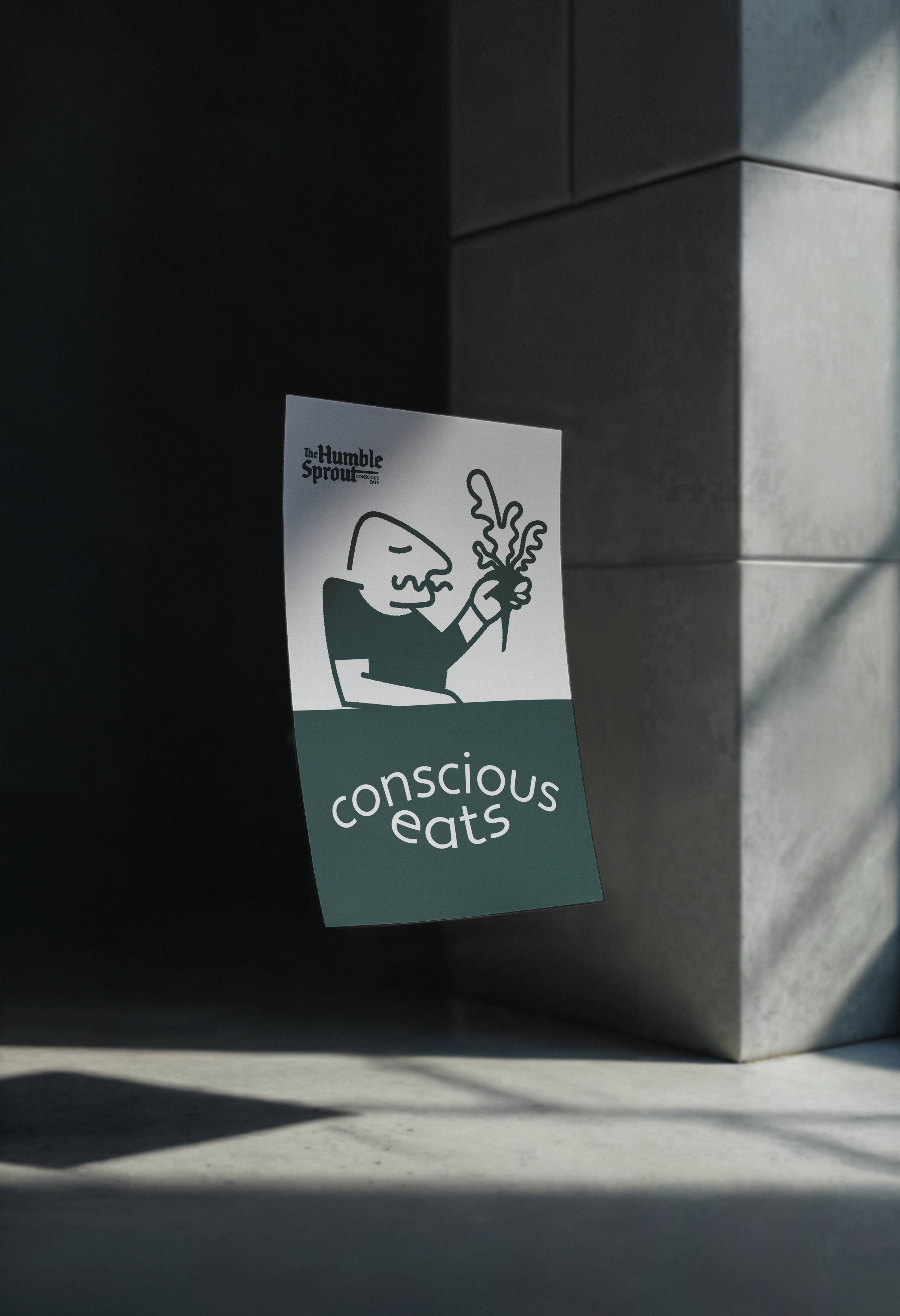
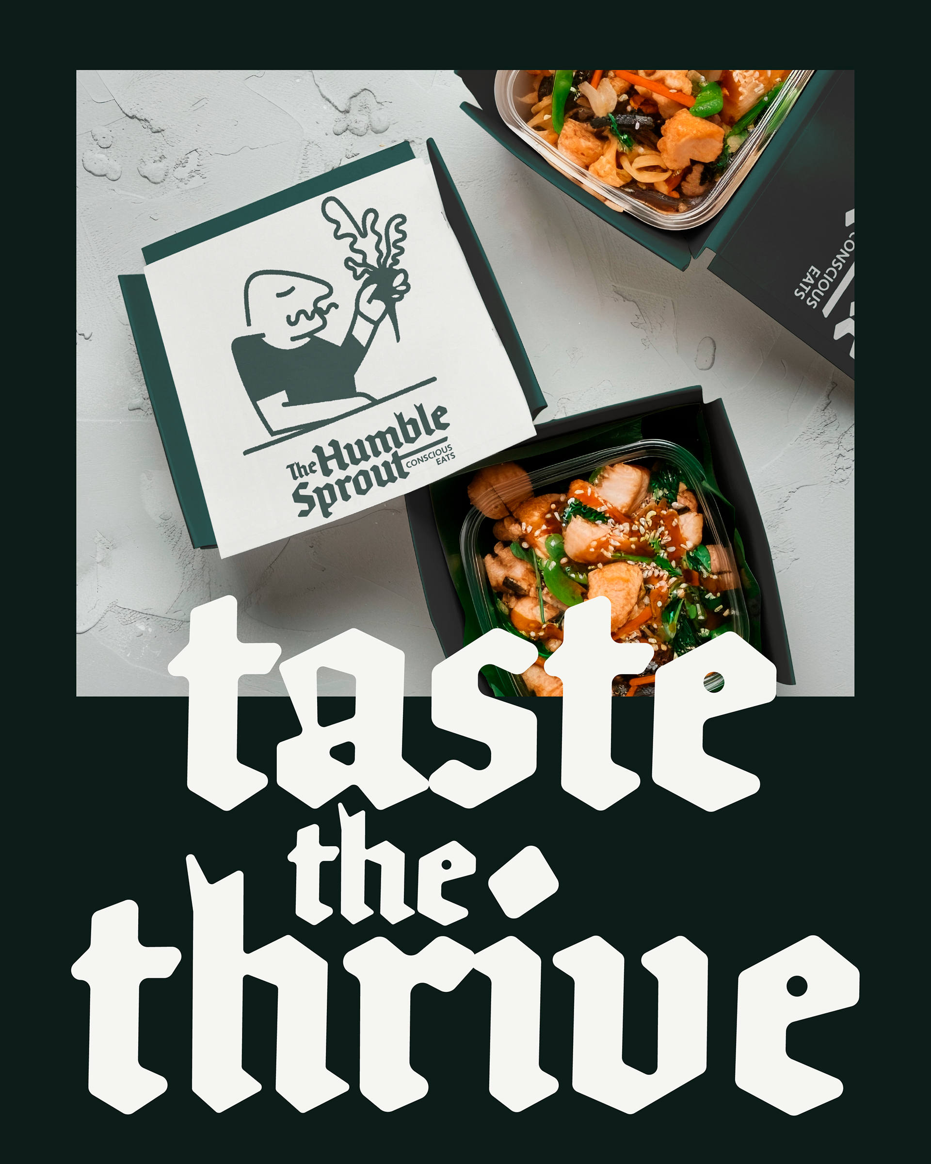
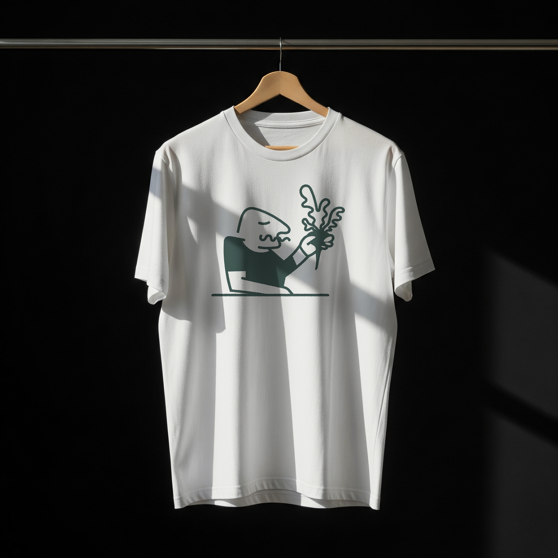
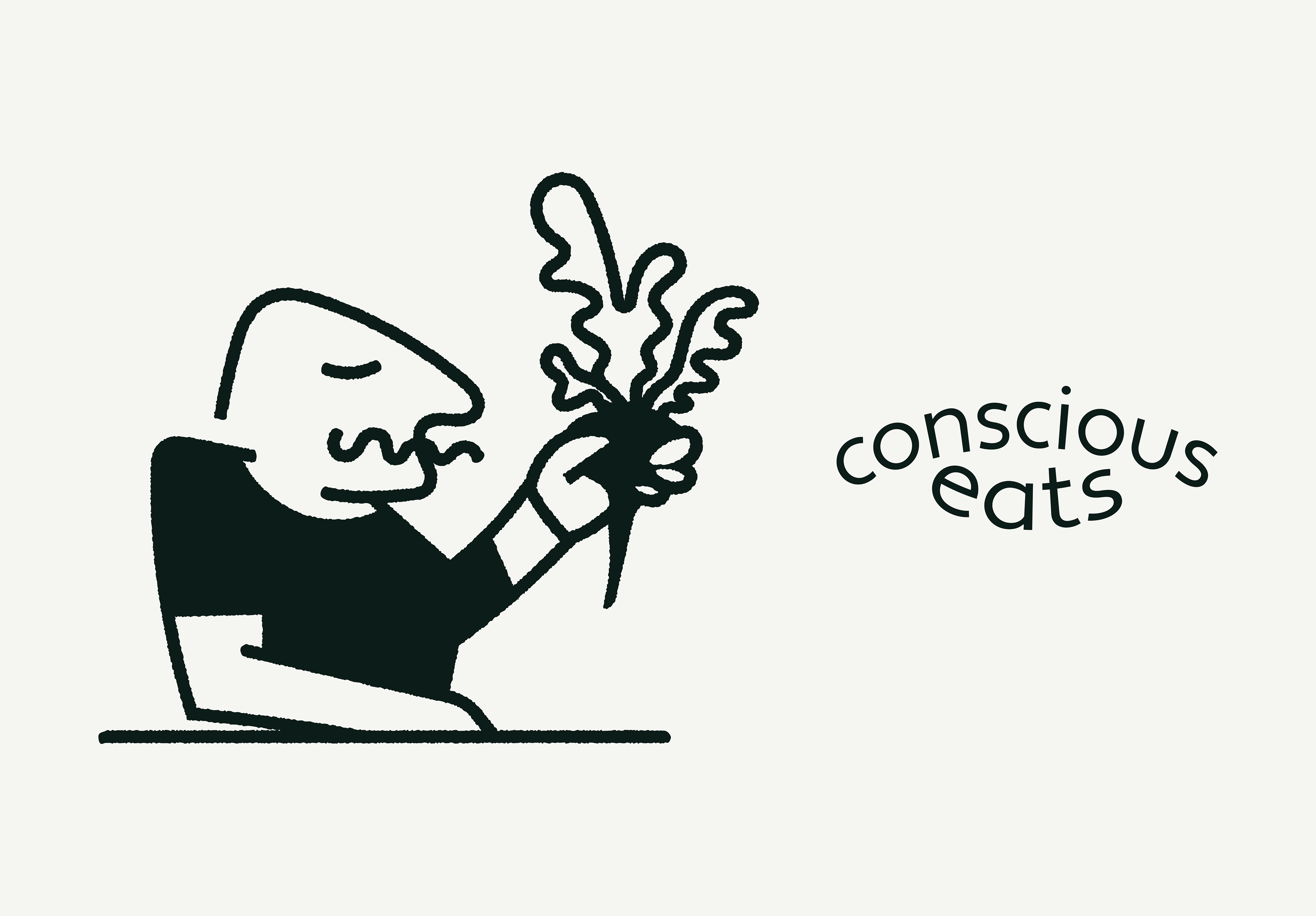
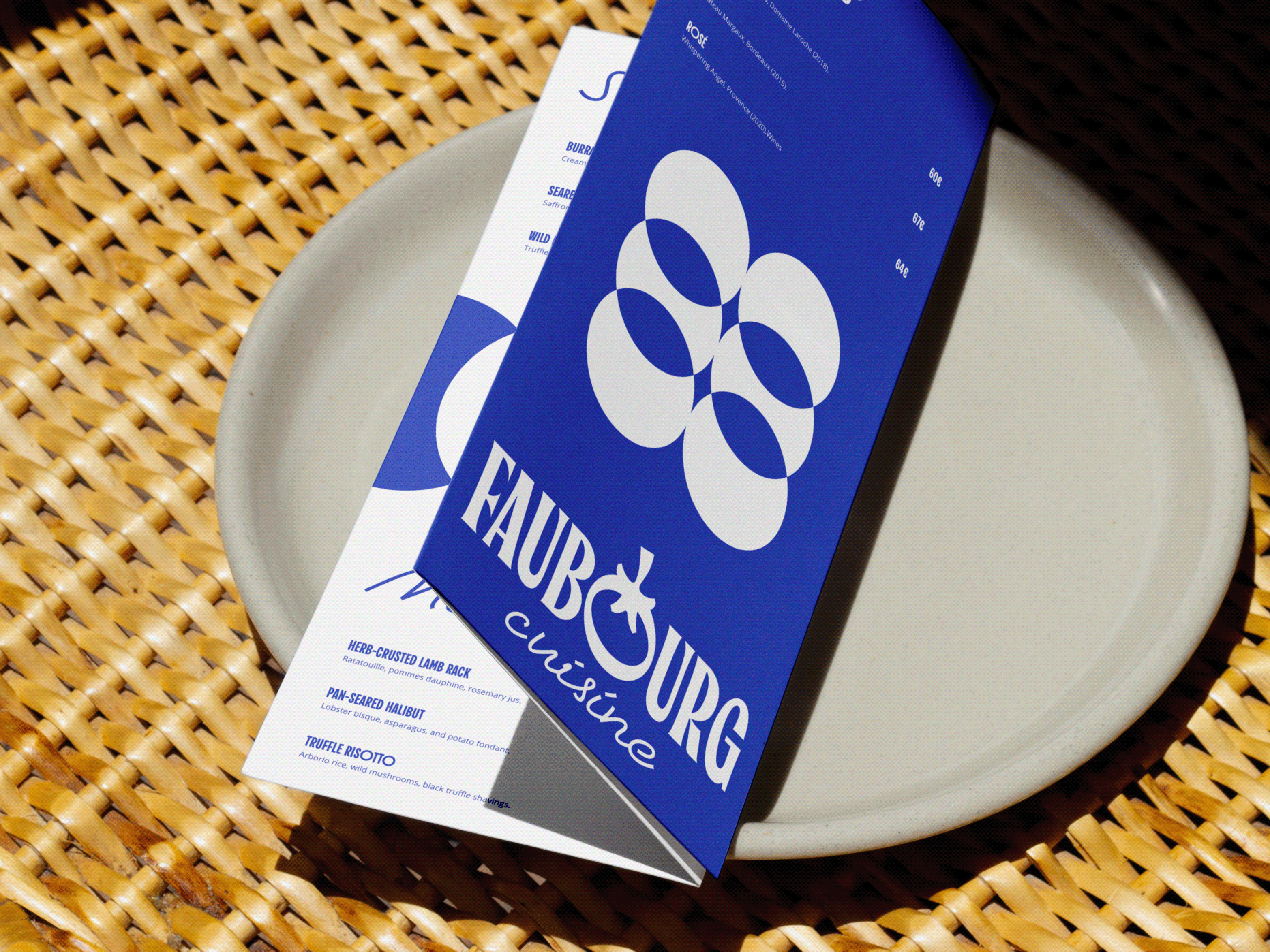
I opted for a simple, hand-drawn character holding a beet. This was a deliberate choice to immediately communicate authenticity, approachability, and a direct connection to nature. It is designed to feel friendly and relatable, intentionally steering clear of overly corporate or generic health food visuals.
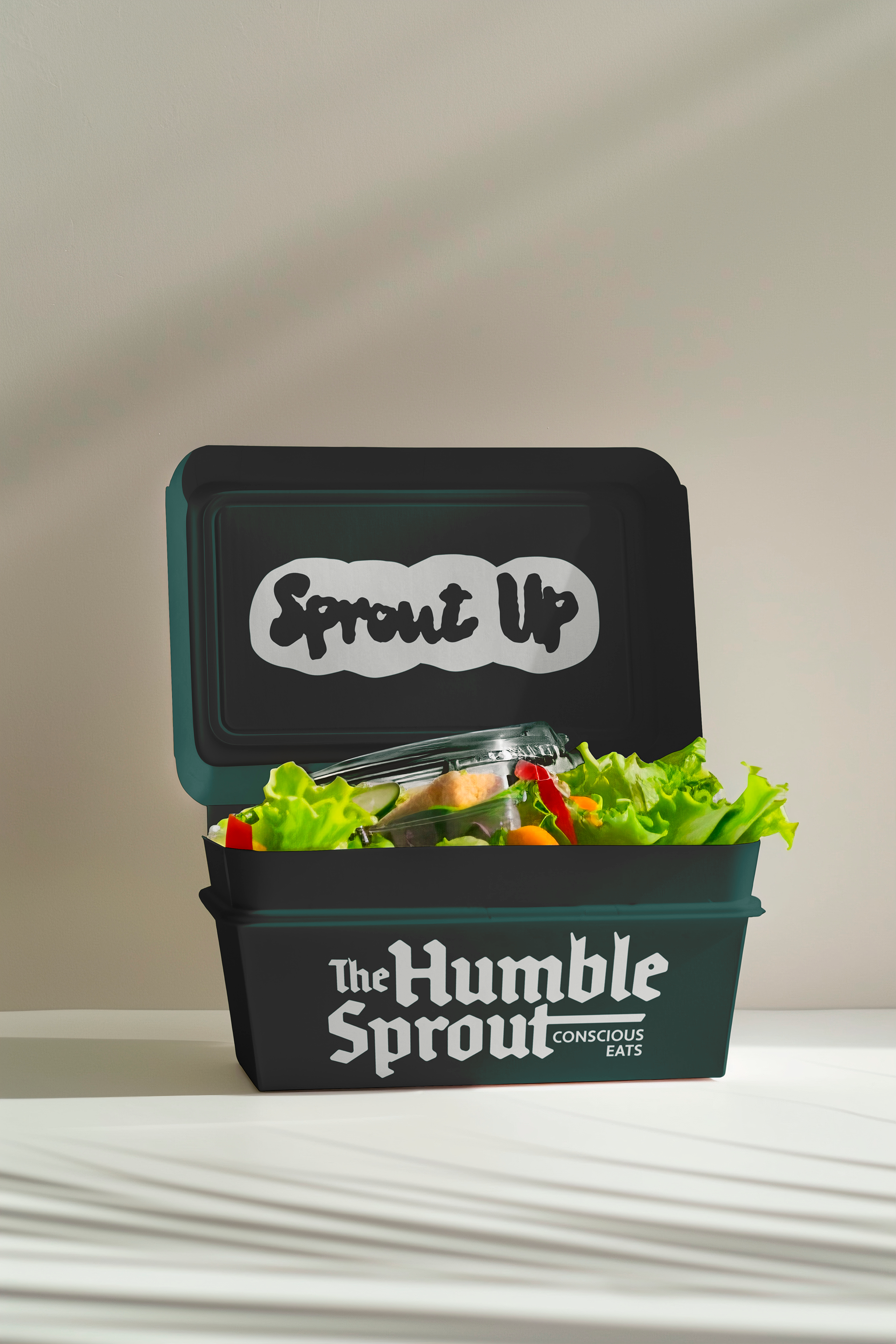
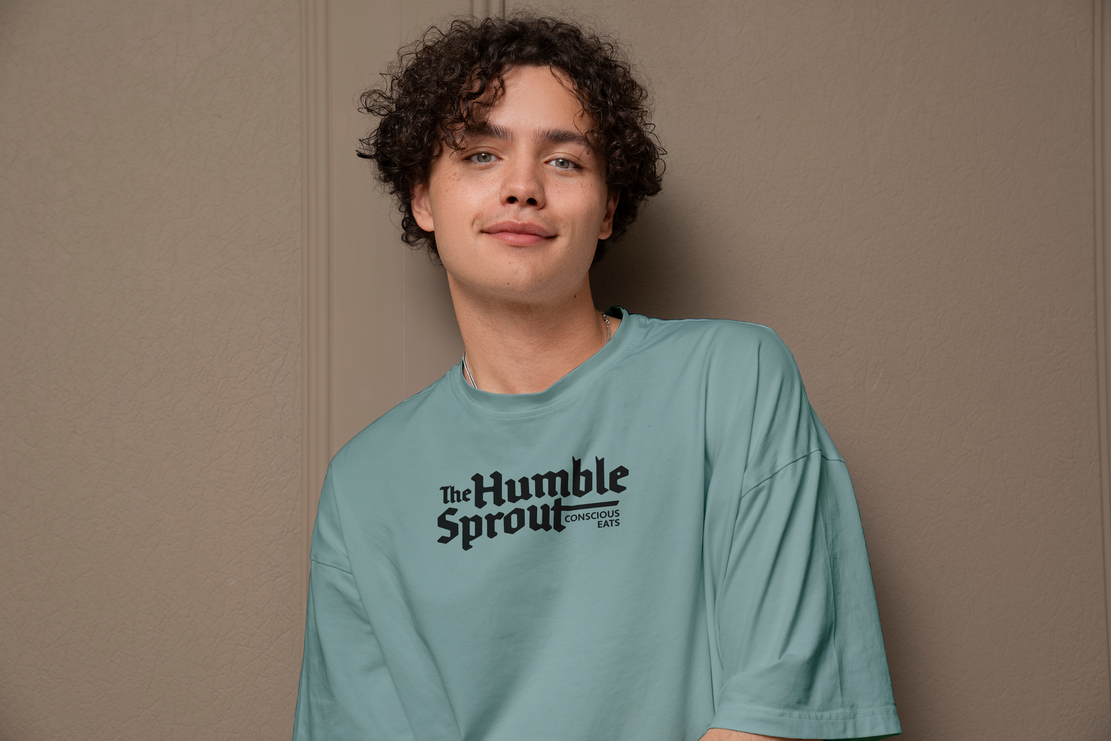
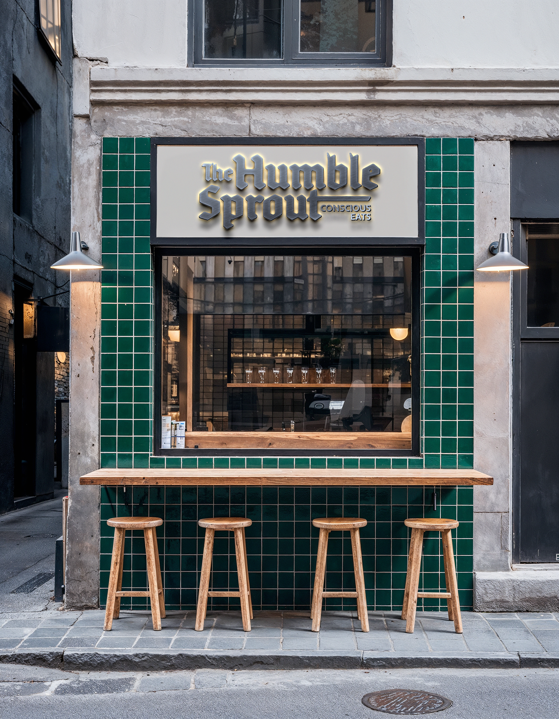
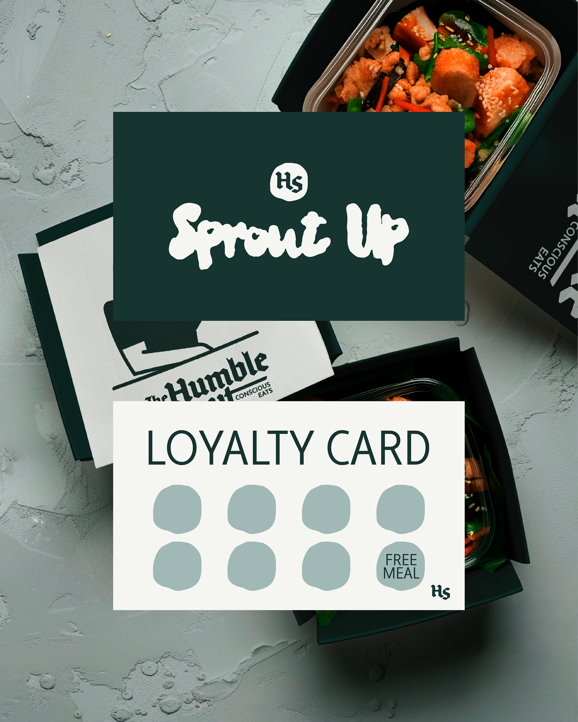
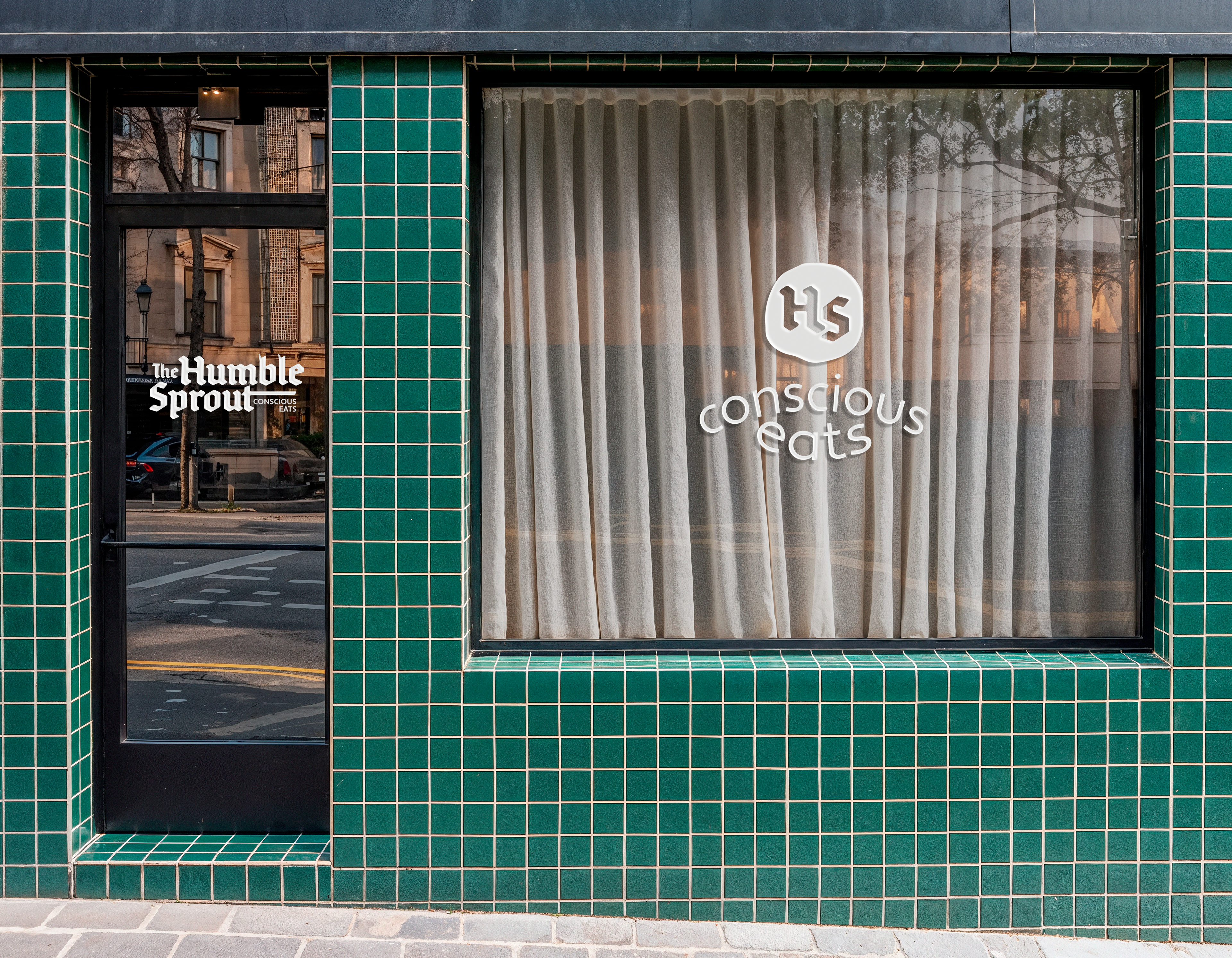
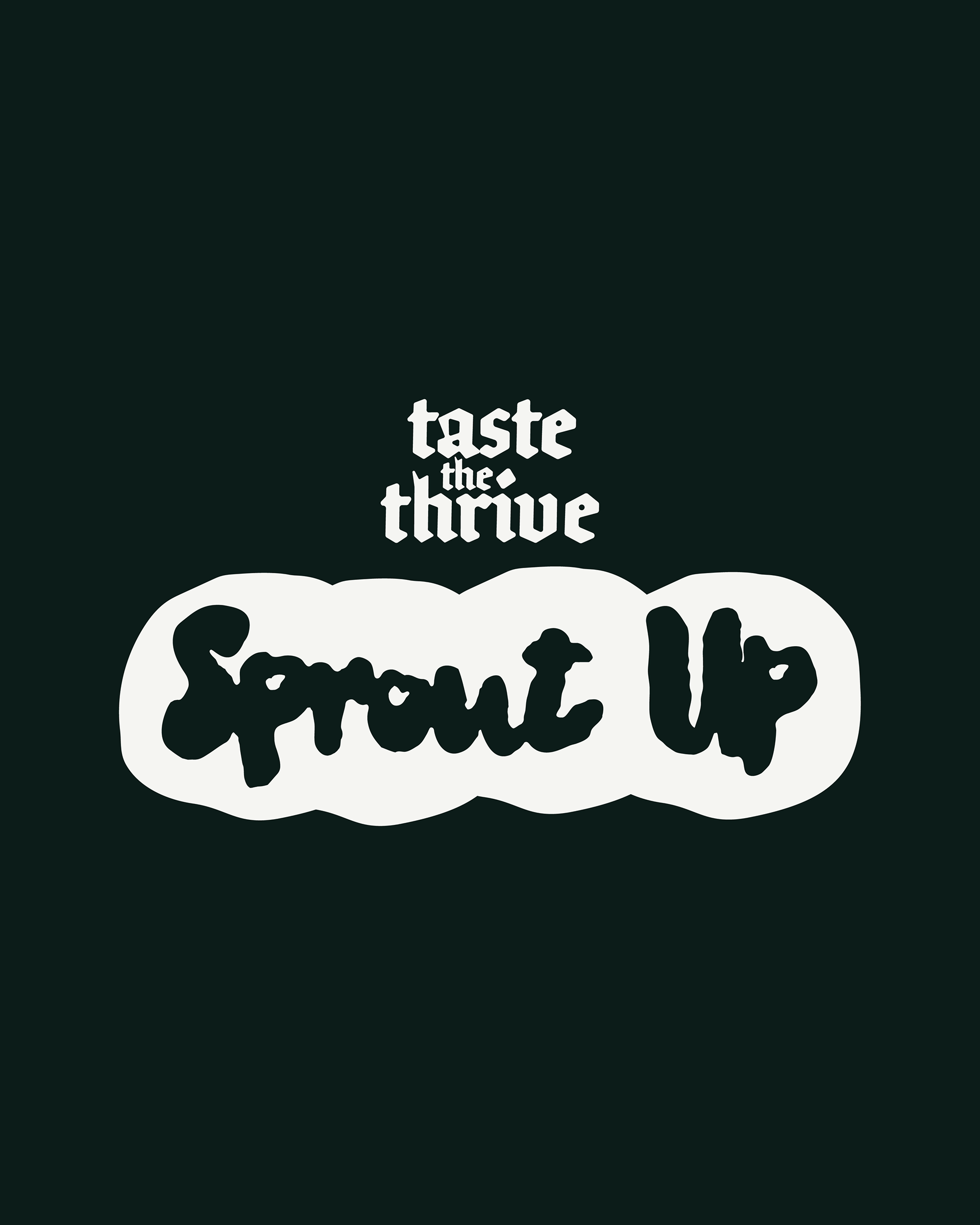
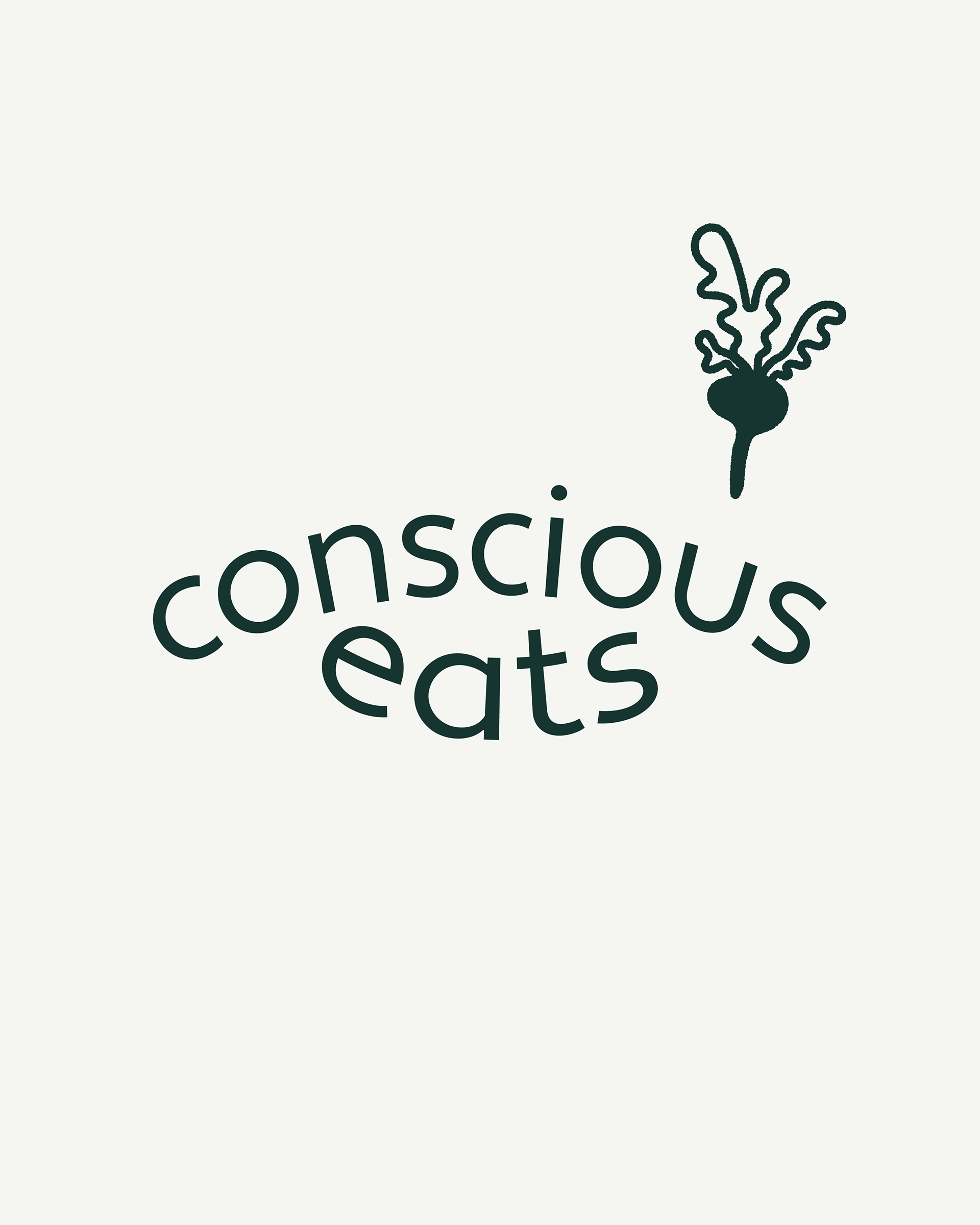
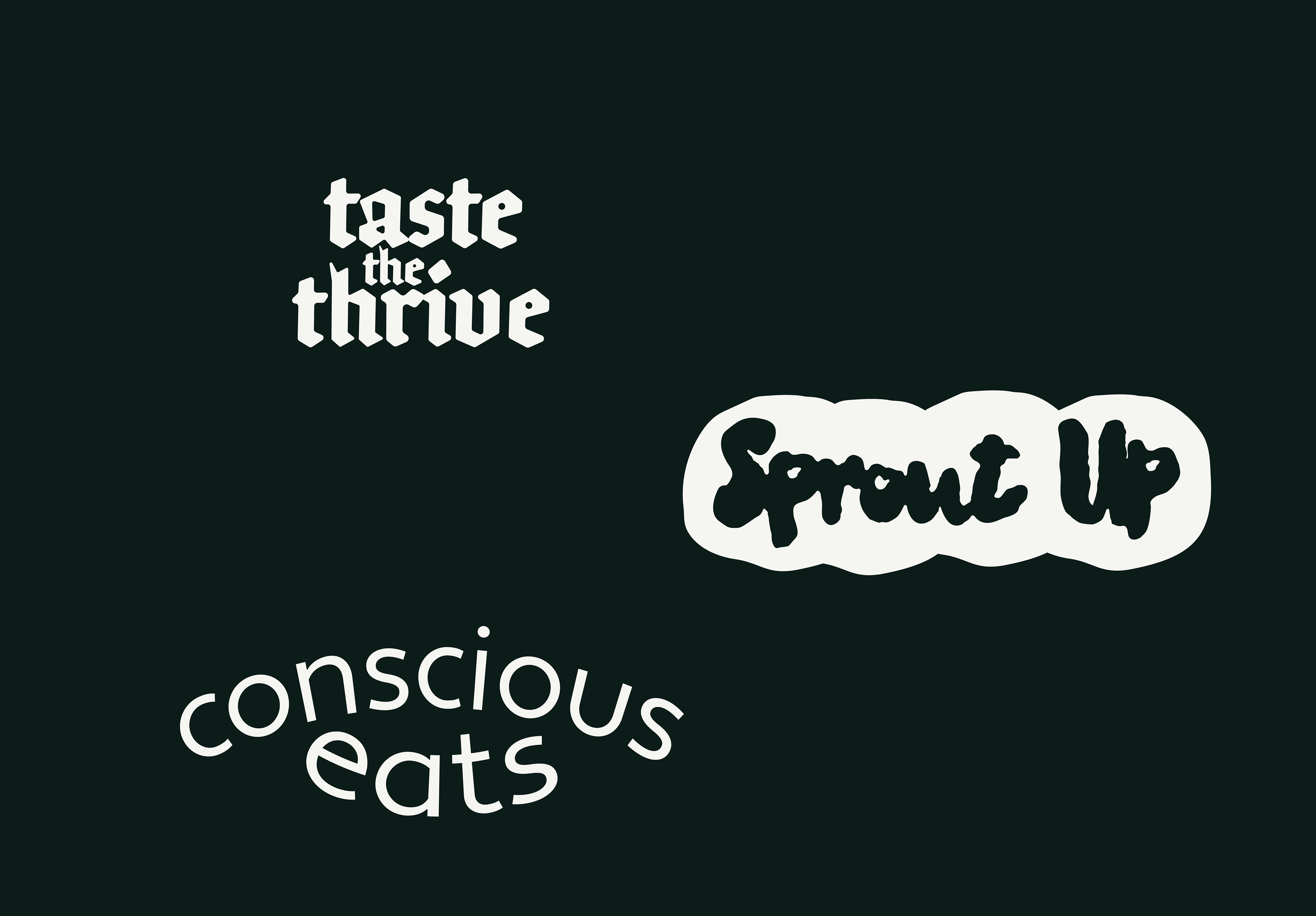
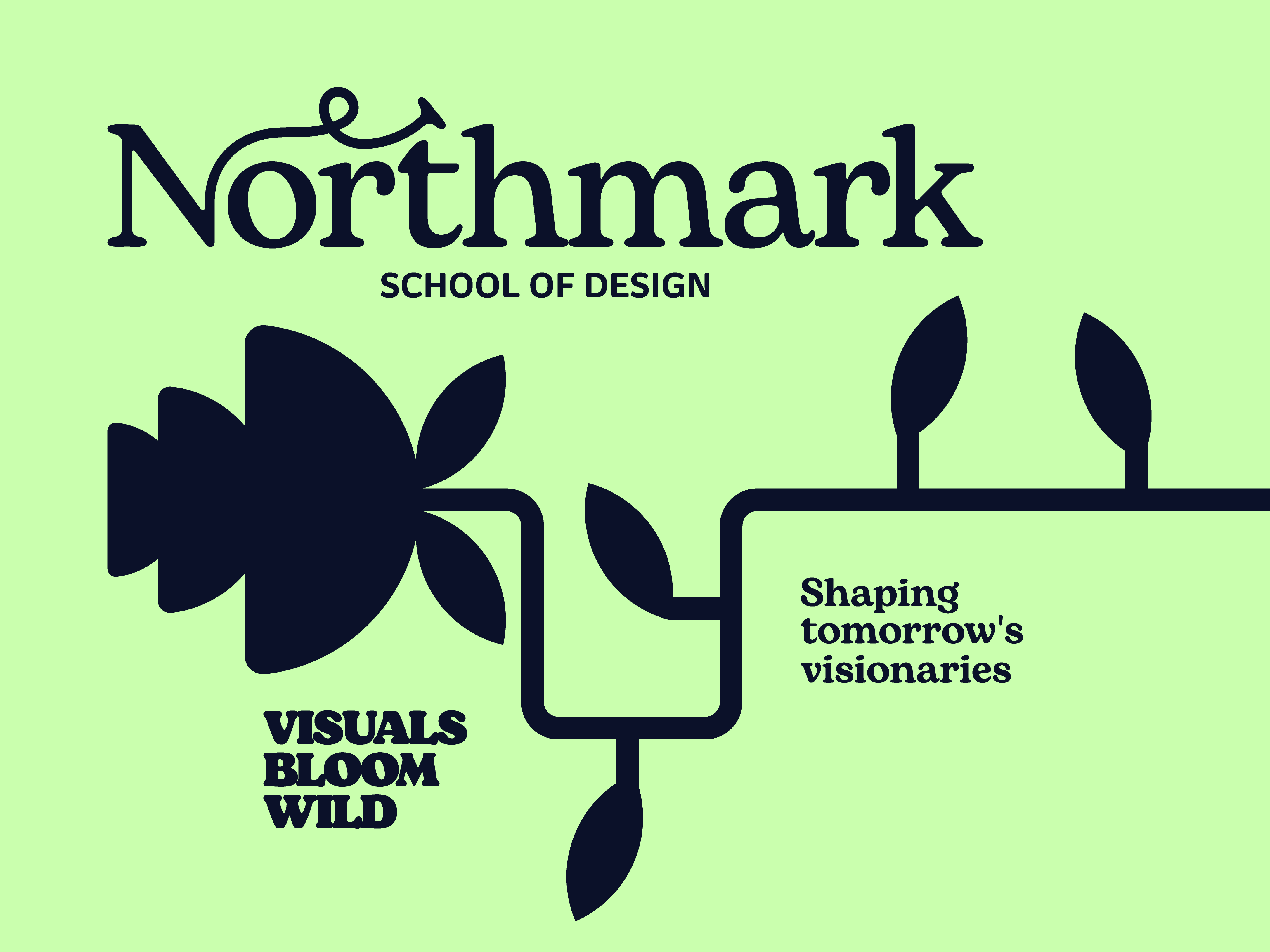
Regarding typography, a key strategic decision was the contrast between the main elements. "The Humble Sprout" is set in a blackletter font. This wasn't just an aesthetic choice, it serves to evoke a sense of tradition and meticulous craftsmanship, subtly suggesting an artisanal approach to their offerings. To provide a modern counterpoint and ensure balance, the accompanying font used also for the tagline, "conscious eats," utilizes a contemporary sans-serif. This pairing creates a unique visual dynamic, blending established quality with a fresh, mindful perspective. And finally, I introduced a bubbly, organic, hand-lettered style font. This choice adds a touch of joy and spontaneity, creating an uplifting moment for the customer when they interact with the packaging.
The color palette was inspired by natural elements. I selected deep forest green and warm terracotta hues to evoke feelings of freshness, grounding, and the organic nature of the food. These colors reinforce the wholesome and earthy essence of the brand.
I opted for a simple, hand-drawn character holding a beet. This was a deliberate choice to immediately communicate authenticity, approachability, and a direct connection to nature. It is designed to feel friendly and relatable, intentionally steering clear of overly corporate or generic health food visuals.
Regarding typography, a key strategic decision was the contrast between the main elements. "The Humble Sprout" is set in a blackletter font. This wasn't just an aesthetic choice, it serves to evoke a sense of tradition and meticulous craftsmanship, subtly suggesting an artisanal approach to their offerings. To provide a modern counterpoint and ensure balance, the accompanying font used also for the tagline, "conscious eats," utilizes a contemporary sans-serif. This pairing creates a unique visual dynamic, blending established quality with a fresh, mindful perspective. And finally, I introduced a bubbly, organic, hand-lettered style font. This choice adds a touch of joy and spontaneity, creating an uplifting moment for the customer when they interact with the packaging.
The color palette was inspired by natural elements. I selected deep forest green and warm terracotta hues to evoke feelings of freshness, grounding, and the organic nature of the food. These colors reinforce the wholesome and earthy essence of the brand.